Dappo
Furniture With a Twist of Artistry

Dappo is a newly established Polish premium furniture brand. It was founded by siblings wanting to continue the legacy of their family, which has been in the furniture business for many years.
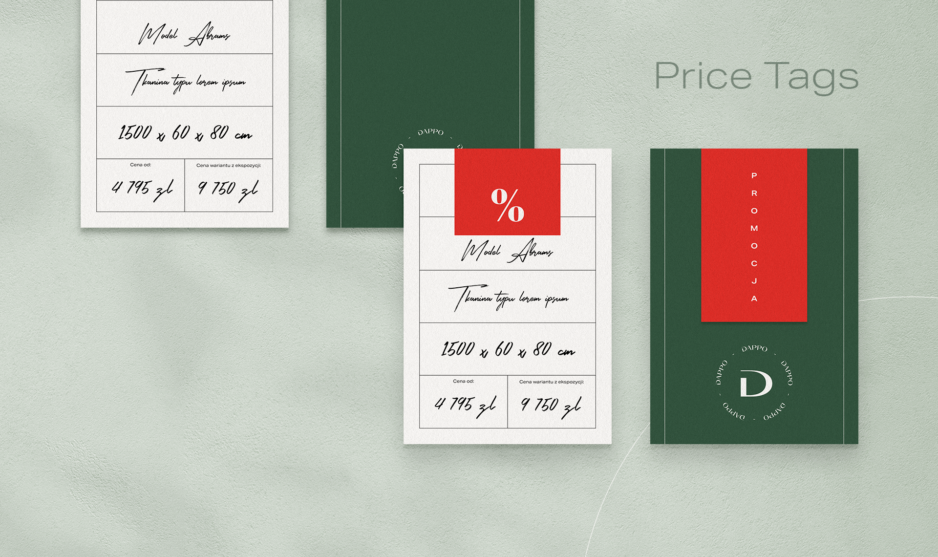
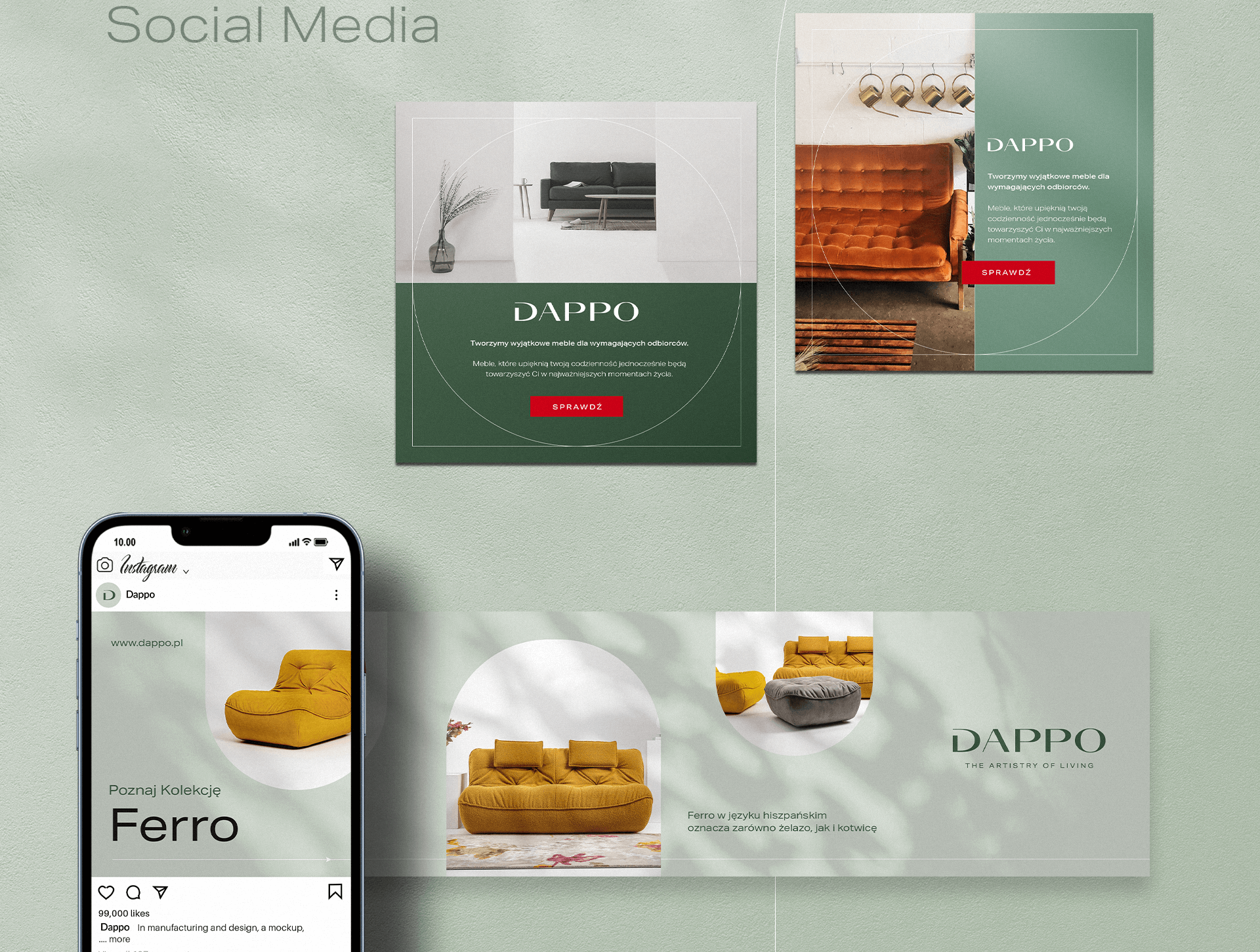
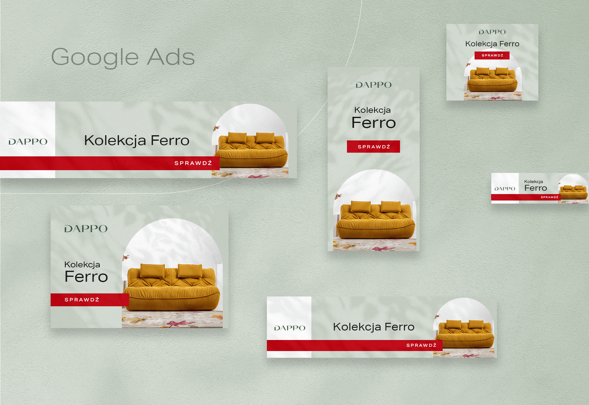
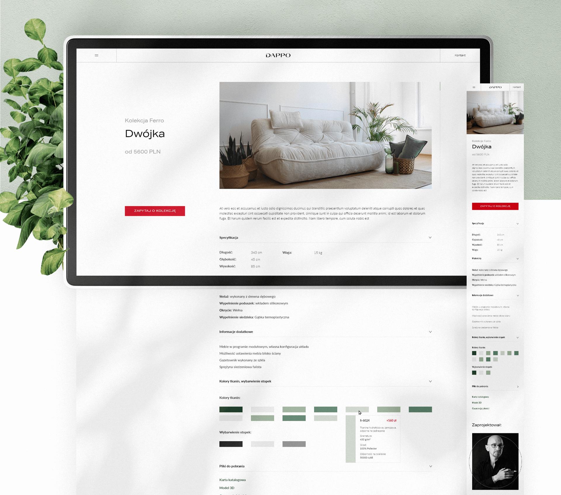
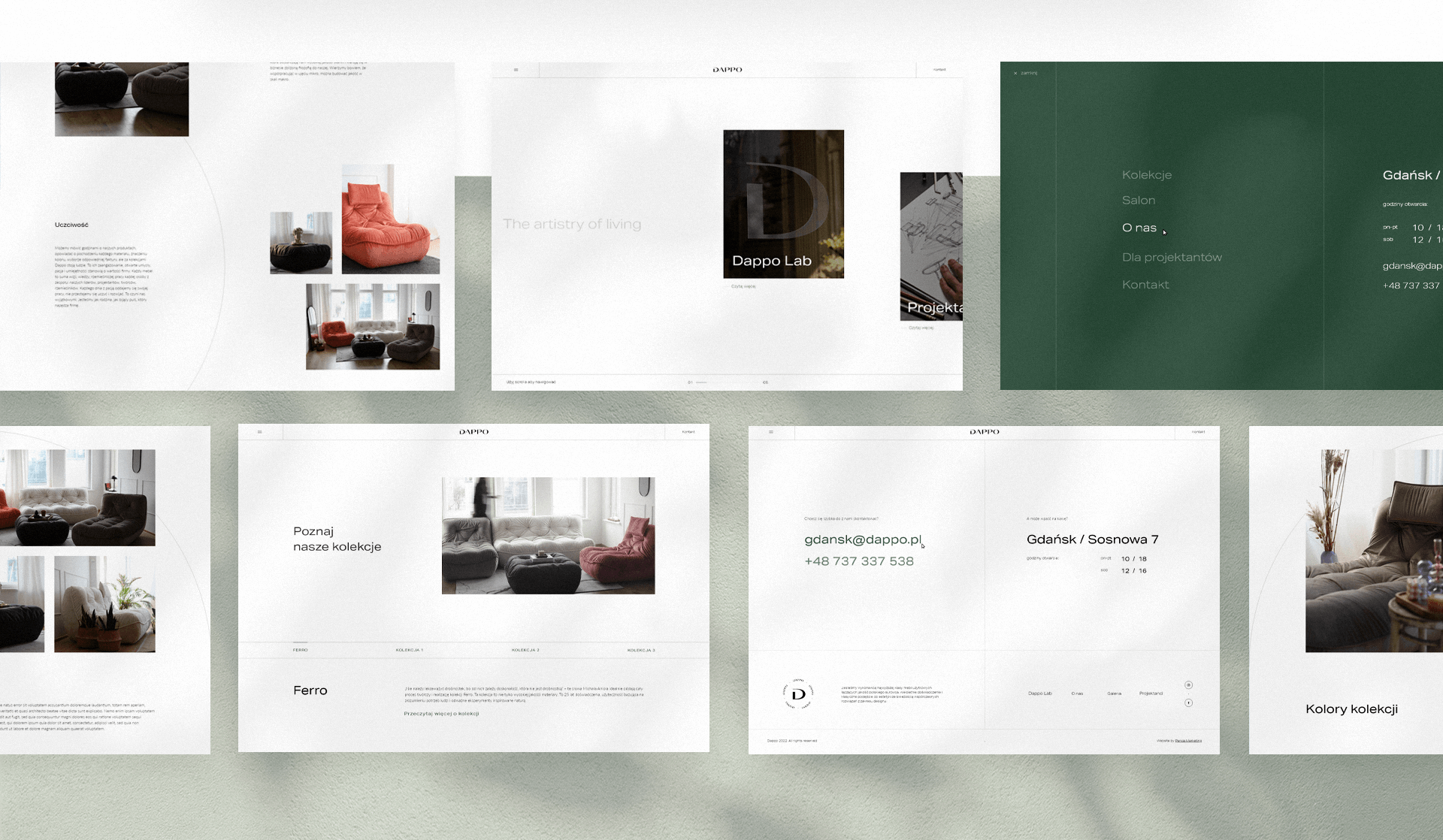
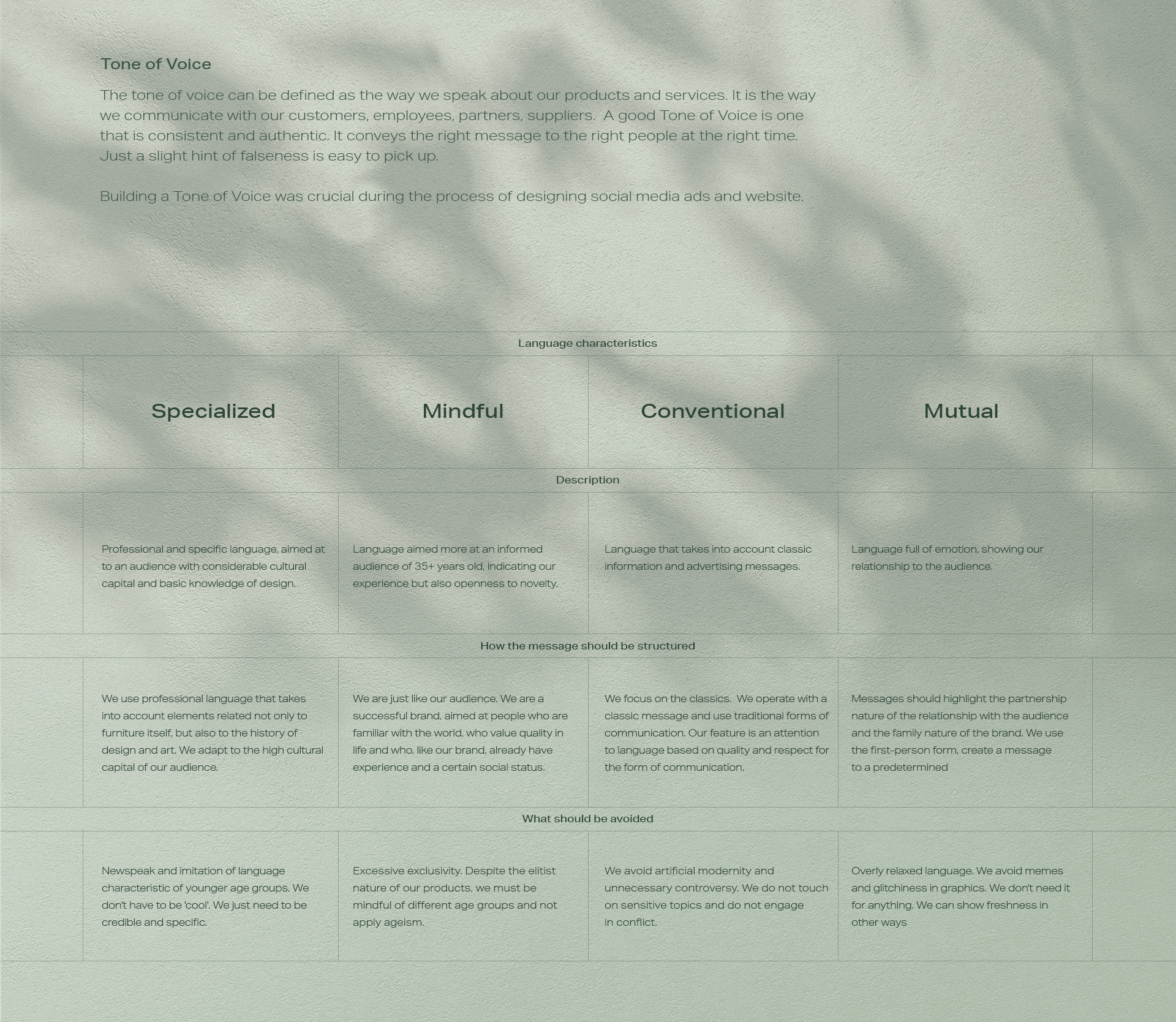
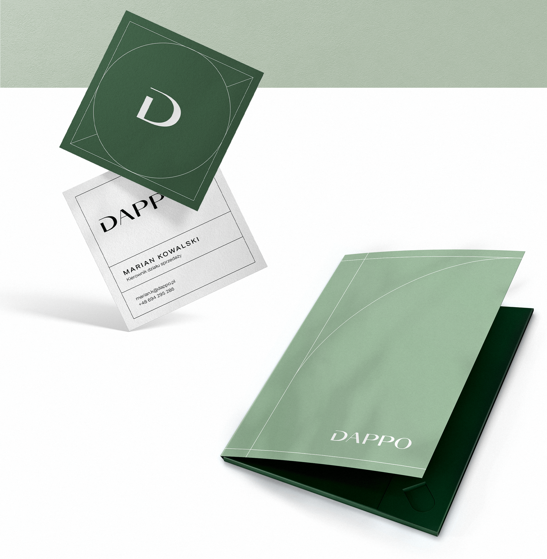
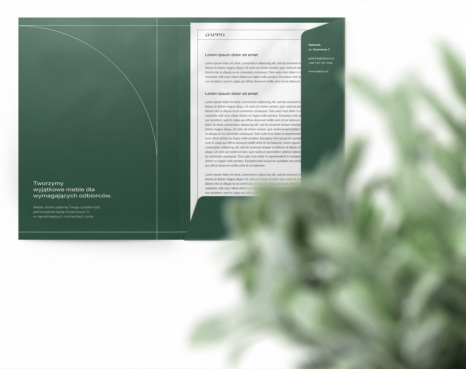
As a brand was just entering the market, we had to put every effort to ensure that the developed graphic identity and communication strategy are appropriate for both the product and the target audience. The owners of the company trusted our experience and decided to go through the complete design process with us. We started the journey with a workshop that guaranteed a deep understanding of their needs. Based on these, we created a sample persona and defined both brand values and Tone of Voice. We then moved on to the design stage, where we laid the visual foundation for the development of the brand. We implemented the new branding and designed numerous advertising and sales materials to allow the brand to operate freely in the market. Have a comfortable seat and learn about our artful adventure.
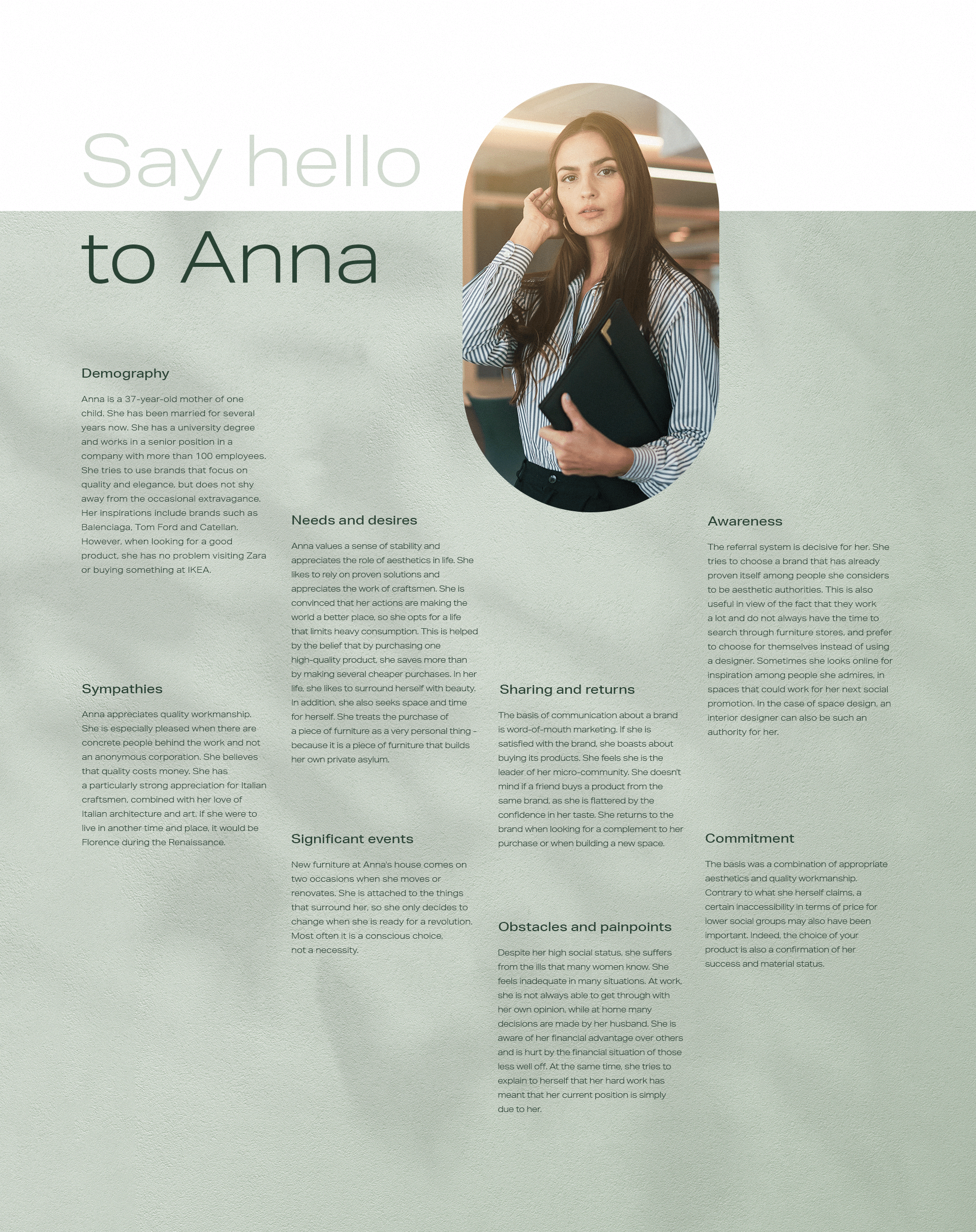
During a discovery we always conduct a series of activities where we try to step into the shoes of our client and its audience. In this case, we did this by conducting two workshops. One was to identify the target persona to whom we would be targeting the message. The second identified the key attributes of the brand.
To show the initial direction of the project to both ourselves and the client, we prepared a stylescape containing a set of inspirations consistent with our assumptions. It is a kind of moodboard with a broader application and deeper understanding.
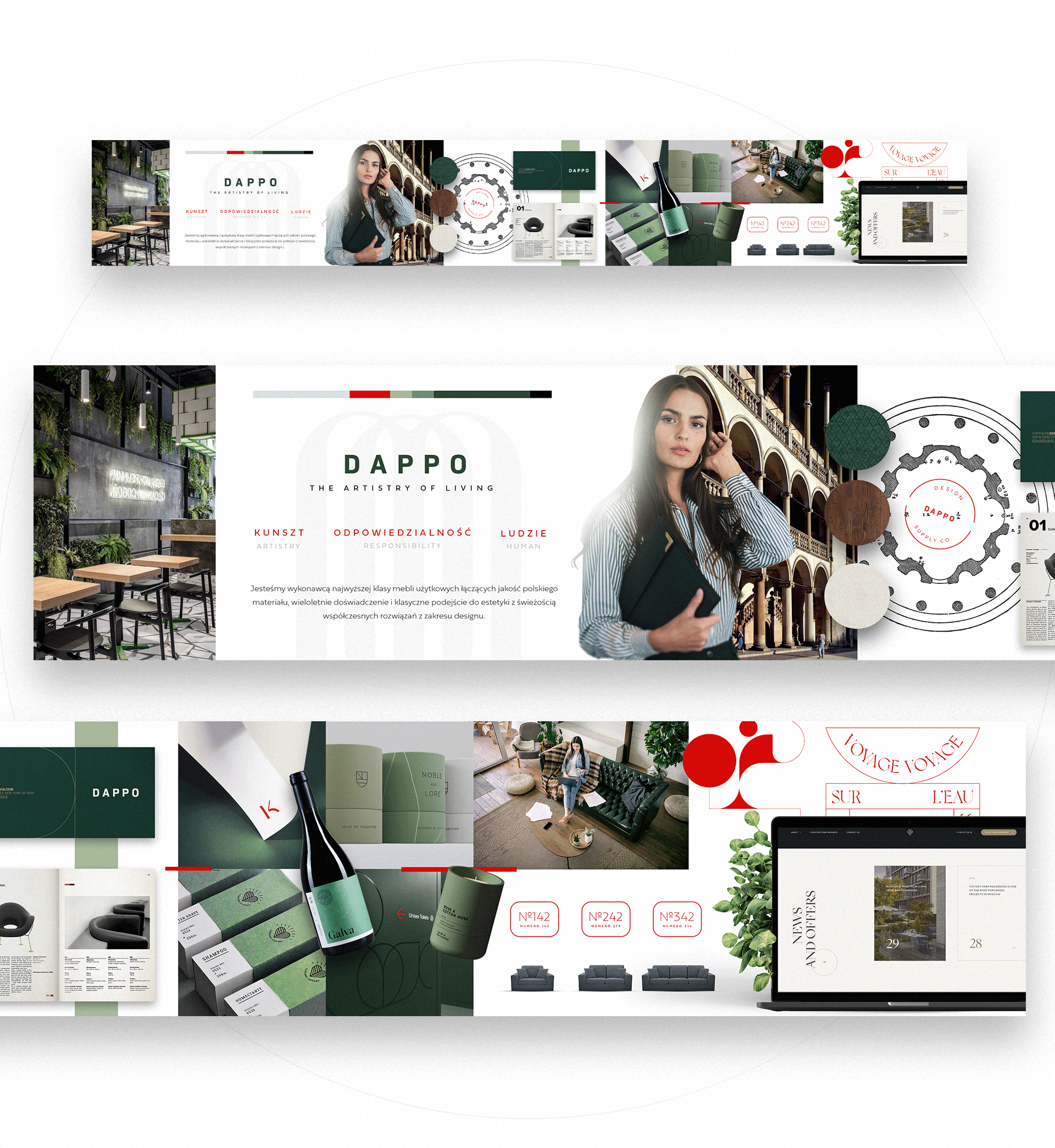
Most vibrant design inspirations:
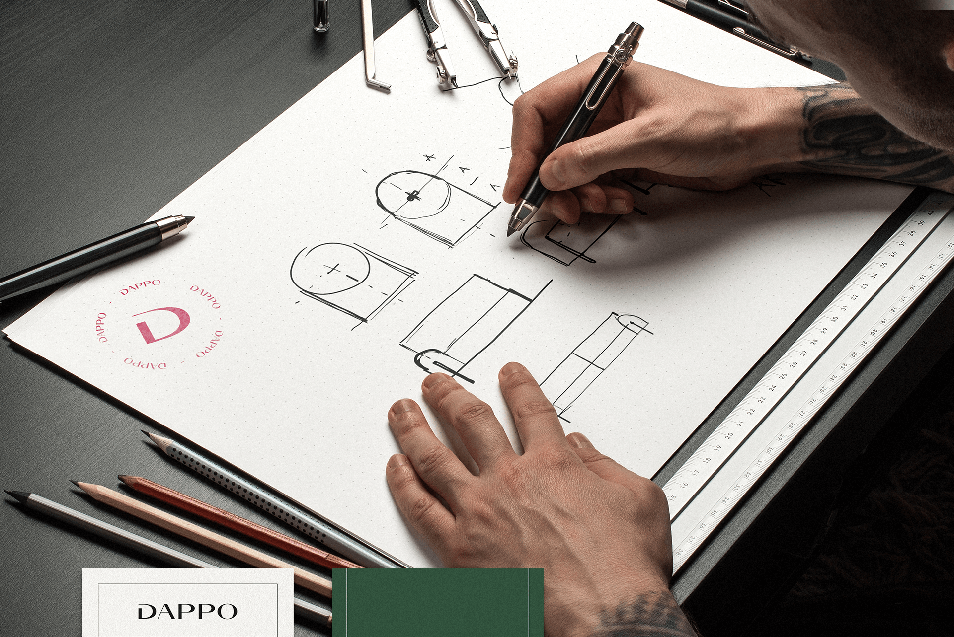
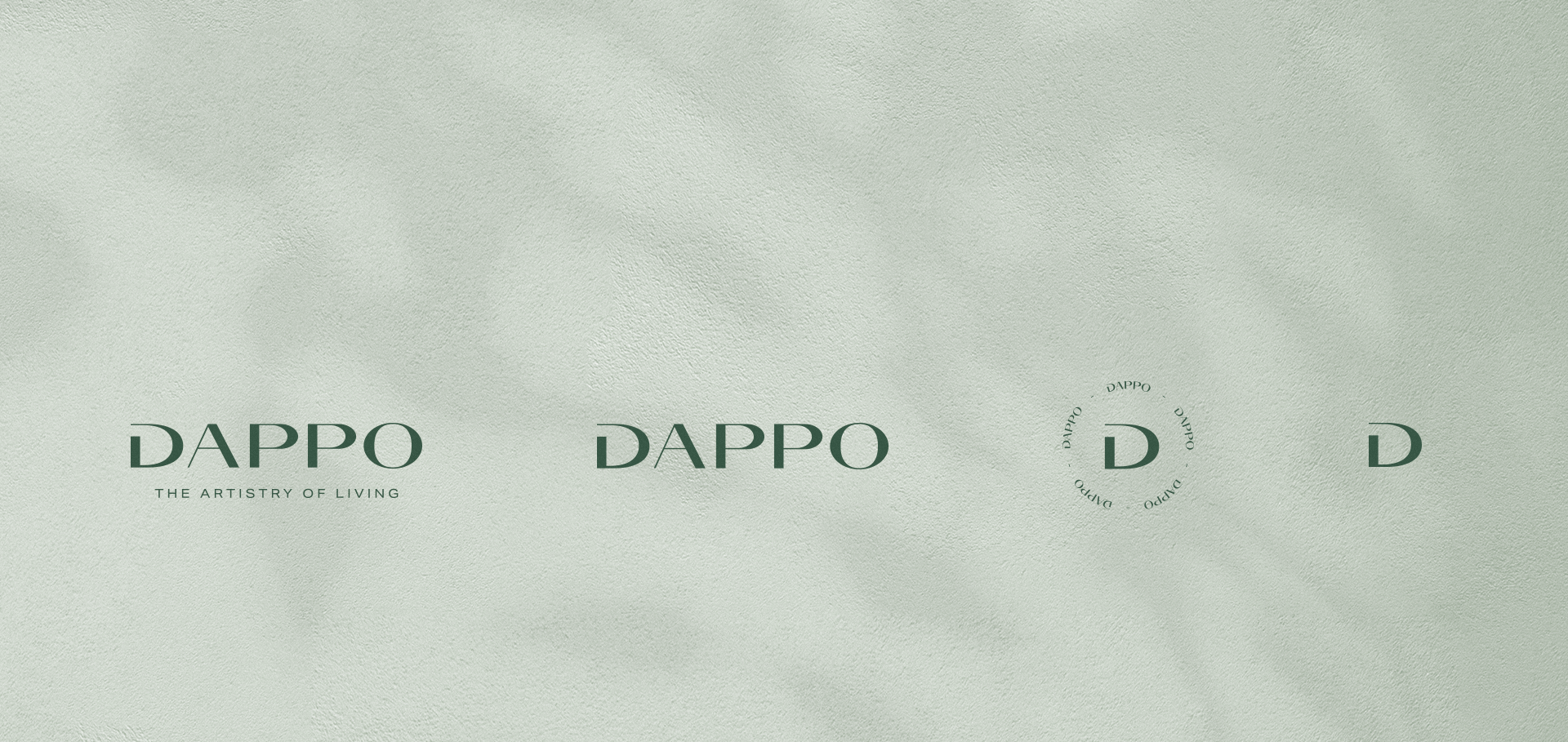
Logo – Typographic, possibly with a designed monogram for use in small sizes or e.g. stamps.
Typography – Sans serif, geometric, modern with classic overtones.
Renaissance – Humanism, advocated by the philosophers of the time, is linked to the idea of responsibility and the focus on people. Arcs and circles instead of sharp shapes in communication. In addition, the architecture blends in with the surroundings – hence the use of floral motifs.
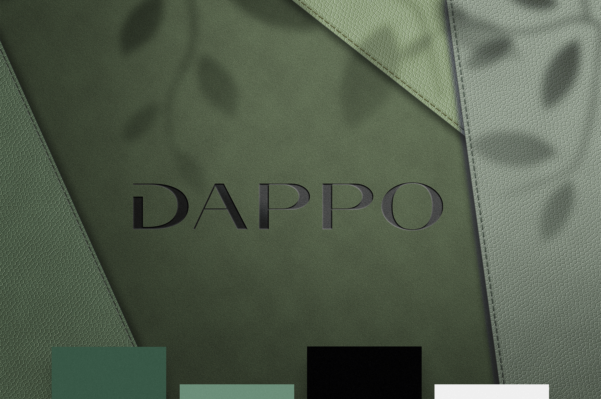
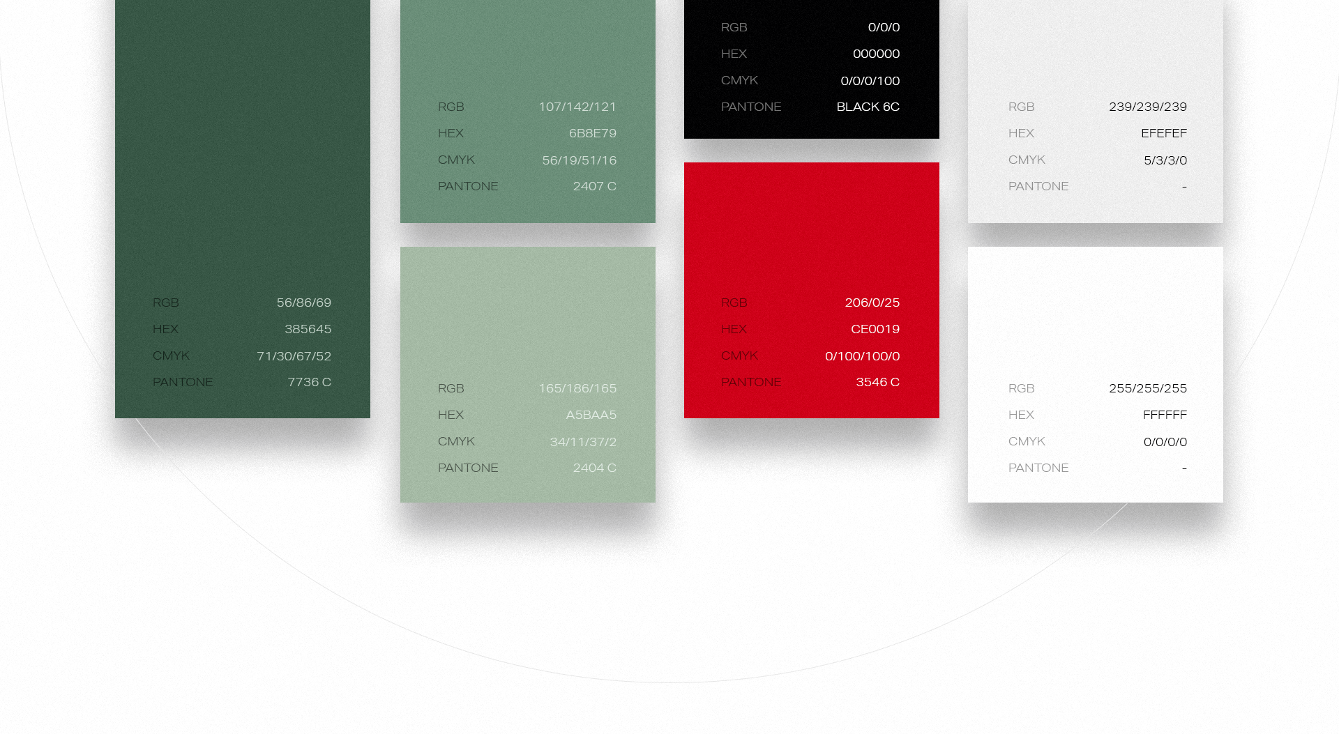
Colors – Based on elegance and the eco trend – tasteful green enhanced by strong red accents.
Textures – Impact on the senses through the use of fabric, wood and paper in communication.
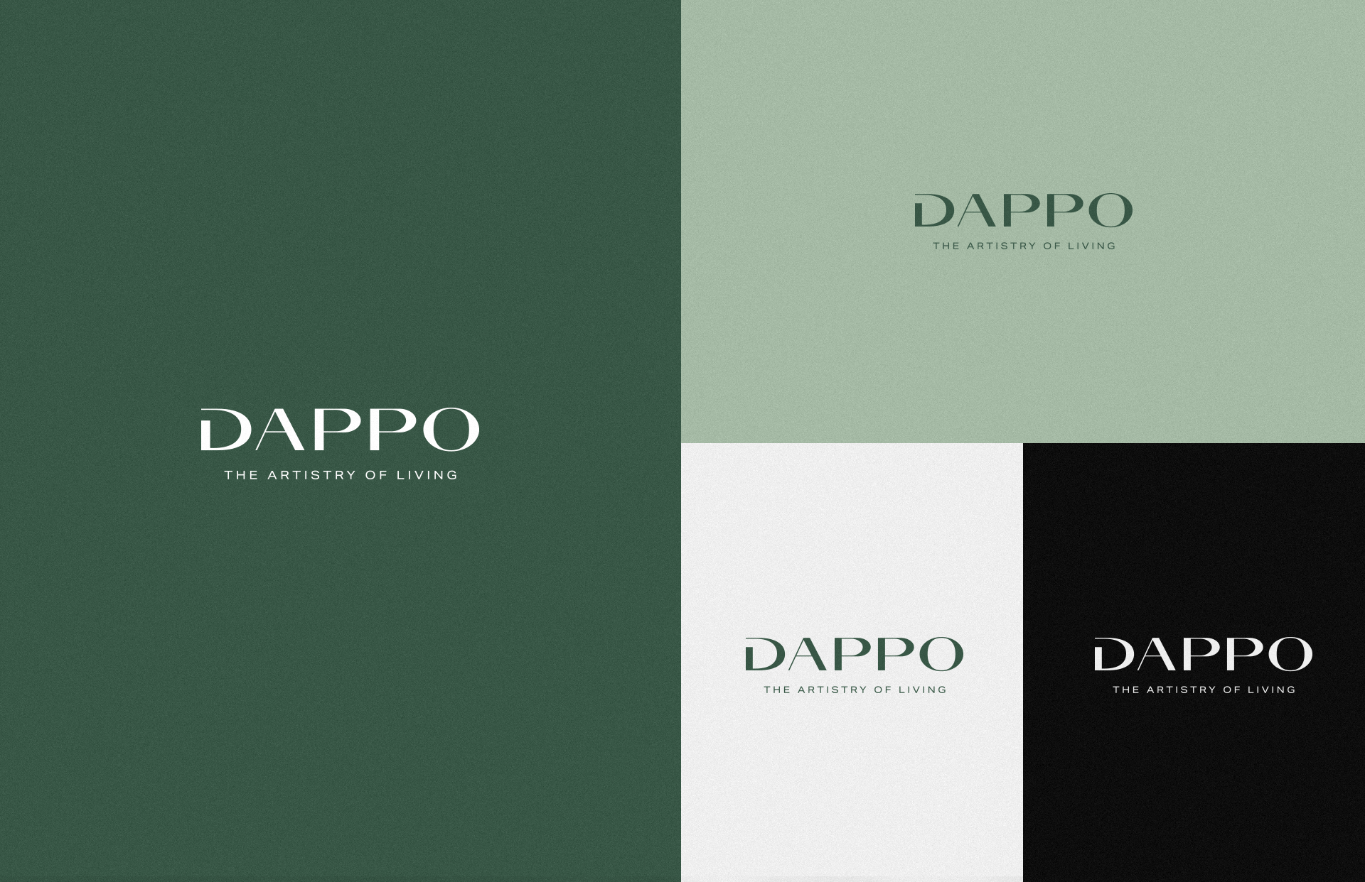
A reponsive approach was taken and thus ensuring the development of a complete logo family. This will ensure a wide spectrum of use of the mark, which is so desirable in the furniture industry. Additionaly, it was needed to develop a short but meaningful message that will act as a brand slogan. Complemented by brand values, it forms the basis of the entire brand’s DNA
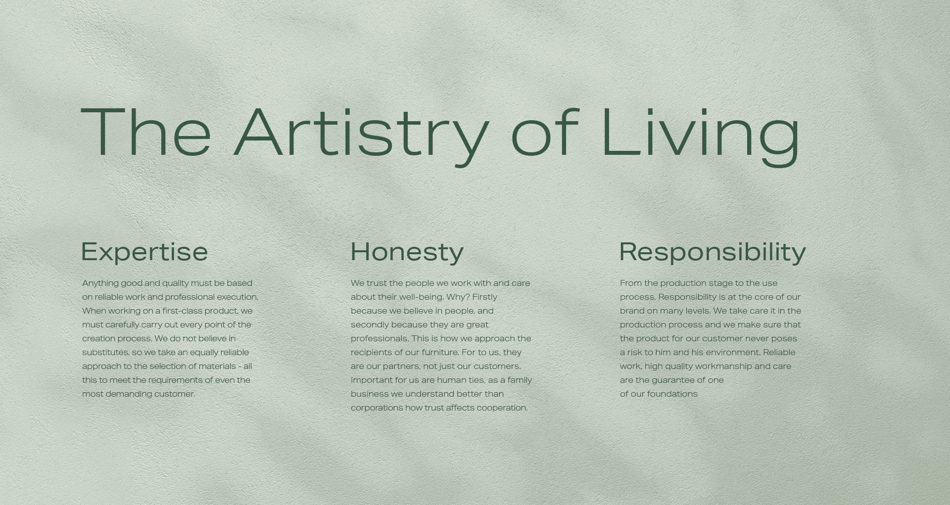

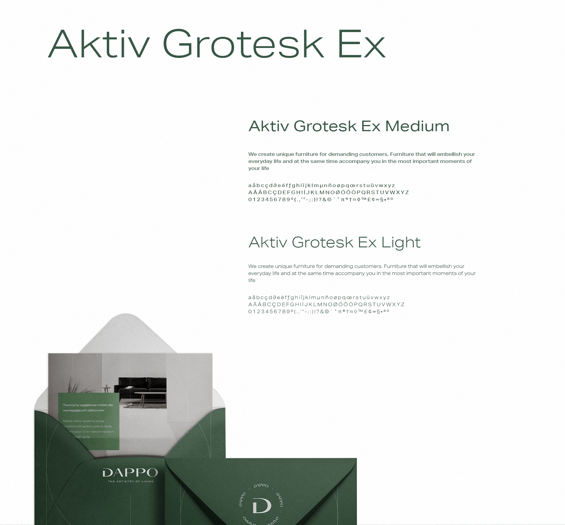
Aktiv Grotesk is a grotesque sans-serif typeface released through Dalton Maag in 2010. It has been described as a “Helvetica killer.” It takes an authoritative but neutral position, supporting any message without overpowering it. A flexible and diverse family of 24 styles with matching italics, from Hairline to Black. The designers of Aktiv Grotesk wanted to create something in between Helvetica and Univers by removing the quirks from Helvetica and adding a bit of warmth to Univers.
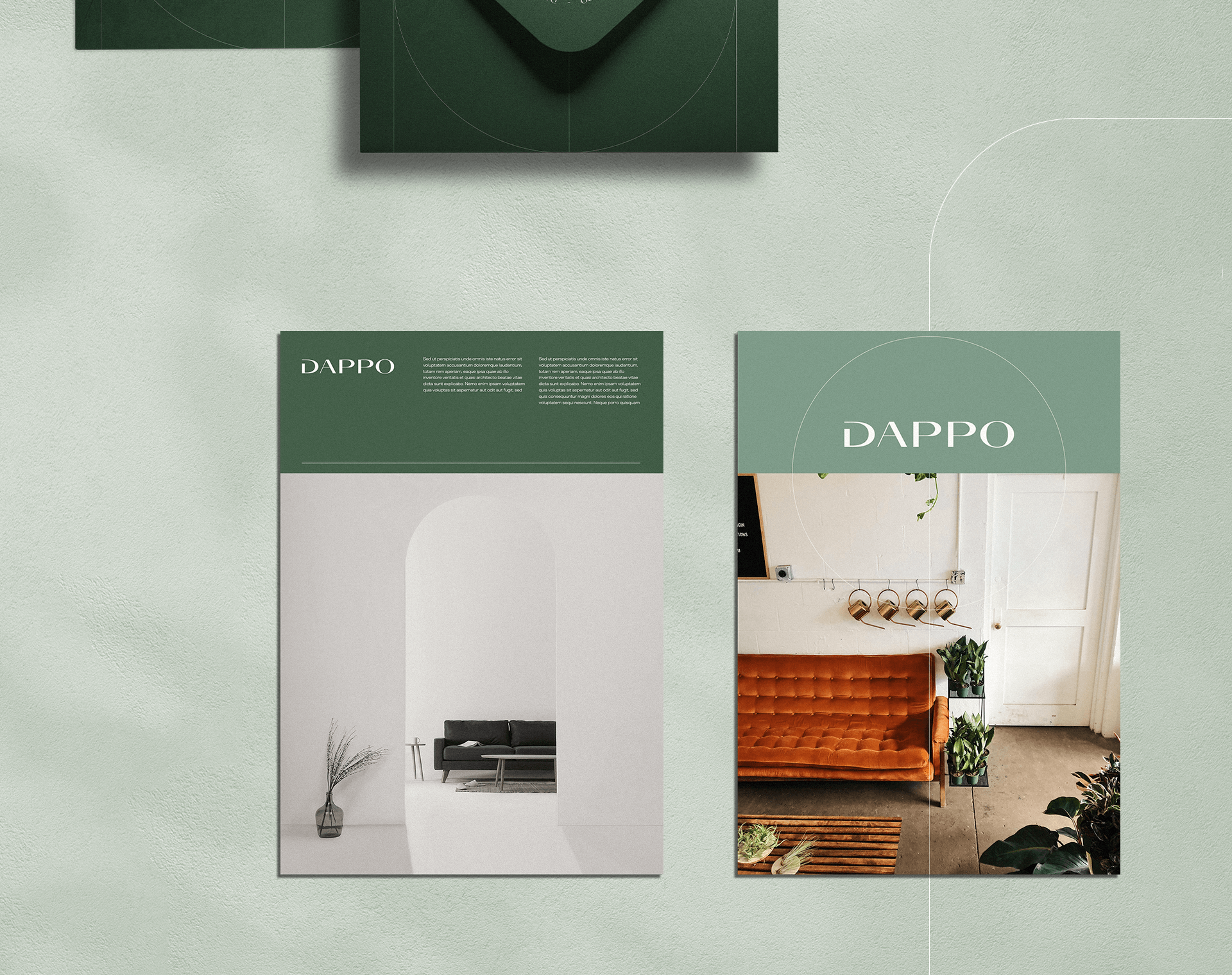
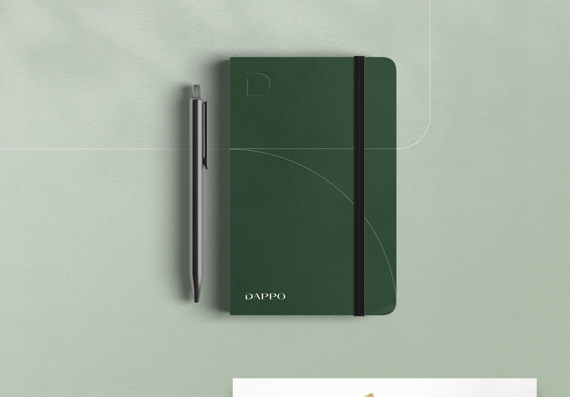
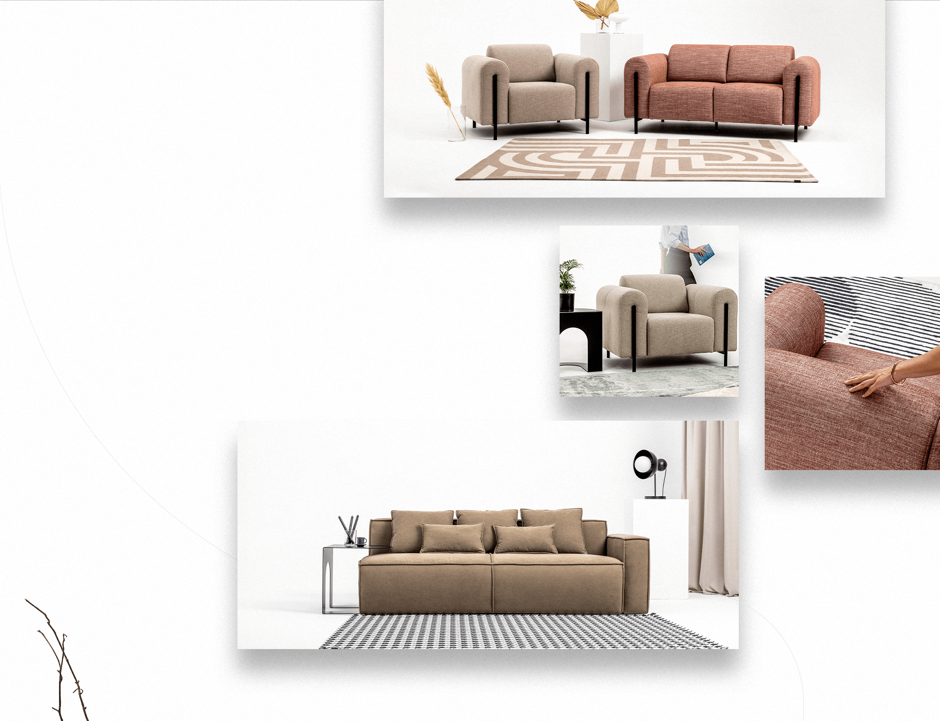
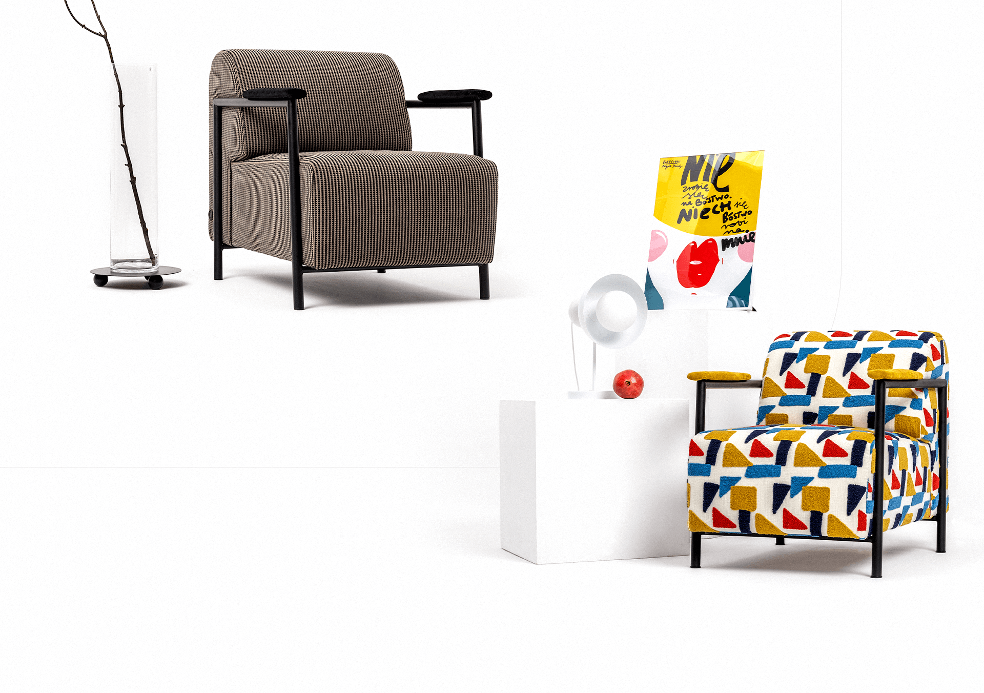
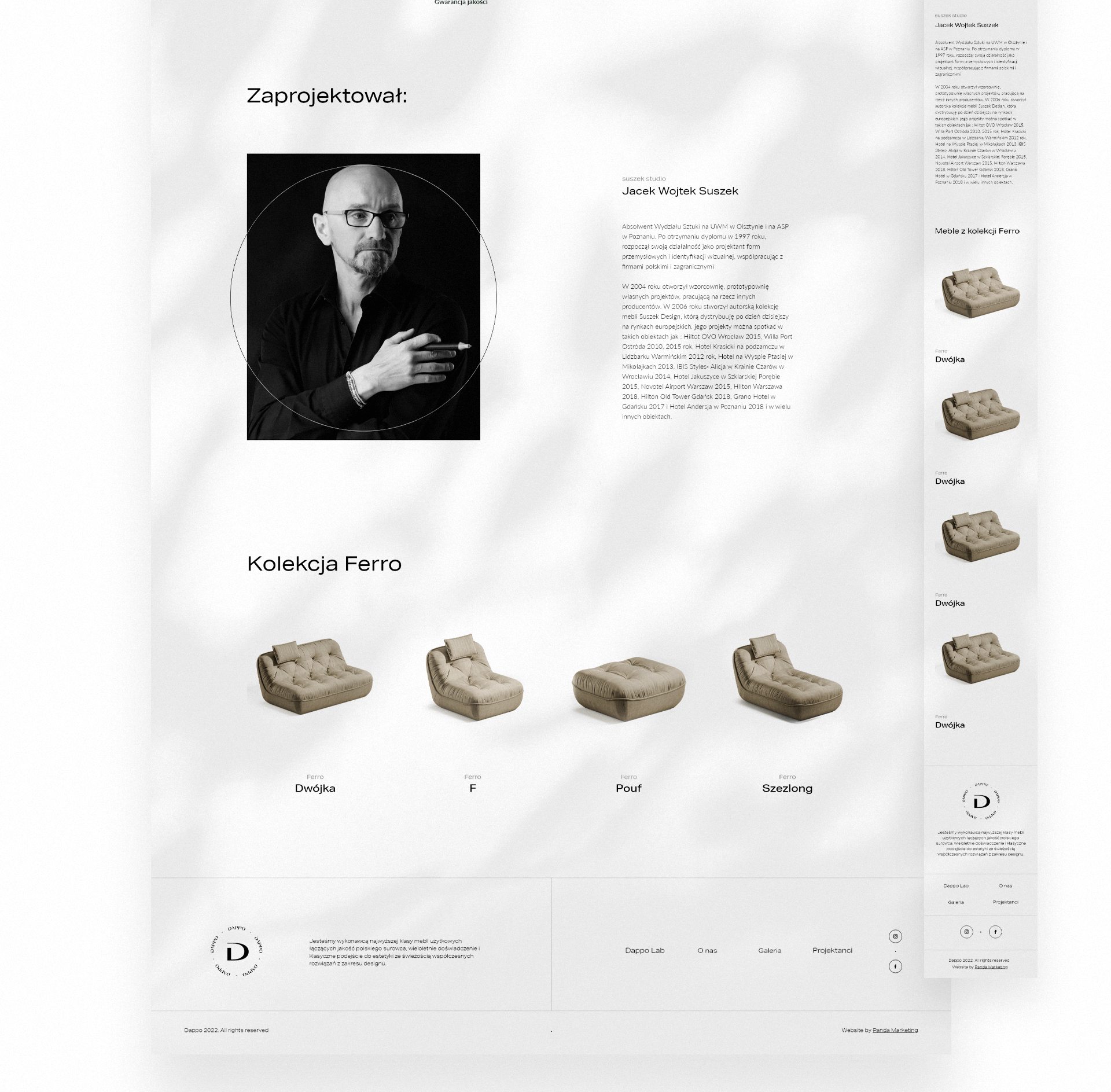
Furniture designs were developed by external designers based on the inspiration contained in the branding. Strong references to the Renaissance era were found in the form of furniture, the use of arches and colors. The ethics of the production process and the materials used have been selected to follow the brand’s philosophy.
