EFAD
Rebranding for the Voice of Dietitians
The subject of this study is the new visual and verbal concept of the EFAD organisation and its sub-branches. Work on the project began with the COVID-19 outbreak which forced us to take a completely different approach. In the end, as a result of work lasting nearly 6 months, we were able to develop a recipe for strengthening both the main brand and complementary brands. Thanks to this, EFAD is no longer limited by its branding.
WHAT WAS THE SCOPE AND CHALLANGES?
It didn’t take long for us to understand that the client needed more than a logo change – to develop a coherent visual and verbal communication strategy. The organization’s tremendous history and tradition demanded respect for the existing mark it operated with, so the rebranding had to take into account visual elements to which there was a strong attachment within the organization Additionally, EFAD is a distributed organization with representatives in all European countries. The entire team working with us on the branding was also dispersed, hence the work had to be done completely remotely.
HOW WE DID IT?
We divided the work into 4 main stages. We decided to start with the formation of verbal messages to organize the content generated by specialists from different countries. We wanted each member of the organization to know how they could present their workplace. Next, we attempted to renew the already aged logo. At the same time, we began the search for a key visual that would provide the foundation for the entire visual layer. Ultimately, we developed a way to translate the concepts created into the other components of the ecosystem.
To understand our client we used the platform miro.com . We conducted two series of workshops with two different research groups. They included a total of 14 people with various roles in the EFAD organization – from representatives of different departments to the organization’s president himself.
As a result, we received invaluable input for further work done by our specialists. We have understood what our client cares about, who the persona is, and we have been able to start working on the verbal layer.


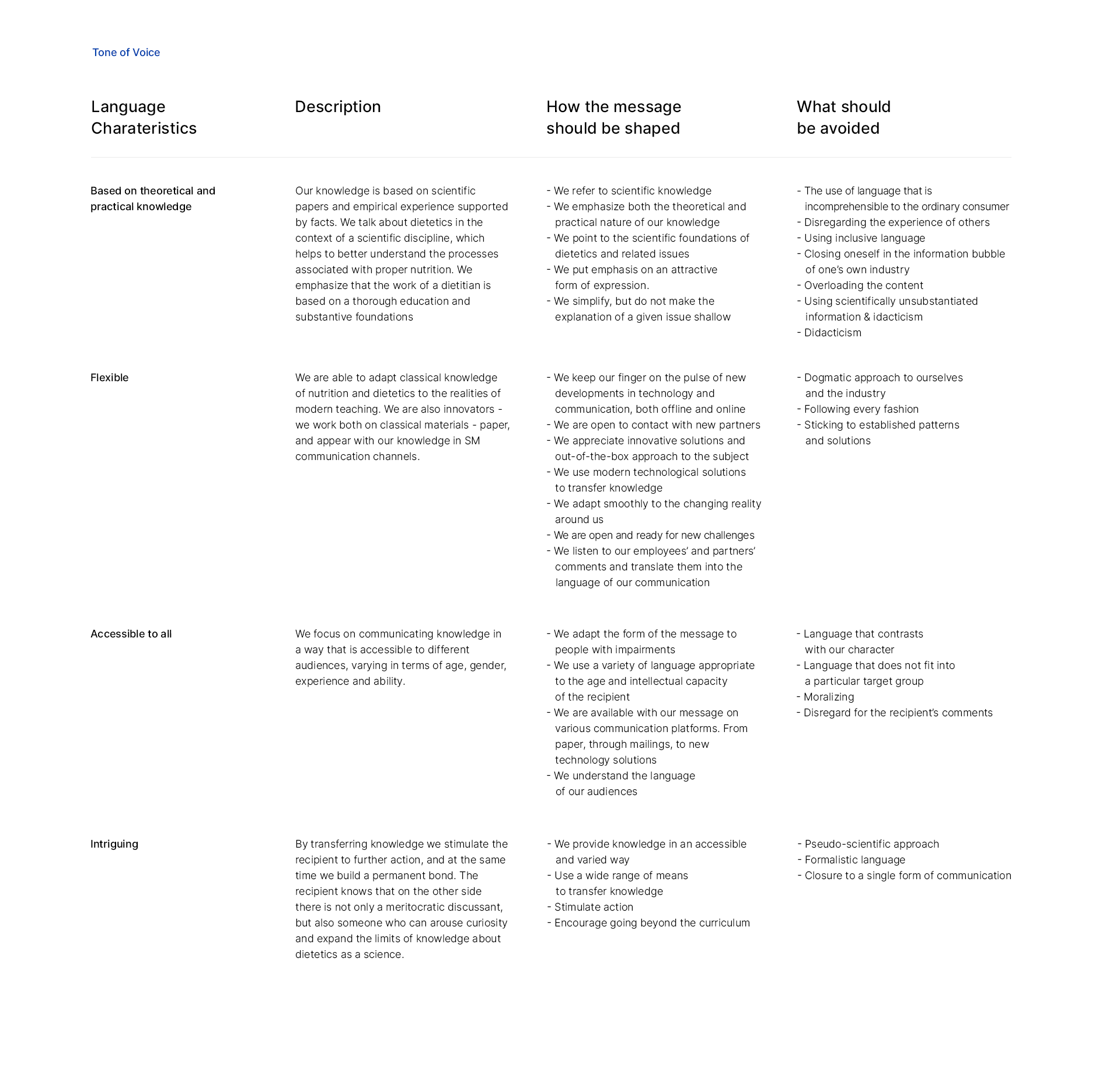
The main task of creating a verbal layer is to outline the language that EFAD should use to communicate with its target group. The solutions developed thanks to the workshops should in the future be the determinant of the brand message and complement the visual message.
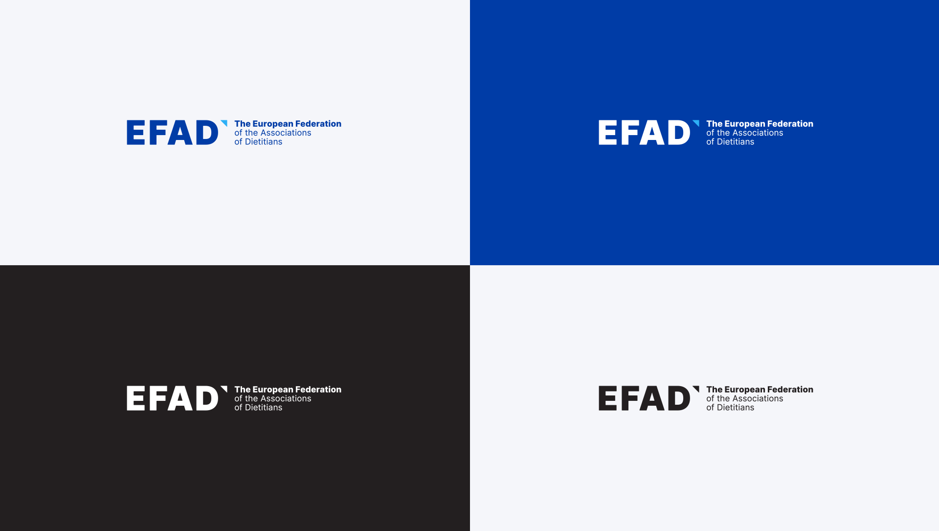
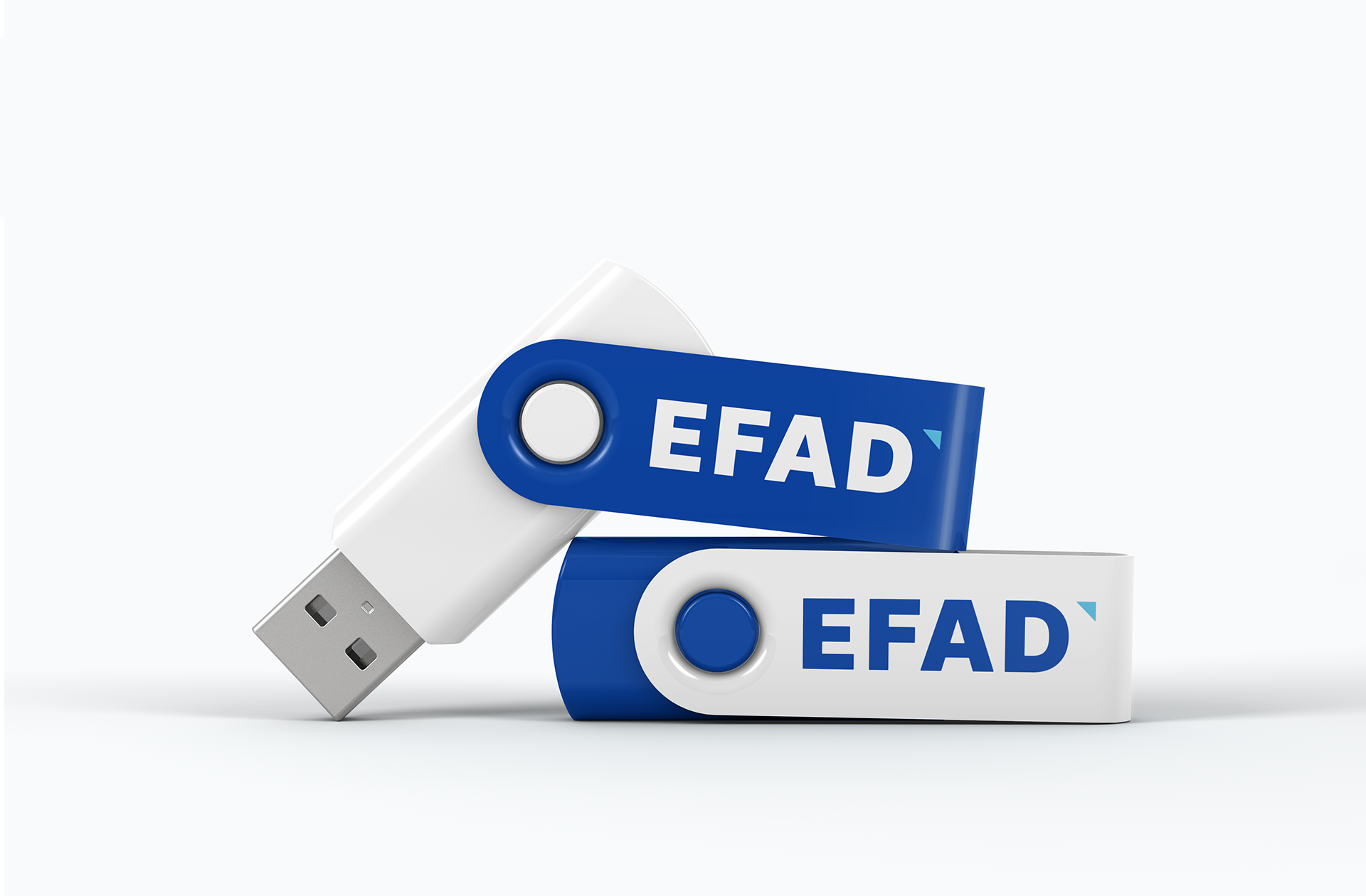
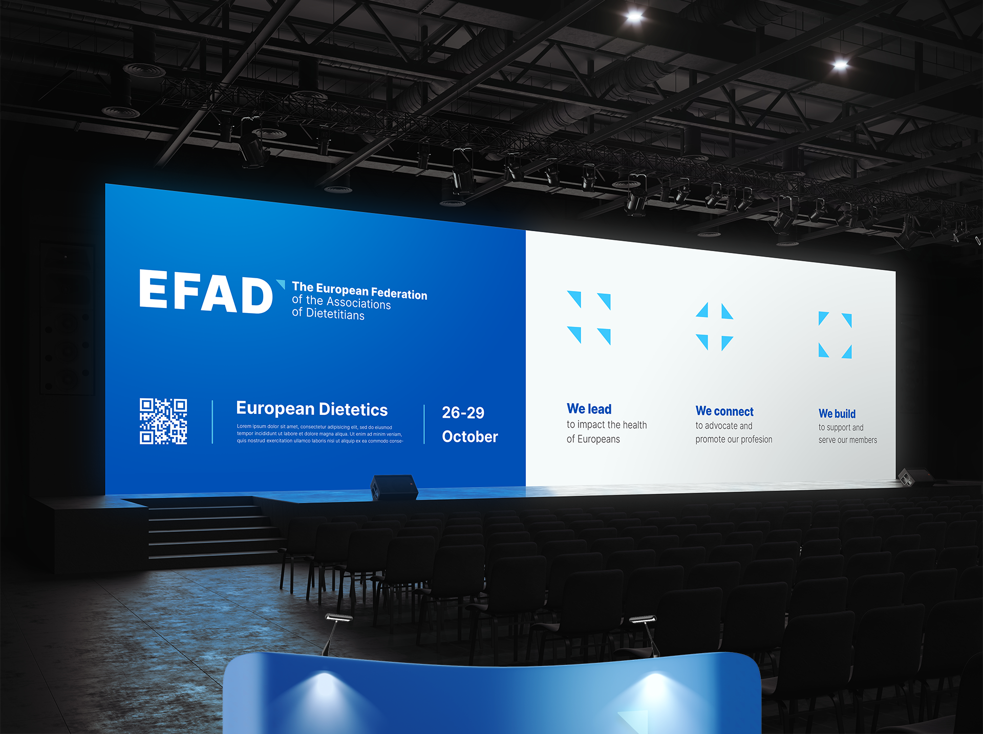
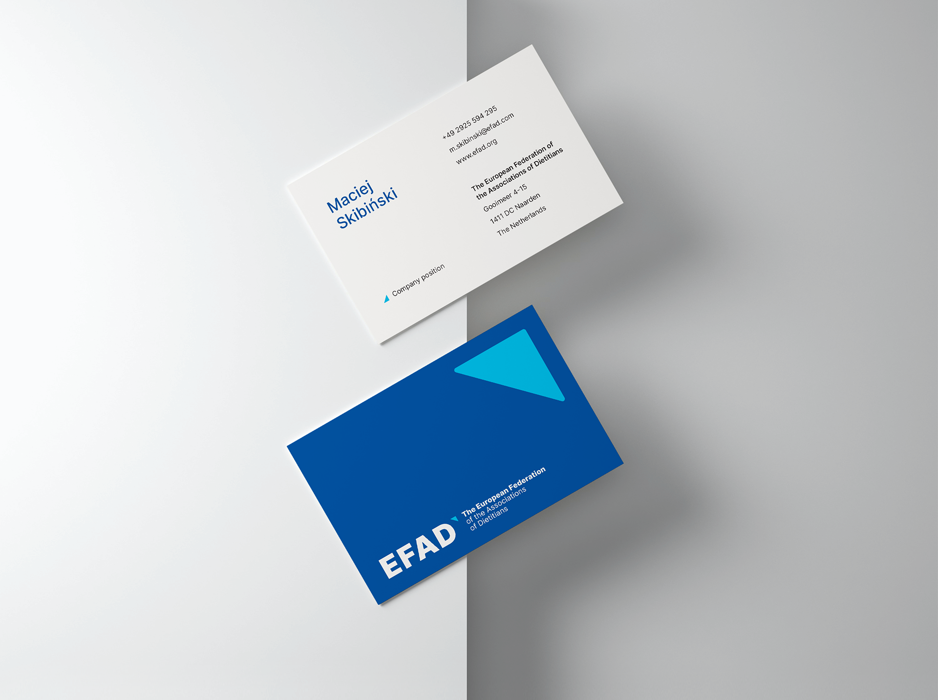
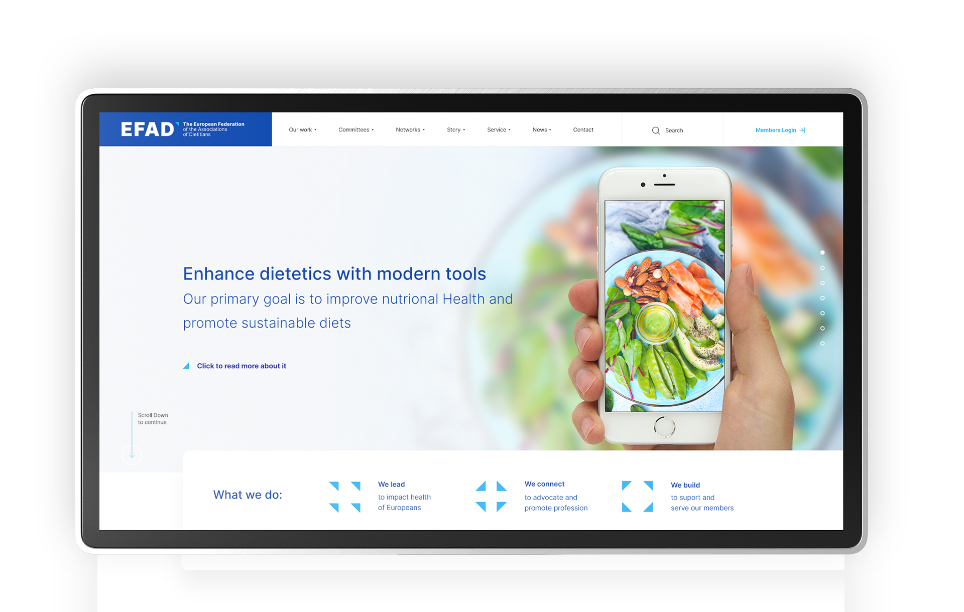
During the development of the new EFAD logo, the focus was on evolution, acknowledging the previous logotype as a base field for change. The aim was to keep the classic character of the logo, while emphasising the power of the brand by strengthening the typography. A triangle was used as the key visual for the visual identity.
Thanks to the new layout of the logo, the whole has gained in legibility and has become more universal, which in the future will be helpful in building more or less standard materials.
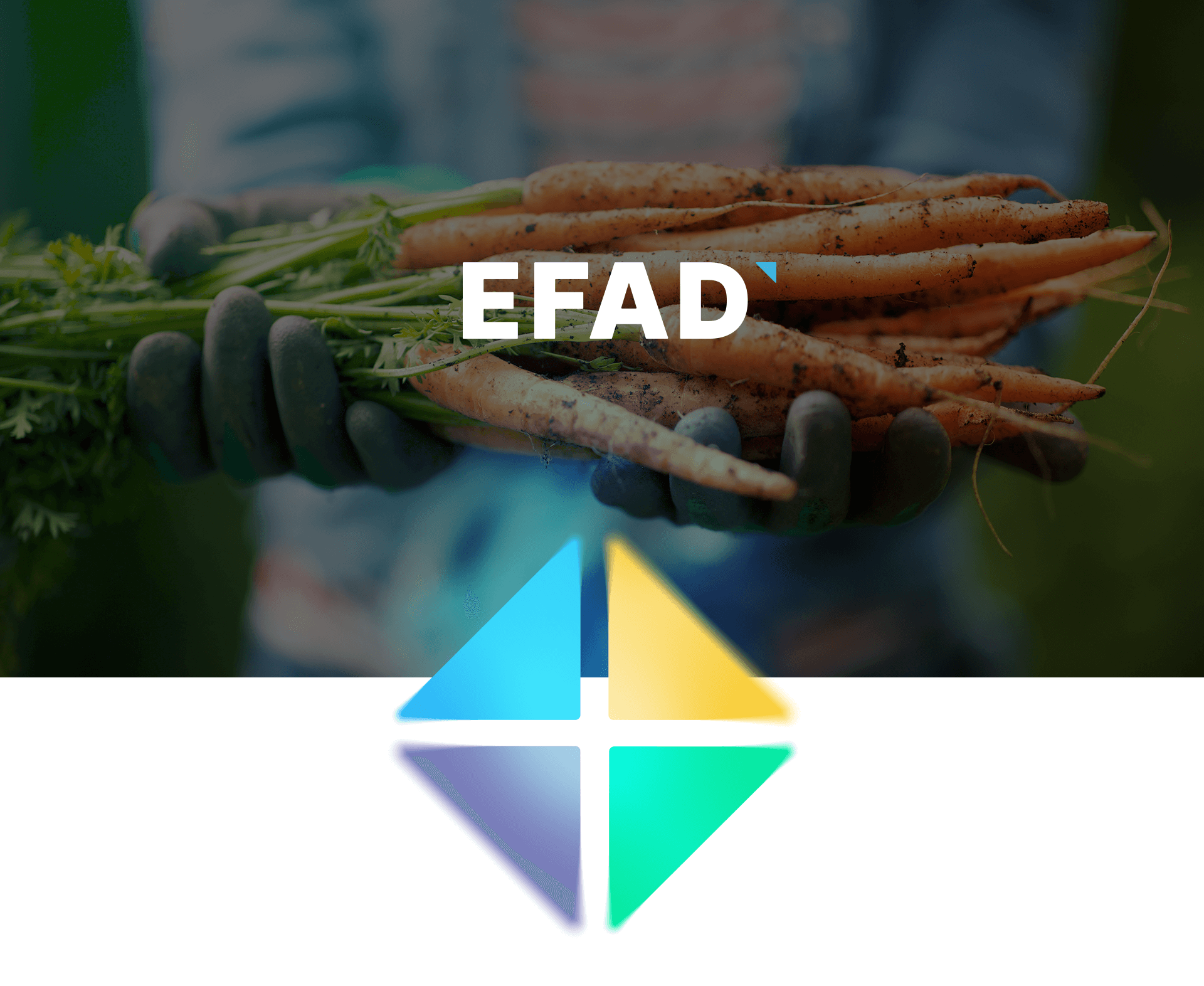
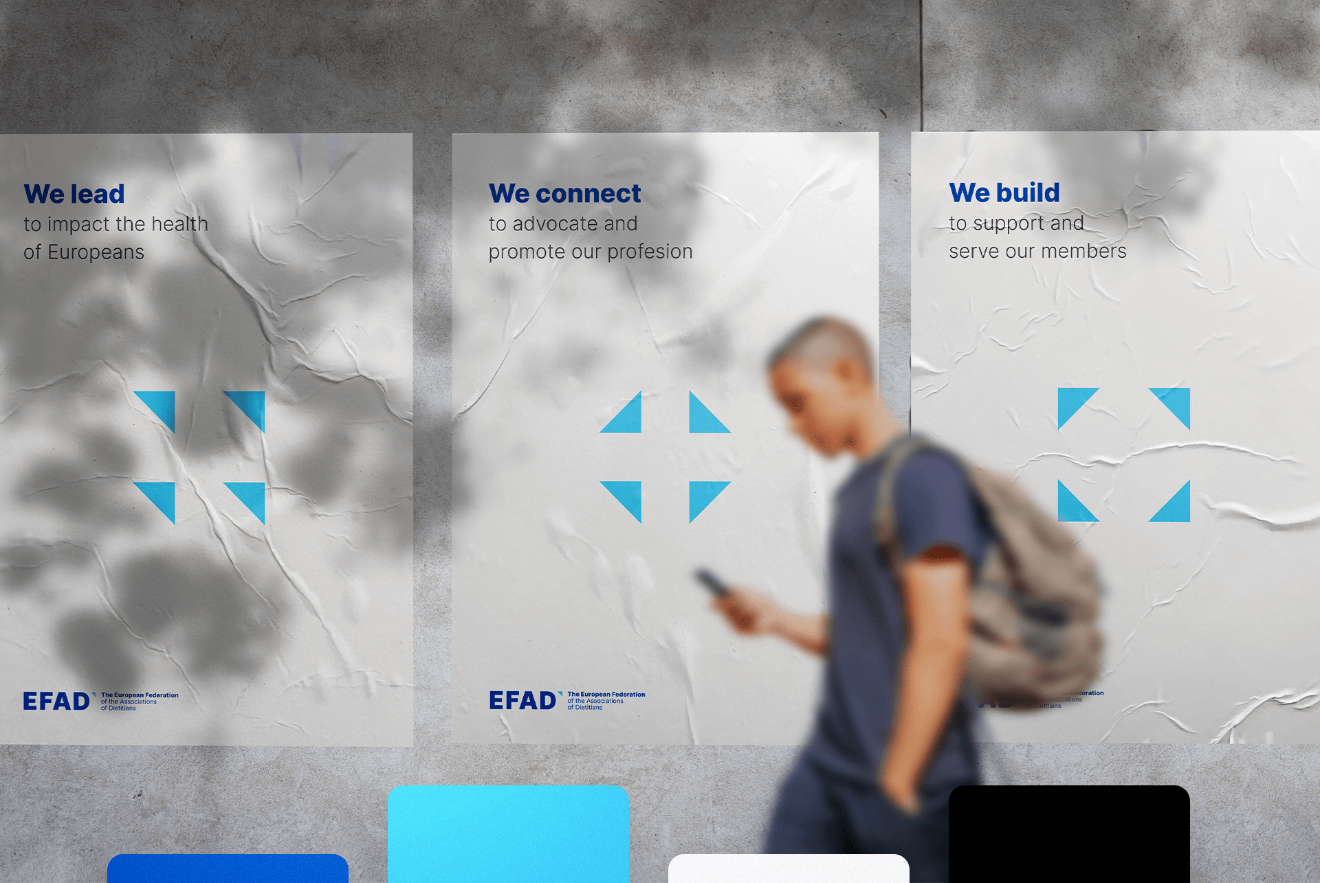
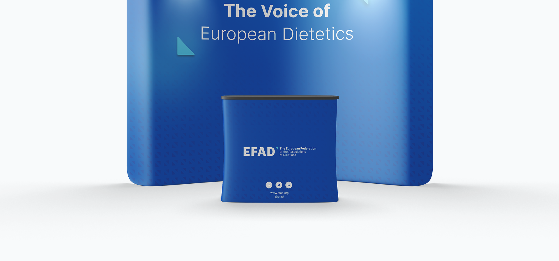
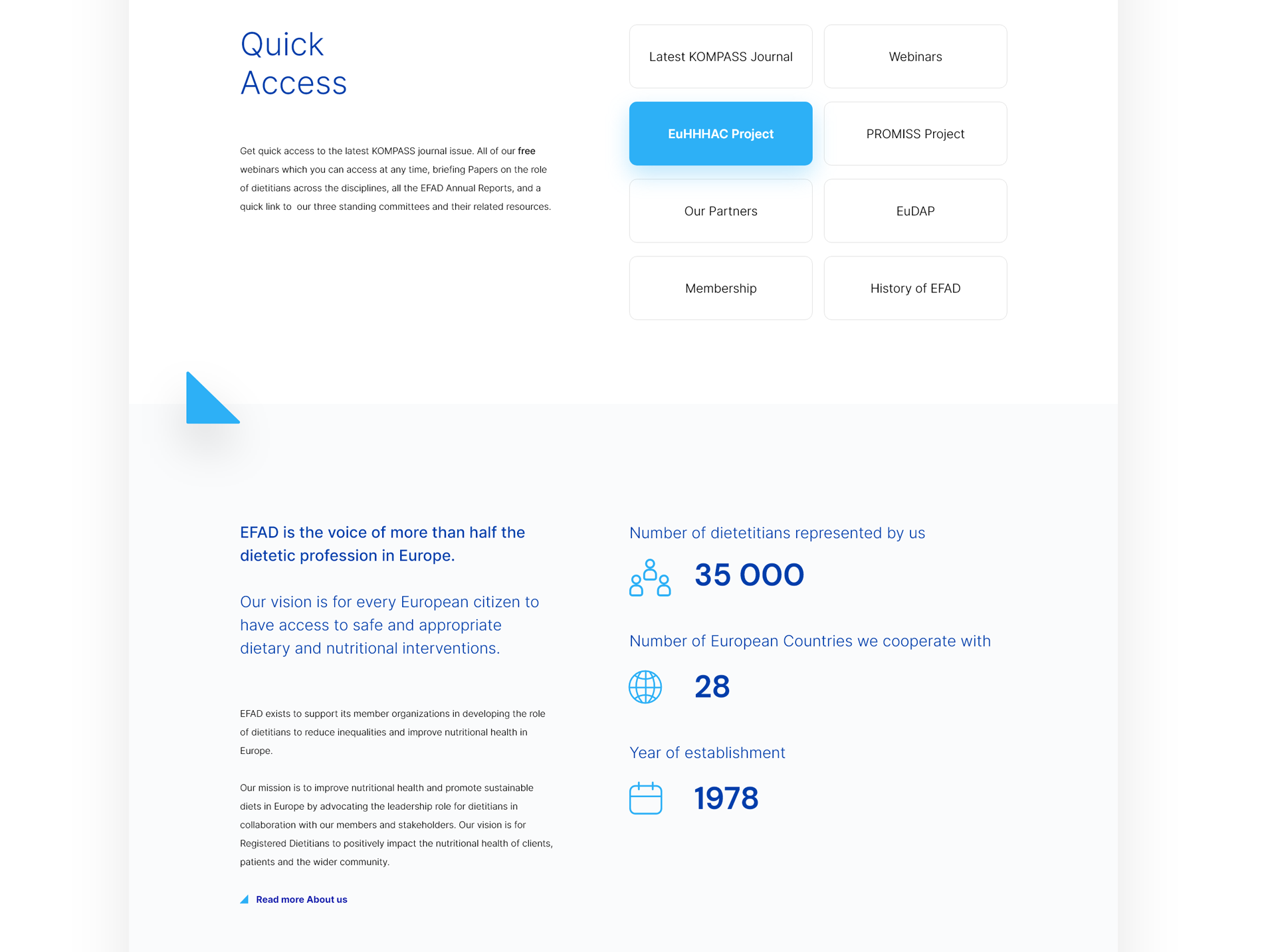
The main key visual of the brand’s visual identity is a triangle. It is a strong reference to the nutritional pyramid, which is close to the profession of a dietician. Its structure perfectly reflects the scientific and formal nature of the organisation. Graphically, it also introduces definitely more possibilities in the materials.
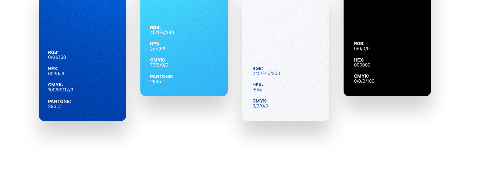
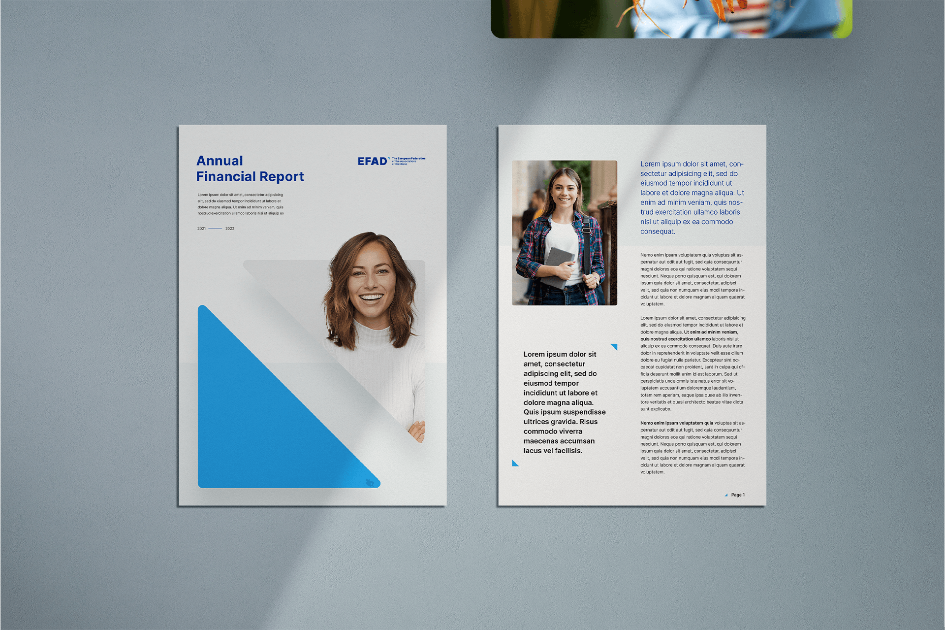
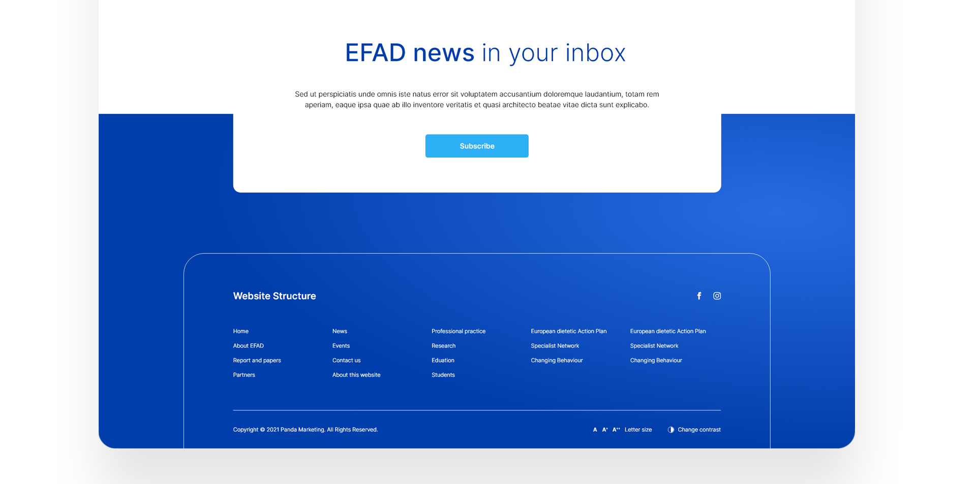
The visual layer should be an extension of the logo and Key Visual. Without it, the developed assumptions will not be able to exist in real life. It is important to remember to be consistent in terms of the graphics, colours or fonts used.
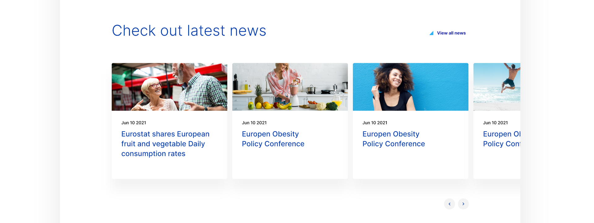
Above all, photography should be authentic. It should represent everything related to healthy eating habits. Despite the large number of specialists in the company and scientific activities, we did not want the image to be associated with scientists in white coats.


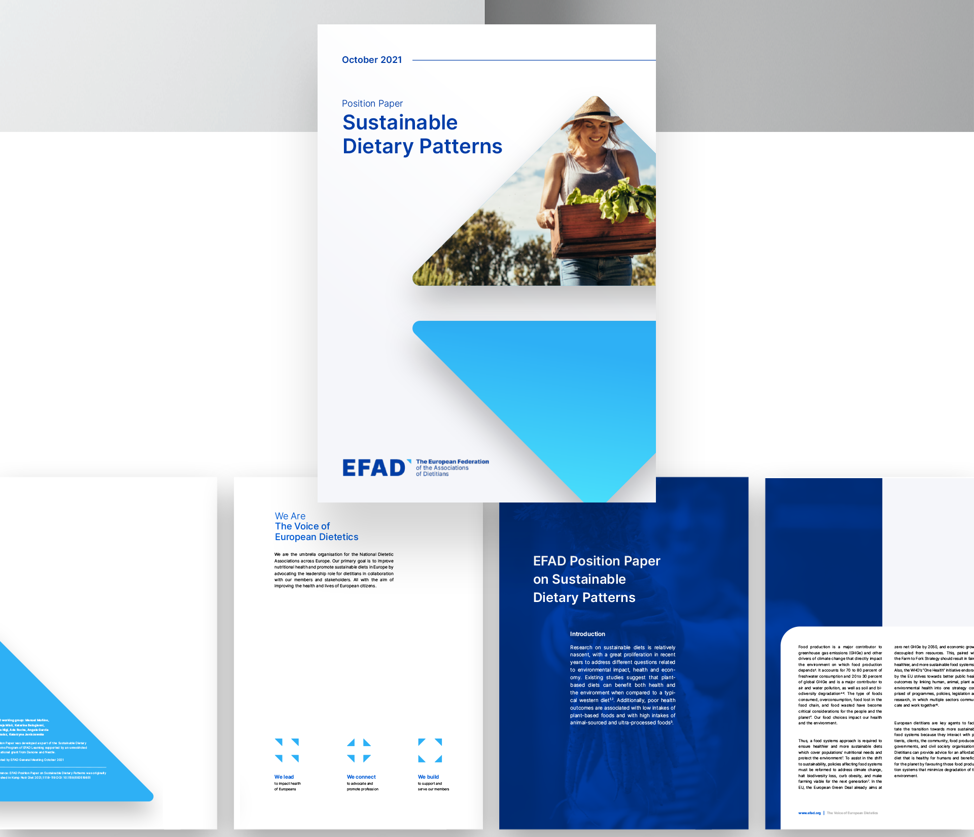


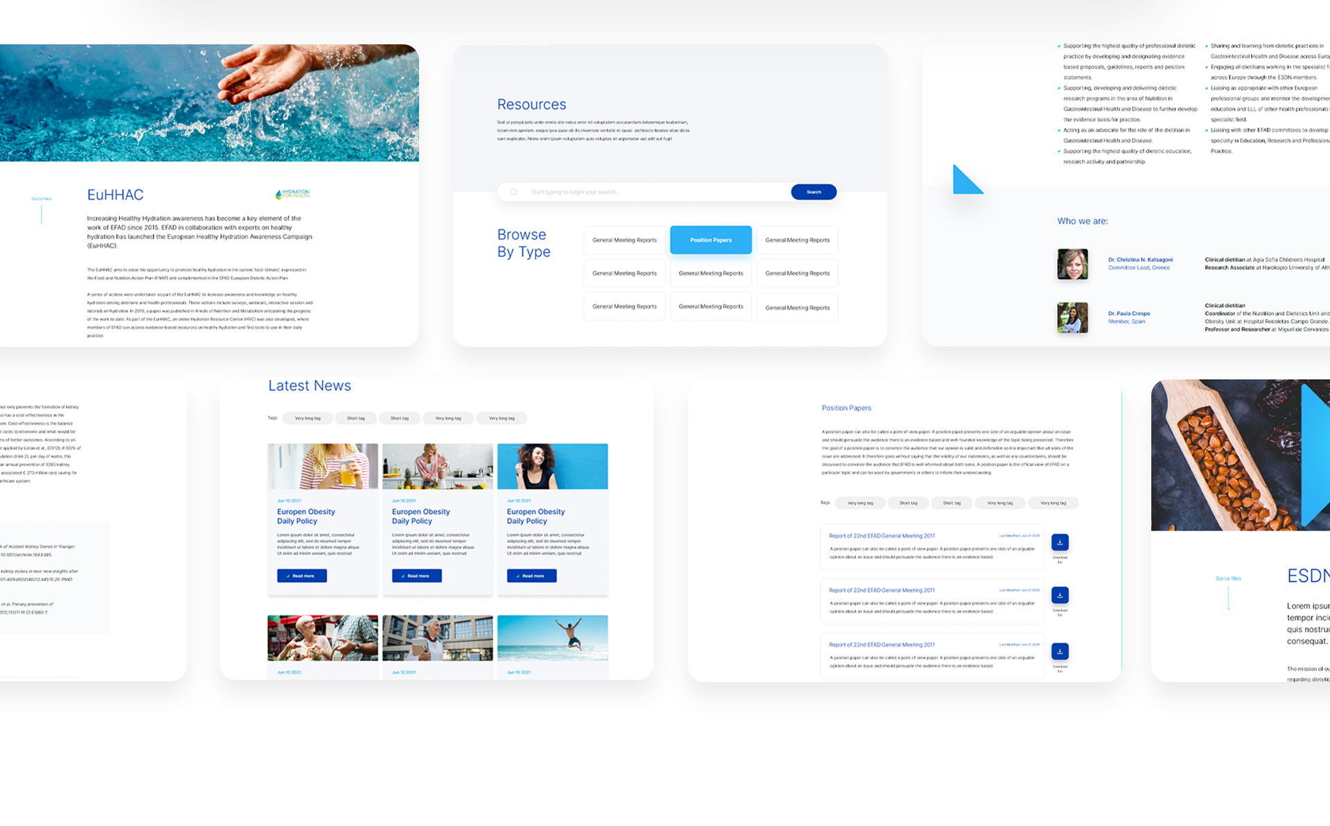
The main objective of the newly created visual identity was to indicate the common identity of the various sub-brands belonging to EFAD. Thanks to this procedure, full coherence was achieved between the entities built by EFAD. For this purpose, the key visual of the main brand was used, emphasising the diversity in an appropriate play of colours.
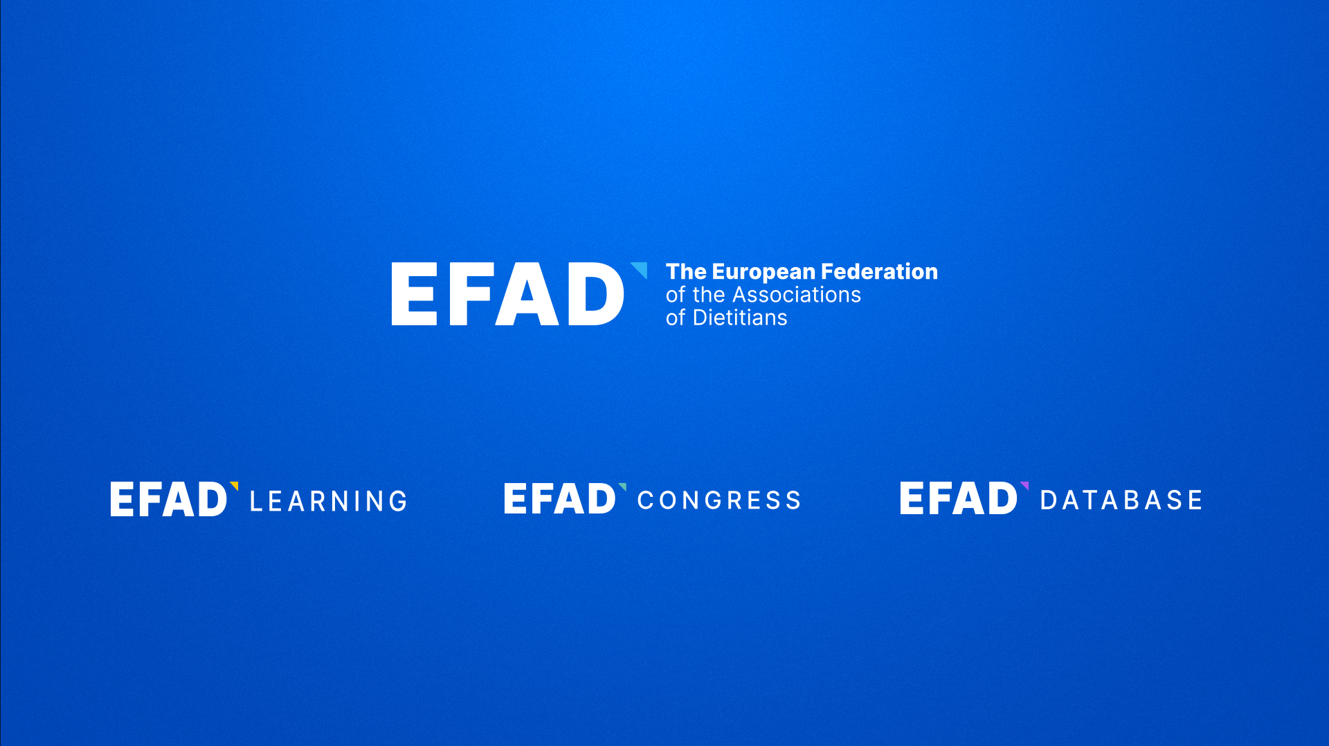
To ensure consistency between the main brand and other sub-brands, we developed a set of connecting elements and distinctions between them. They form the basis for the effective development of subsequent sub-brands in the future.

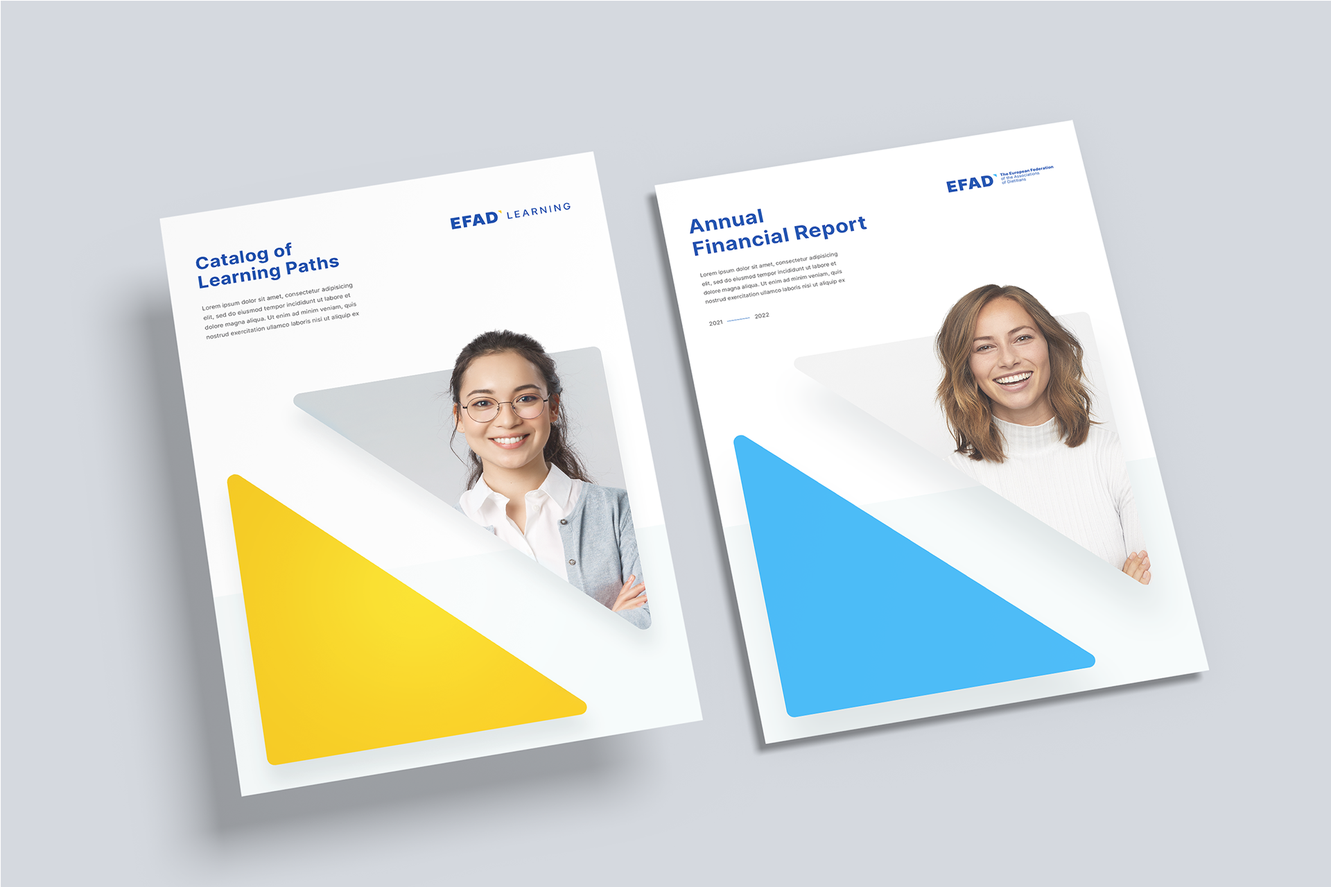
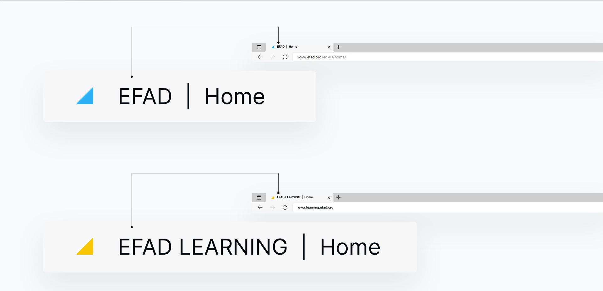
A typical example of the differences introduced between the main logo and the identifying sub-brands is the EFAD Learning logo. It correlates with the main logo thanks to the key visual , while the change of color distinguishes it from the main theme.