Twoje Bezpieczne Finanse
Finance in a safe and minimalistic edition

Since 2008, Twoje Bezpieczne Finanse ("Your Safe Finances") has been operating in the financial and real estate industry. The company specializes in providing financial solutions for seniors. TBF prioritizes the relationships with its customers focusing on key values, such as trust, empathy and honesty.
OUR TASK
Twoje Bezpieczne Finanse contacted us with a request for support in forming a logo. At that point we began our journey together. With every new element that we created, which was enthusiastically approved by our customer, there appeared a need for branding care, the creation of a unified visual concept, the organization of advertising activity and a drive to stand out on the local market
At the turn of 2019 and 2020, following the request of our company, Panda Marketing created the Twoje Bezpieczne Finanse brand, together with the design of the website, marketing materials and the visualization of the office. The people we had the pleasure of cooperating with had a lot of experience and knowledge pertaining to brand creation, which lead to the great results of the work. It is worth to highlight the willingness of the representatives of the company to listen to suggestions, as well as the care for the timely delivery of the necessary materials. To conclude, we would like to distinguish and recommend Panda Marketing to you as a solid and experienced provider of marketing services.
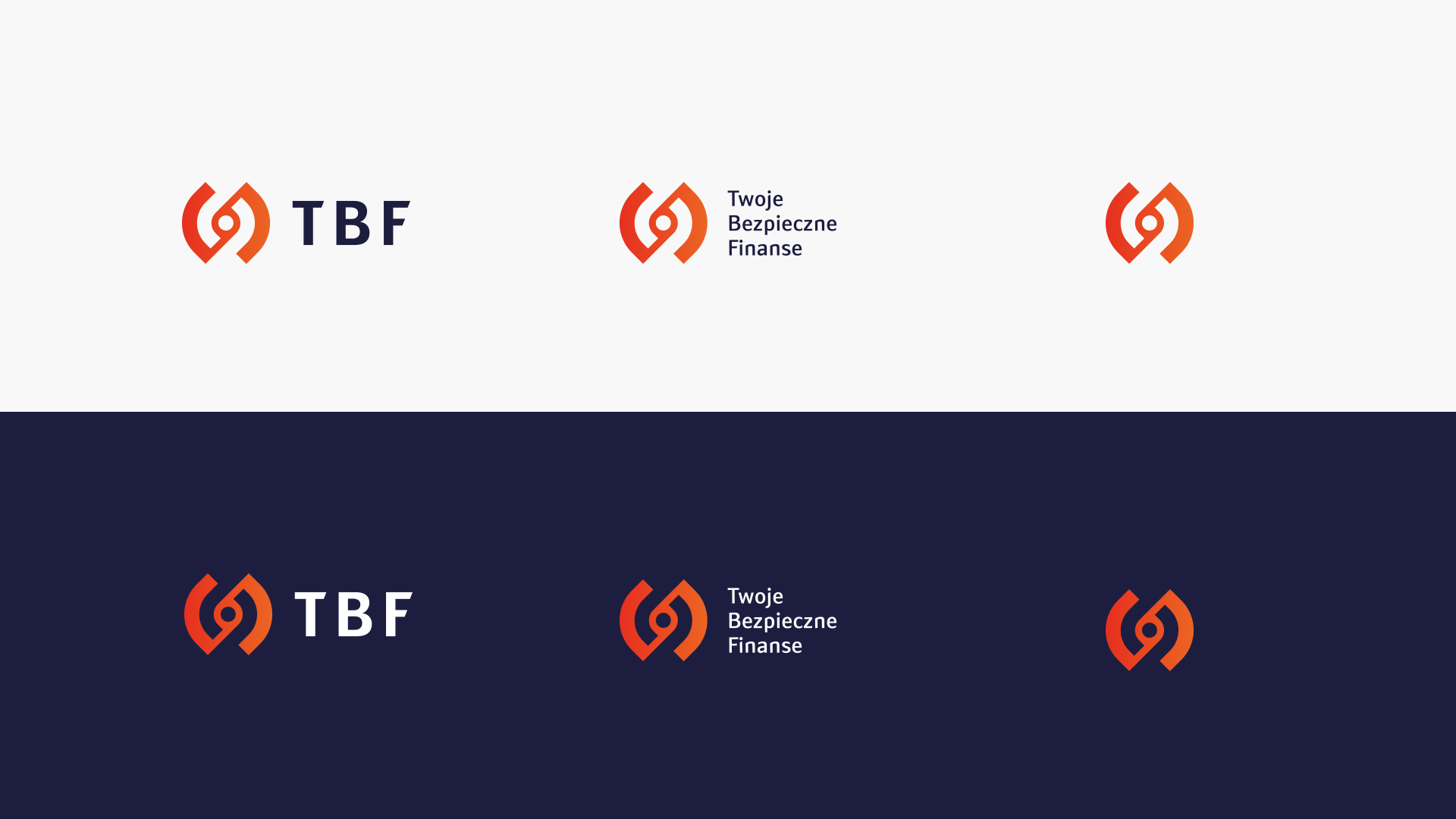
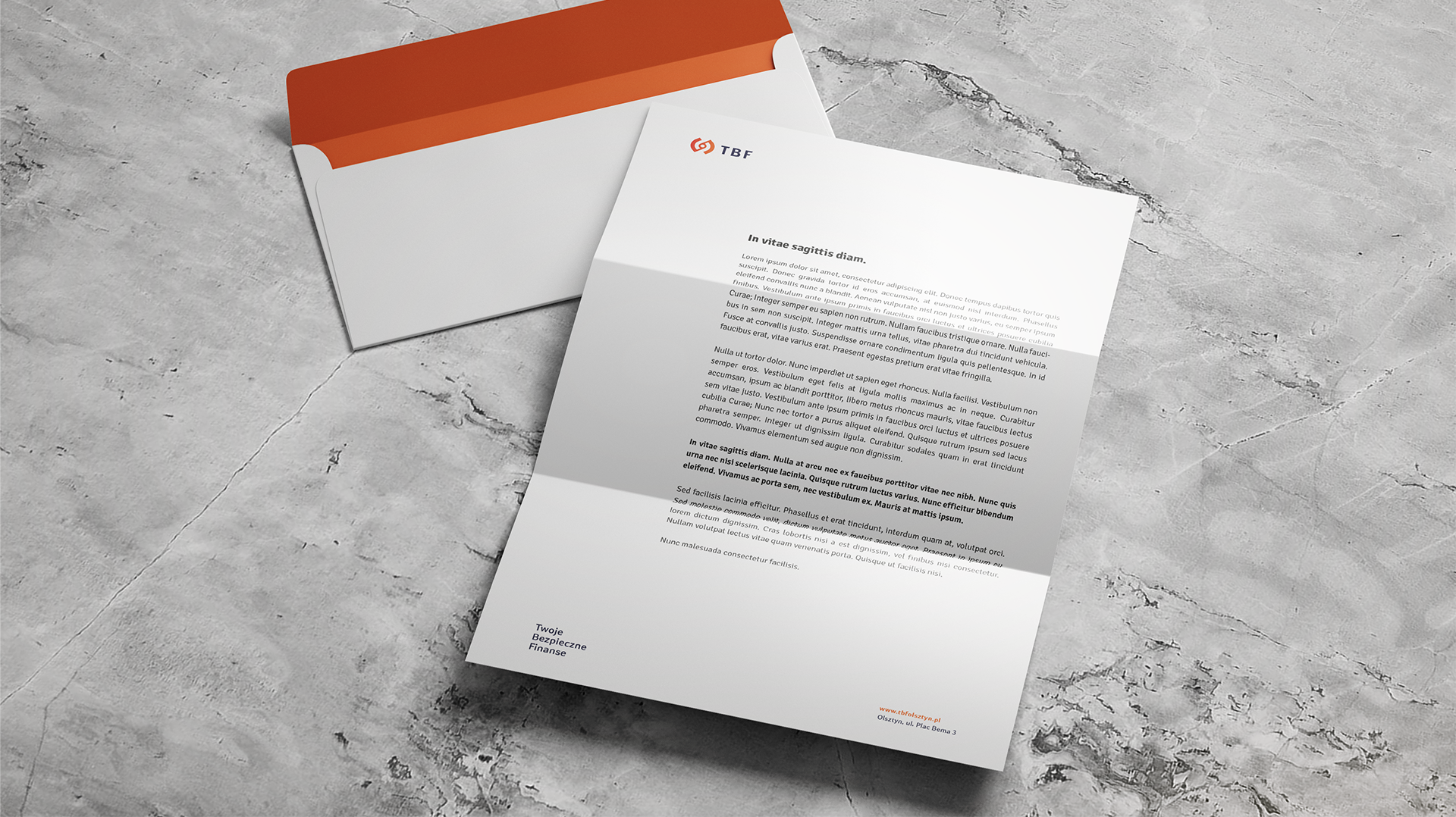
TBF is the acronym for full company name – Twoje Bezpieczne Finanse. There was a necessity to create both a simplified as well as an expanded version in order to increase customer awareness in relation to an entirely new brand. The signet ring presents the company’s initials merged into a single sign and presented in a negative space. A strong contrast is needed as the target group consists of people over 50 years of age. Otherwise, there could be a situation in which the logo would not receive enough attention.



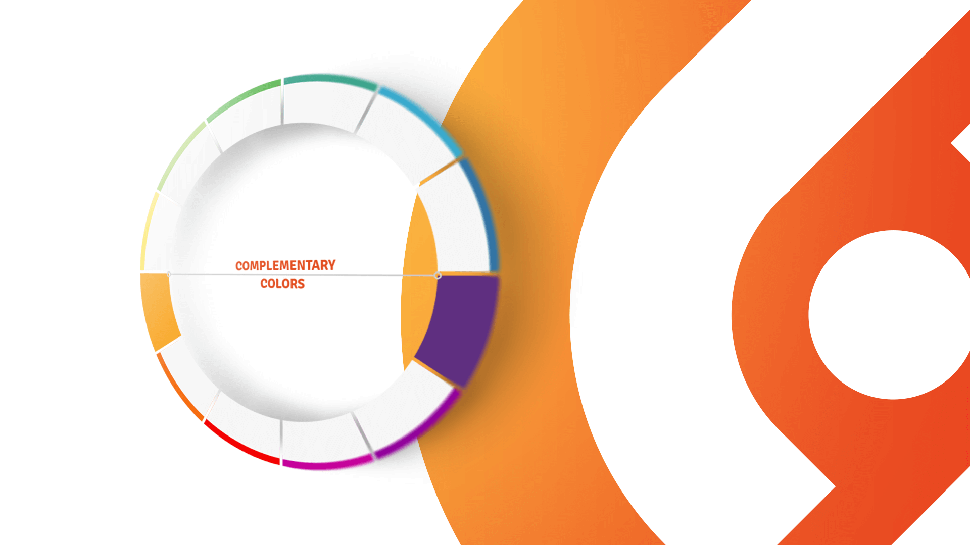
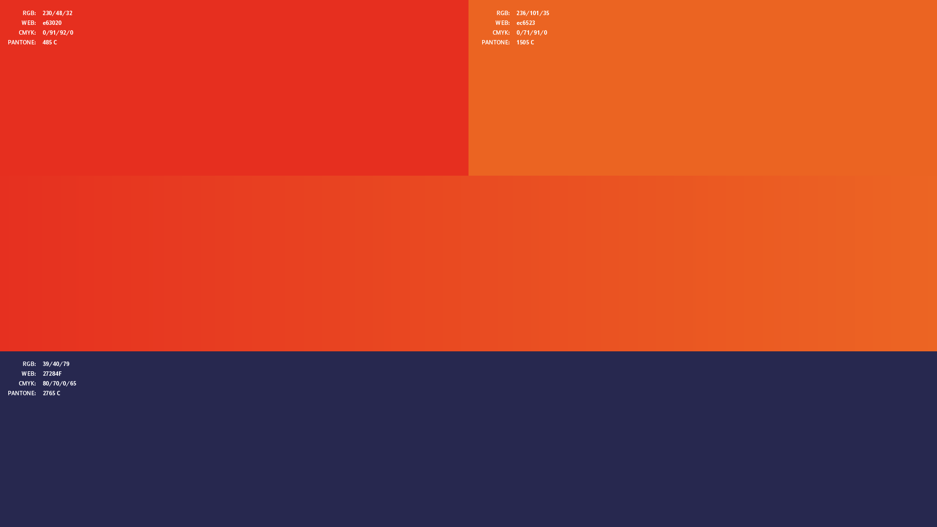
With age, the eye lens suffers from progressive yellowing. This phenomenon has an effect on how seniors perceive the colors that surround them. Shades of yellow, orange and red are perfect colors for this target group as greens and blues become more different to distinguish. Eventually, we made the decision to use orange as the main color and dark violet as a supplement.
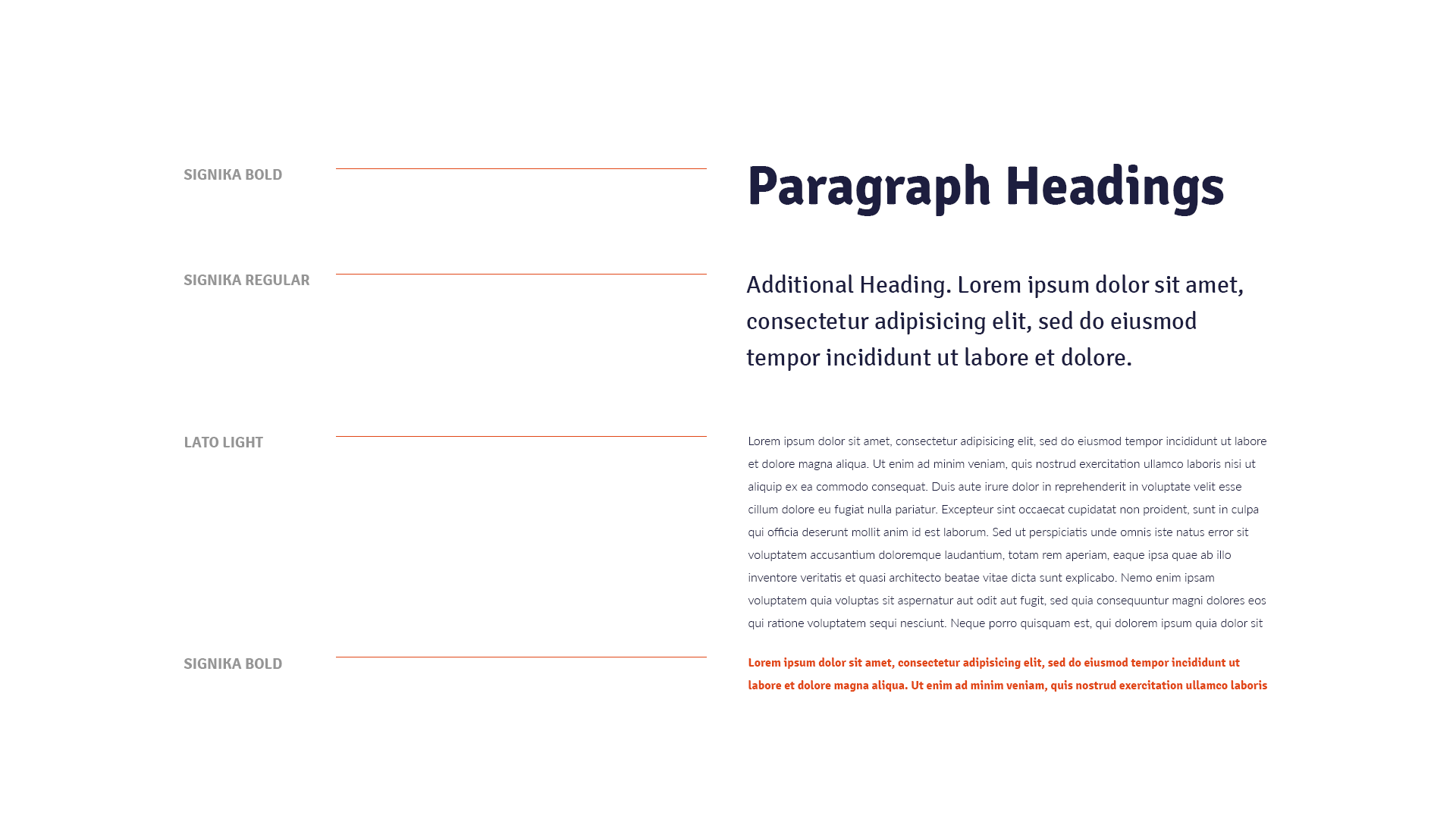
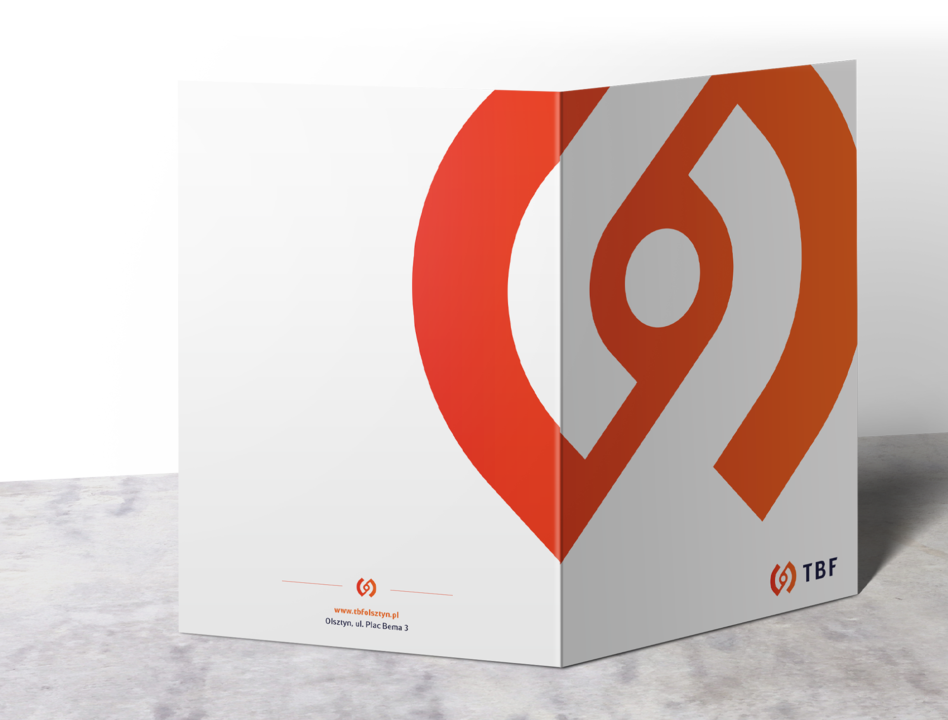
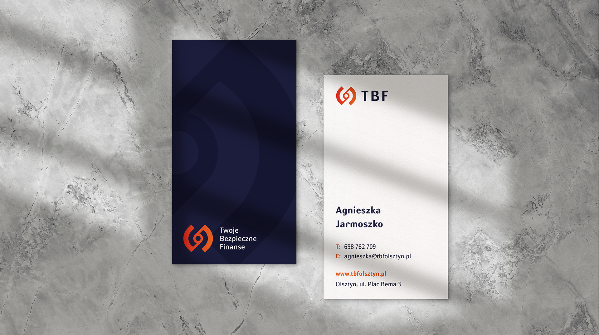
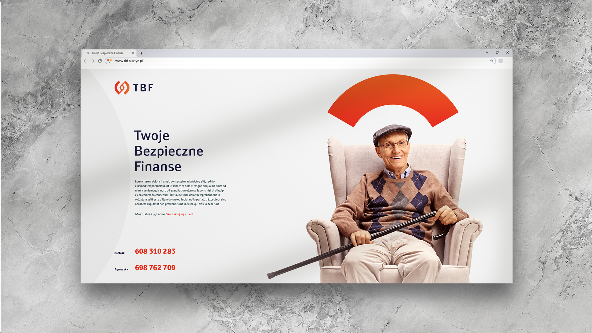


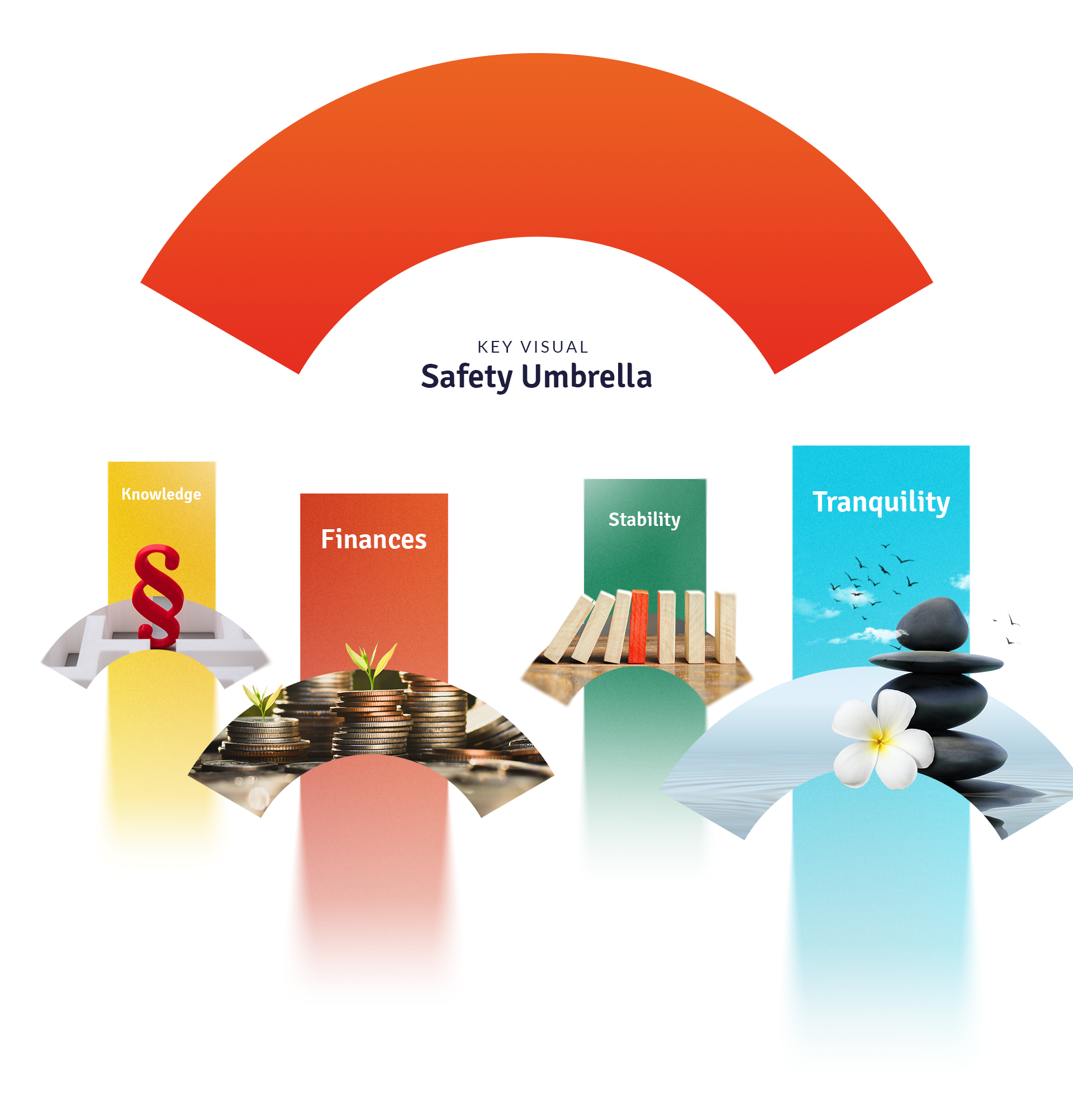
The creation of key visual during the logo design stage and the development of a marketing strategy is an idea that ensures that communication proceeds flawlessly. Before the creation of a graphic main theme for TBF, the focus was on analyzing customer activity and on the needs of the customer’s recipients. Following the idea that seniors are not a monolithic group, we established the persona taking into account demographic conditions, the financial situation, habits, preferences, personal tendencies and needs that undergo changes, e.g. due to health. Seniorzy chcą, by kierowane do nich przesłania były pozytywne, precyzyjnie trafiały w ich oczekiwania i zaspokajały ich potrzeby. Stawiają wysokie wymagania usługom, chcą się identyfikować z marką, jednocześnie szukają dialogu oraz oczekują rzetelnych porad i transparentnych komunikatów.
Seniors like it when the messages directed to them are positive, when they address their expectations and fulfill their needs. They have high demands of services. They want to identify with the brand, they are searching for a dialogue and expect advice and clear messages.
An ideal graphic element that suited TBF communication turned out to be an umbrella, as it is associated with security and safety. The theme identifying the brand was made of a simple visual sign that resembled an orange unfolded umbrella. The systematic and consistent use of this image in various forms of communication with TBF customers will evoke positive emotions and make the brand stand out amongst the competition.
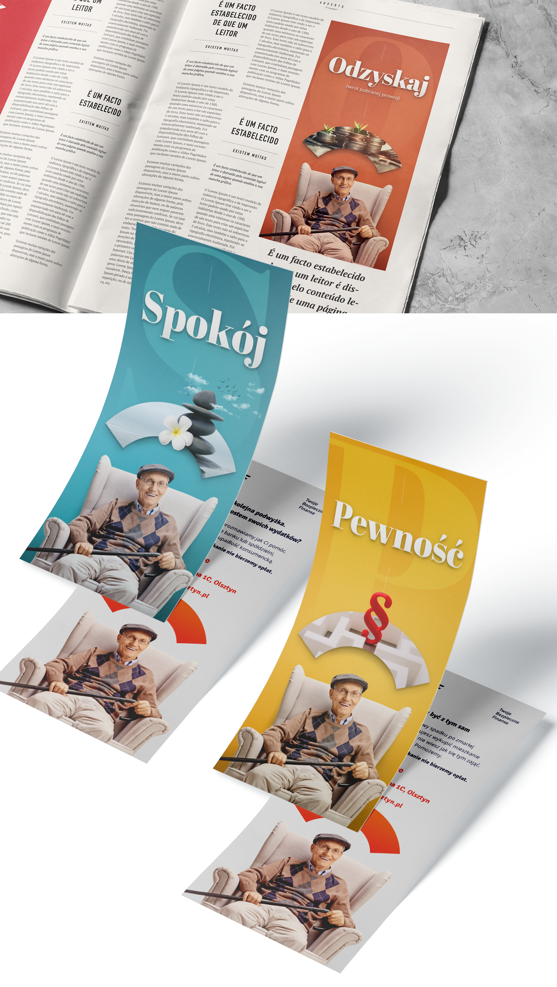
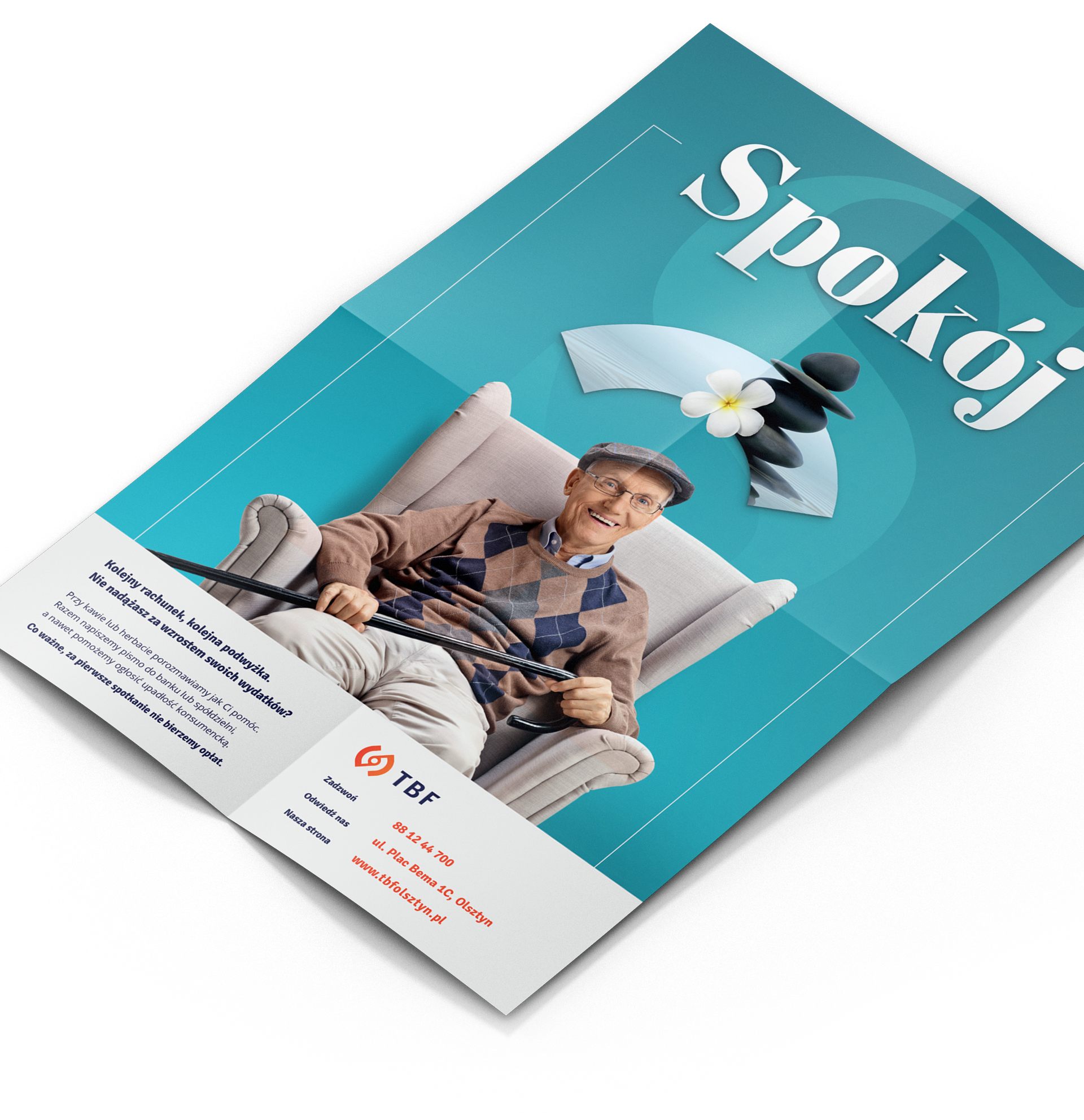
TBF key visual is universal and as such, it can be used in numerous brand elements, including in the company’s headquarters, in outdoor space when conducting various activities, in printed materials, on the website as well as when communicating through Facebook.

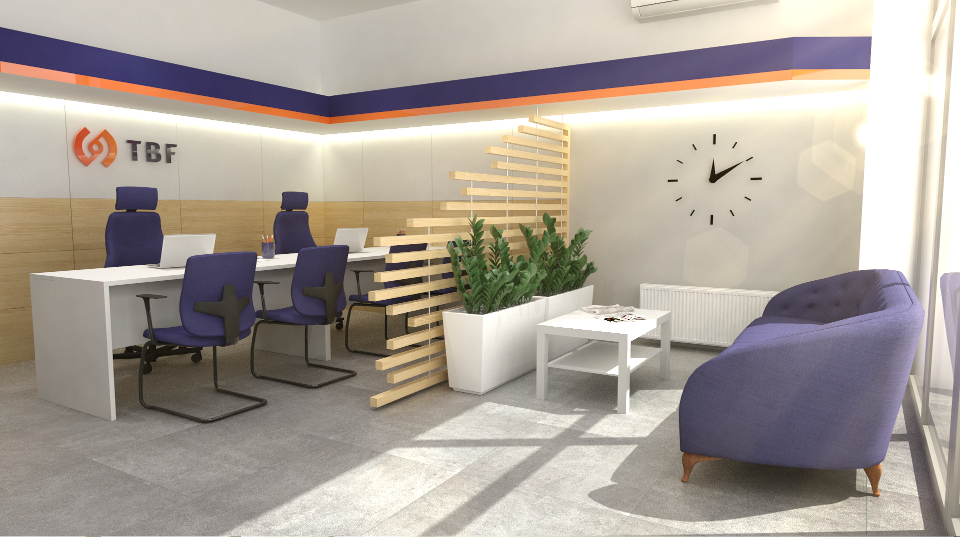
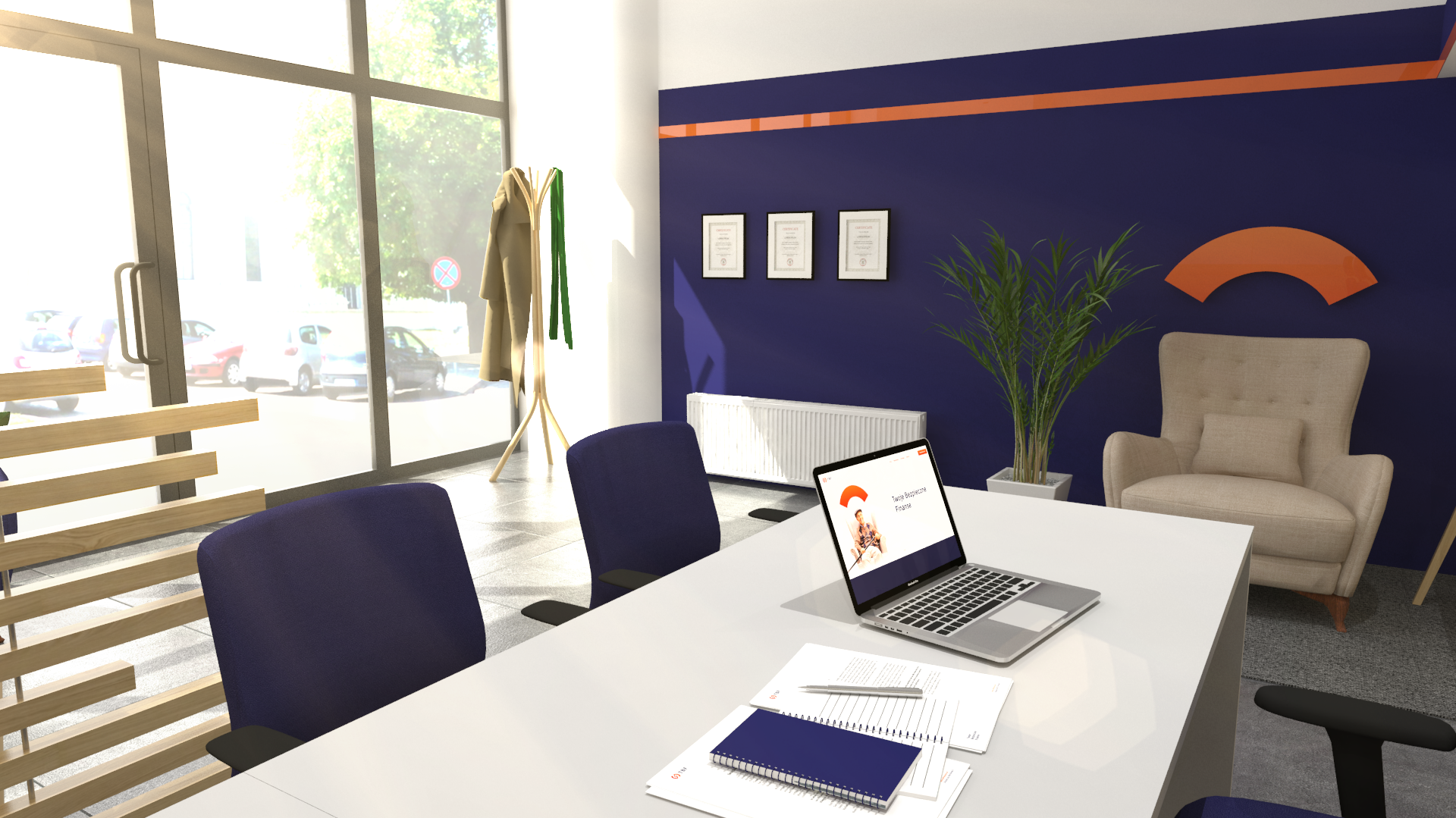
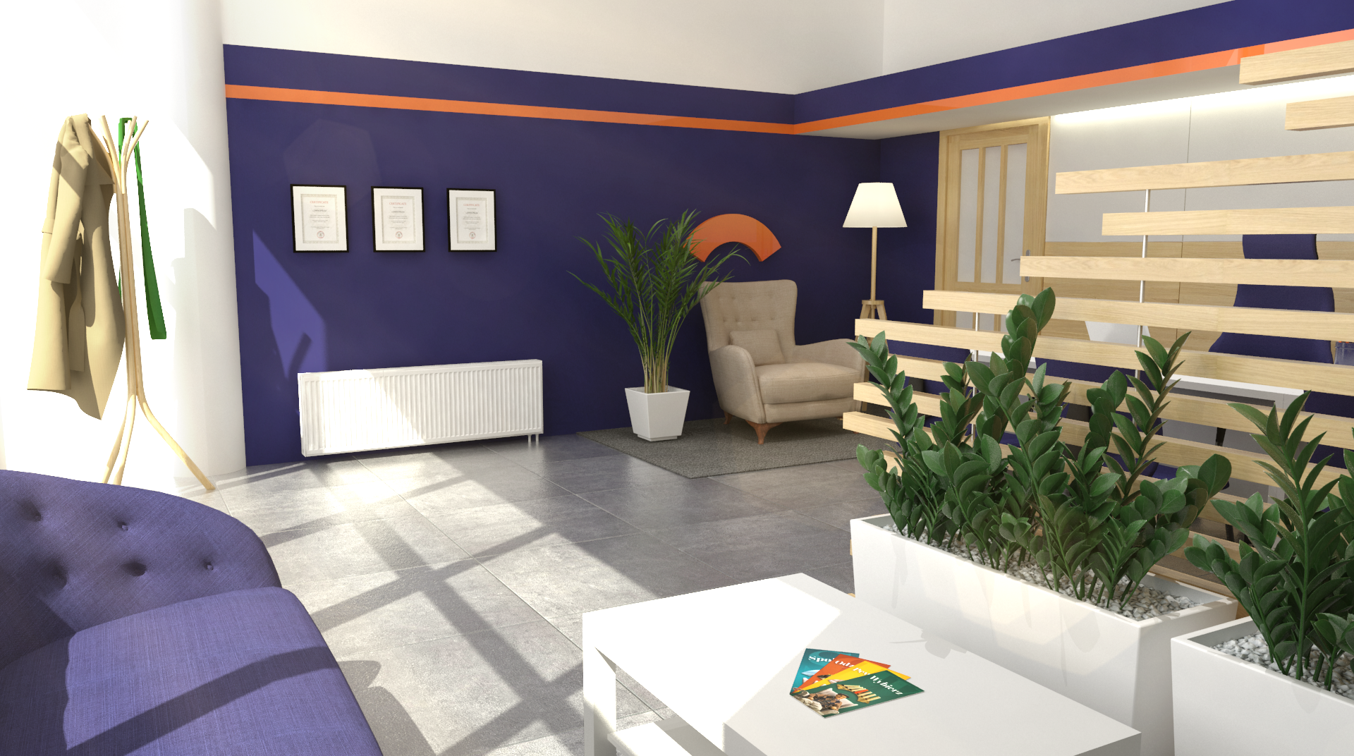
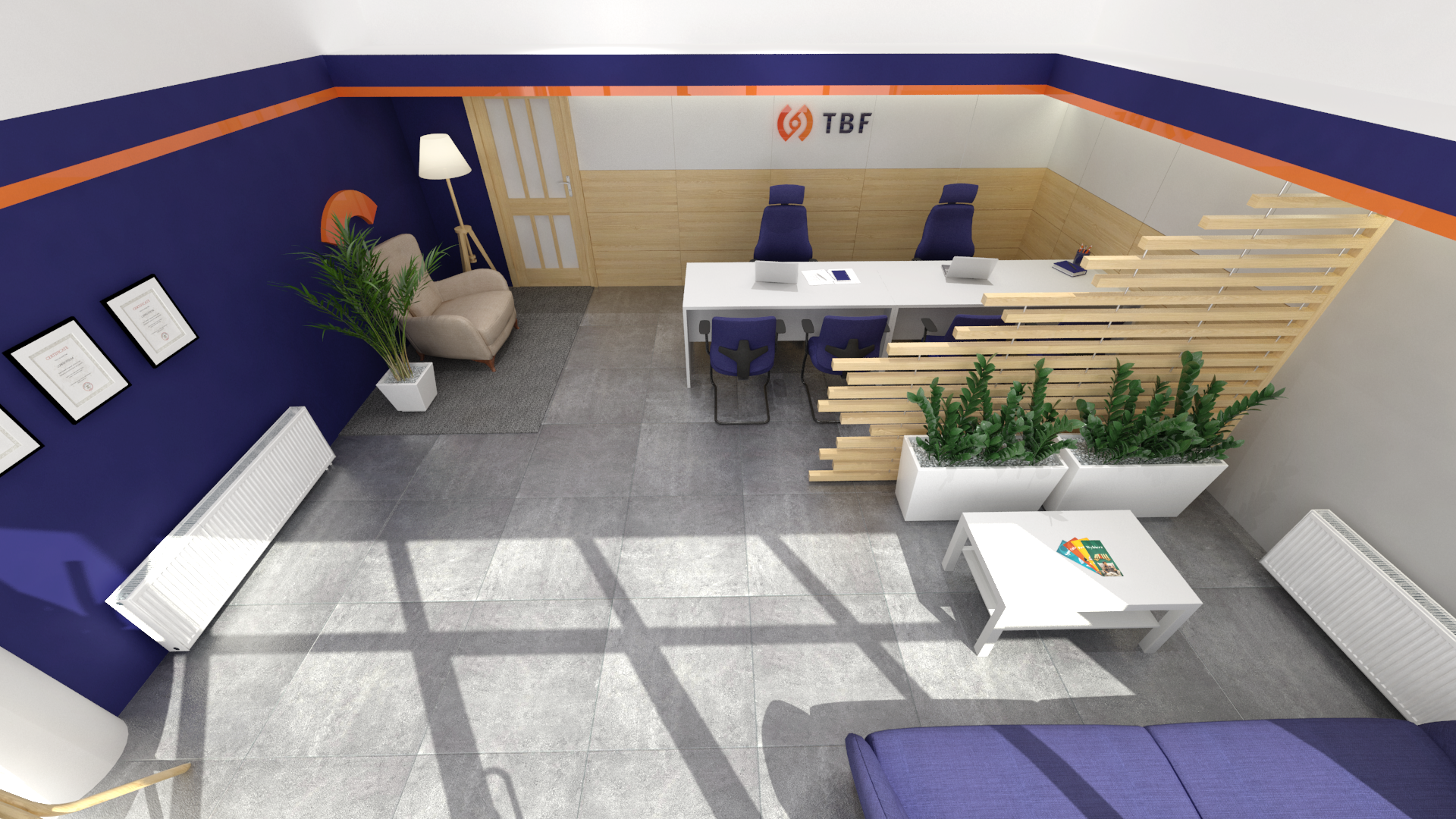
Activities for TBF developed well beyond the initial concepts and logo creation. The customer also decided to arrange a visualization for the interior of his headquarters once he noticed how effective the cooperation had been. Naturally, the point was for the interior to correspond with the main theme and to optimize the process of customer service. We began our work by talking with the customer. During design, it is critical to understand the expectations and needs. It was a challenge to perform the dimensioning of space, to create a model of the interior and to create a functional arrangement in a small space.
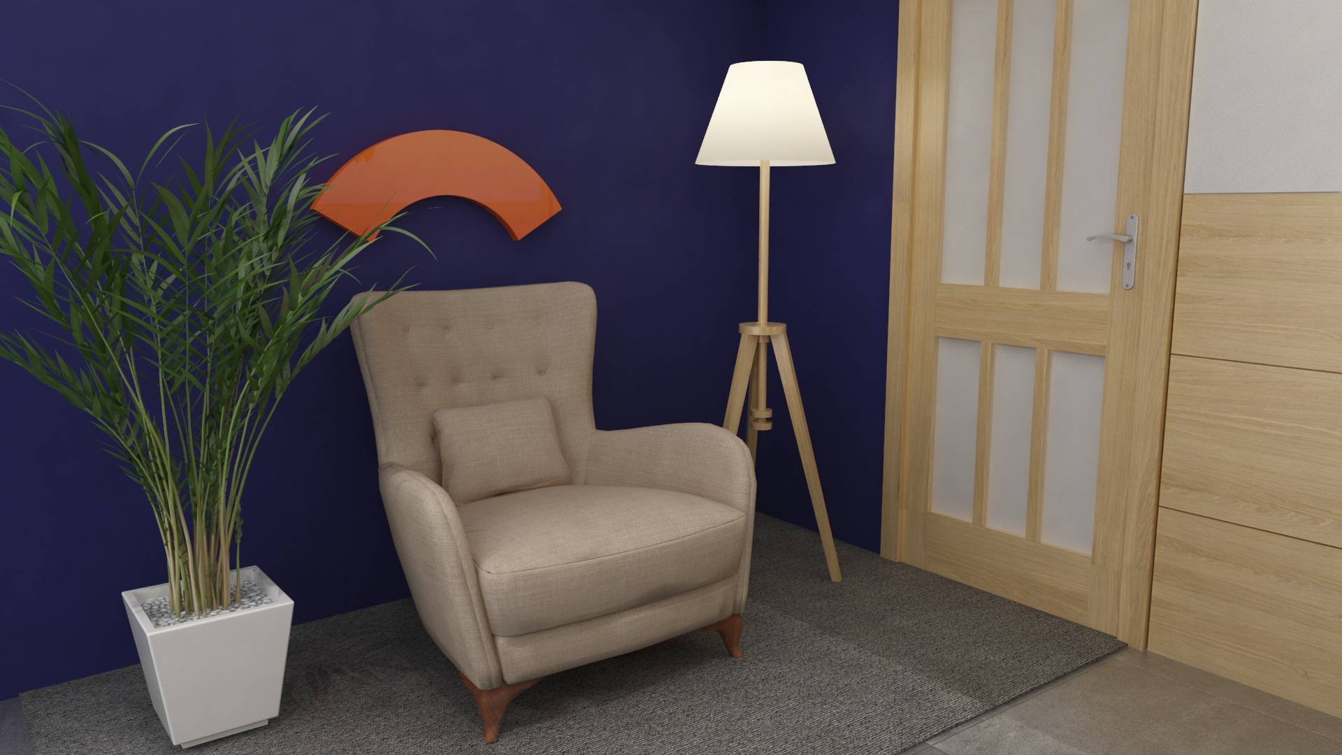
The openwork wall with its green plants made it possible to create a customer waiting area and a space for the comfortable servicing of a customer while preserving the possibility of monitoring incoming clients. We were also able to create a space just for employees in this small interior. It was also possible to put inside a chair with an “umbrella”, which is the key graphic element that will be used in marketing campaigns.
