MPEC Olsztyn
Good energy visualized

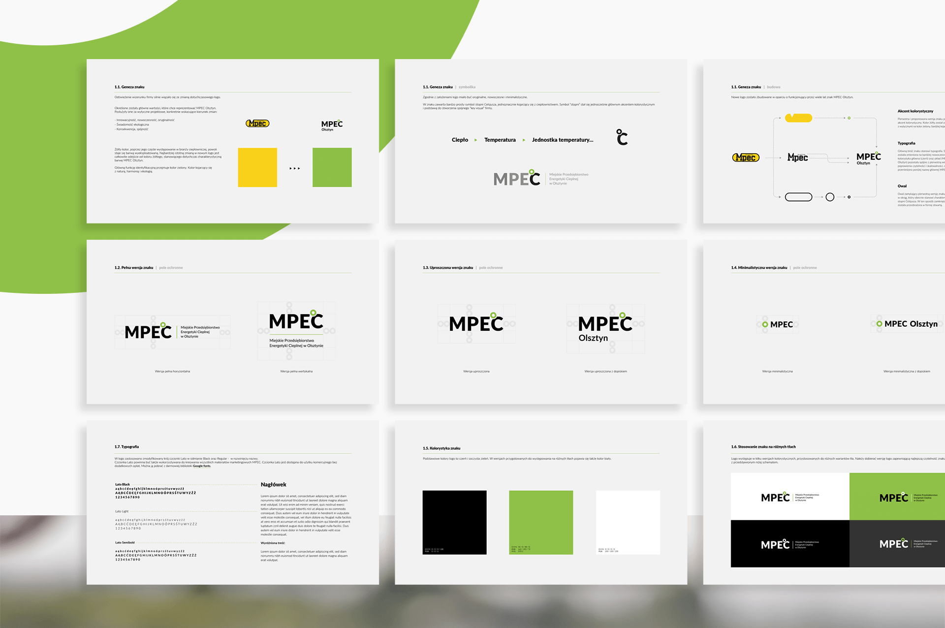
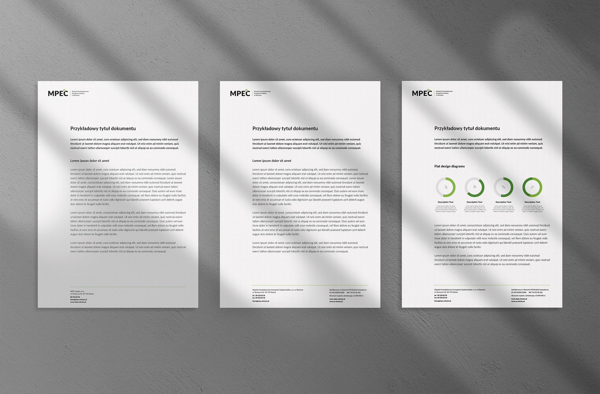
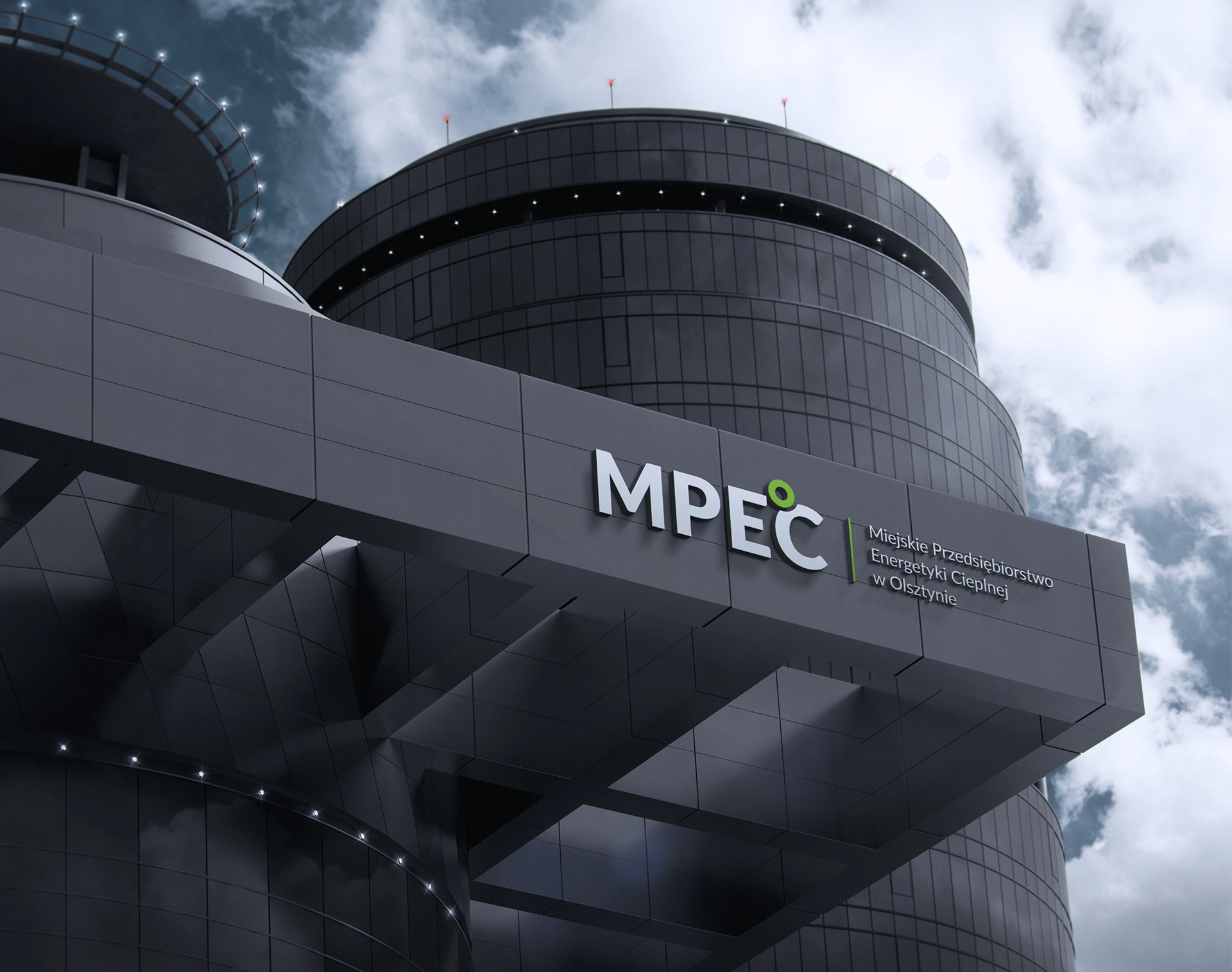
The task we faced was to create a new version of the logo, evoking associations with the earlier mark that had been used for over 30 years. Then, we developed a visual identity book, which sets a modern and consistent direction of brand communication.
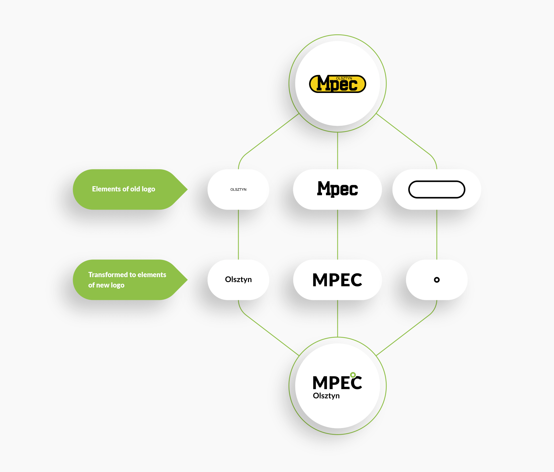
Our client was very attached to his logo and did not want it to change drastically, arguing it with the fact that the mark was highly recognizable on the local market. Bearing in mind his concern for his position on the regional market, which has been built over the years, we have made a thorough analysis, in which we have located the weaknesses of the sign and divided into individual elements.
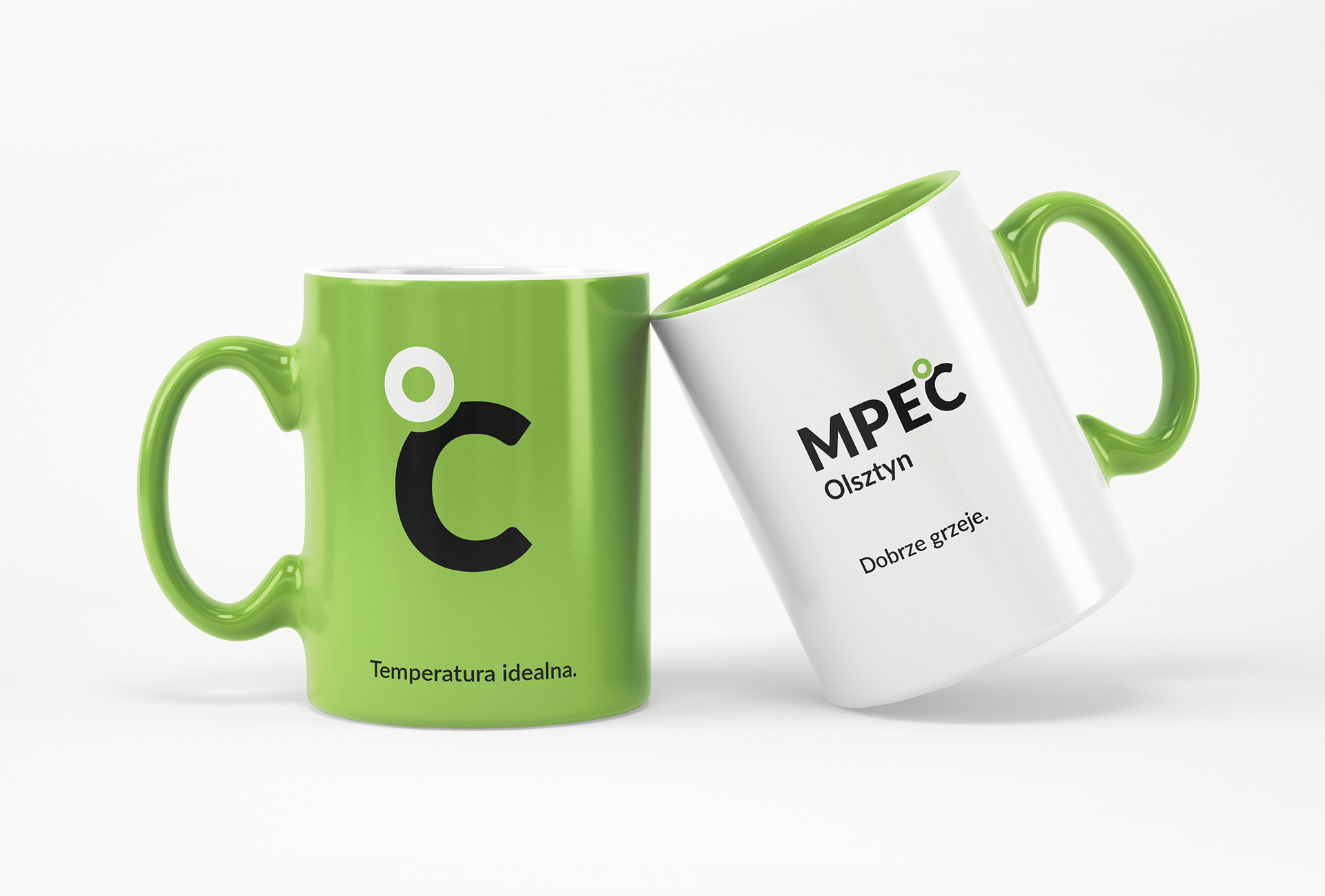
The action taken allowed us to maintain a similar structure of the valid sign – the main typographic part “MPEC” and the annotation “Olsztyn”. The oval, which “closed” the entire form and generated problems with legibility of the sign at smaller sizes, was transformed into the symbol Celsius “degrees”. In this way, we have created an open and more scalable version of the sign.
Associations always play a significant role in the design of visual communication. It was no different in our project. We wanted to distinguish our client from the heating industry, which uses a very limited symbolism: flame themes, heating pipes, arrows in various configurations. We took a different path:
Heat – Temperature – Temperature unit – Celsius scale

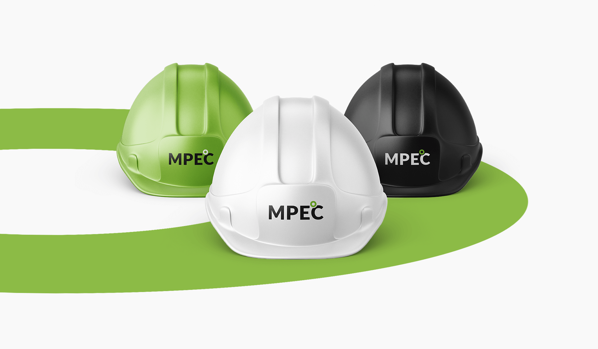
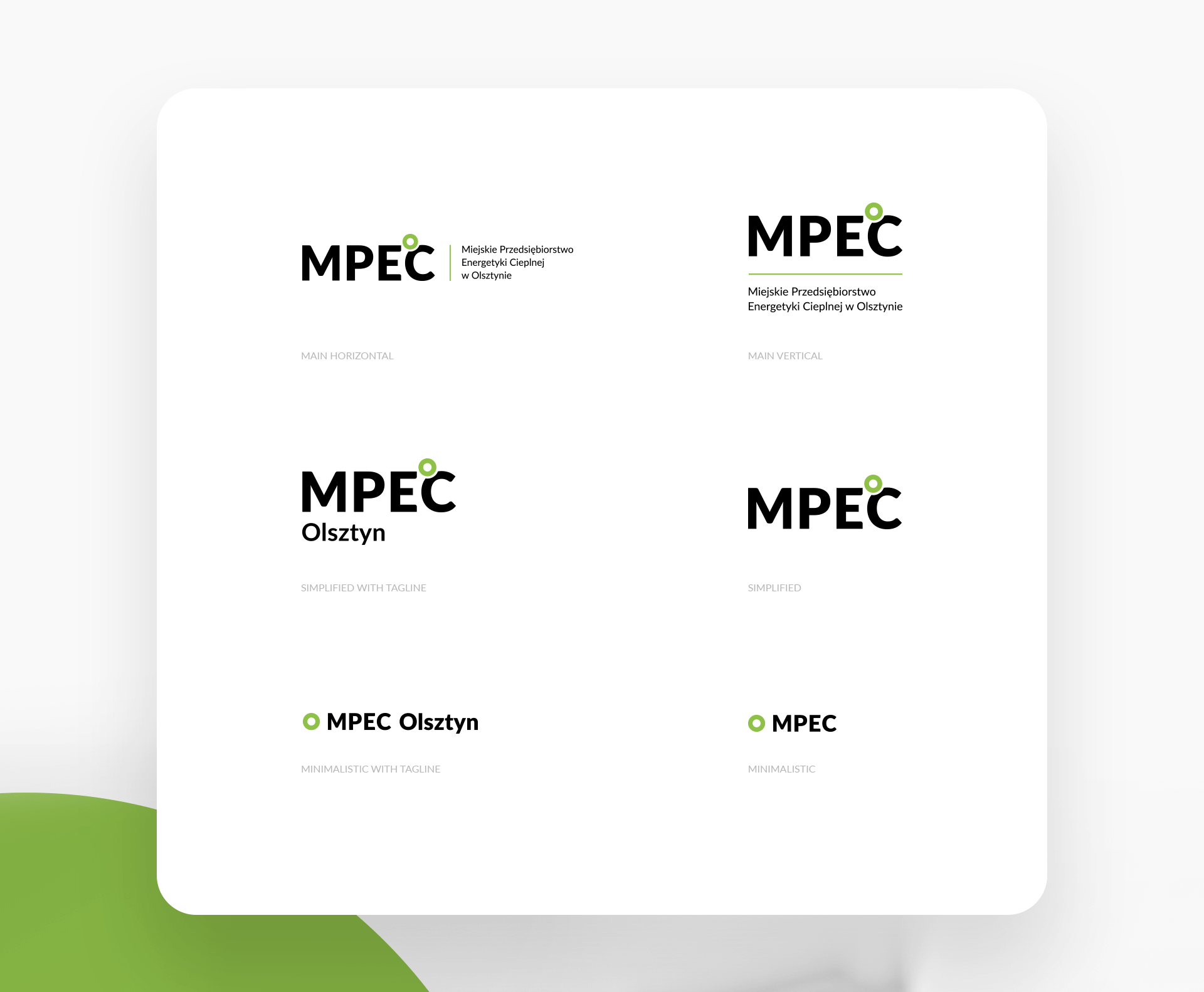
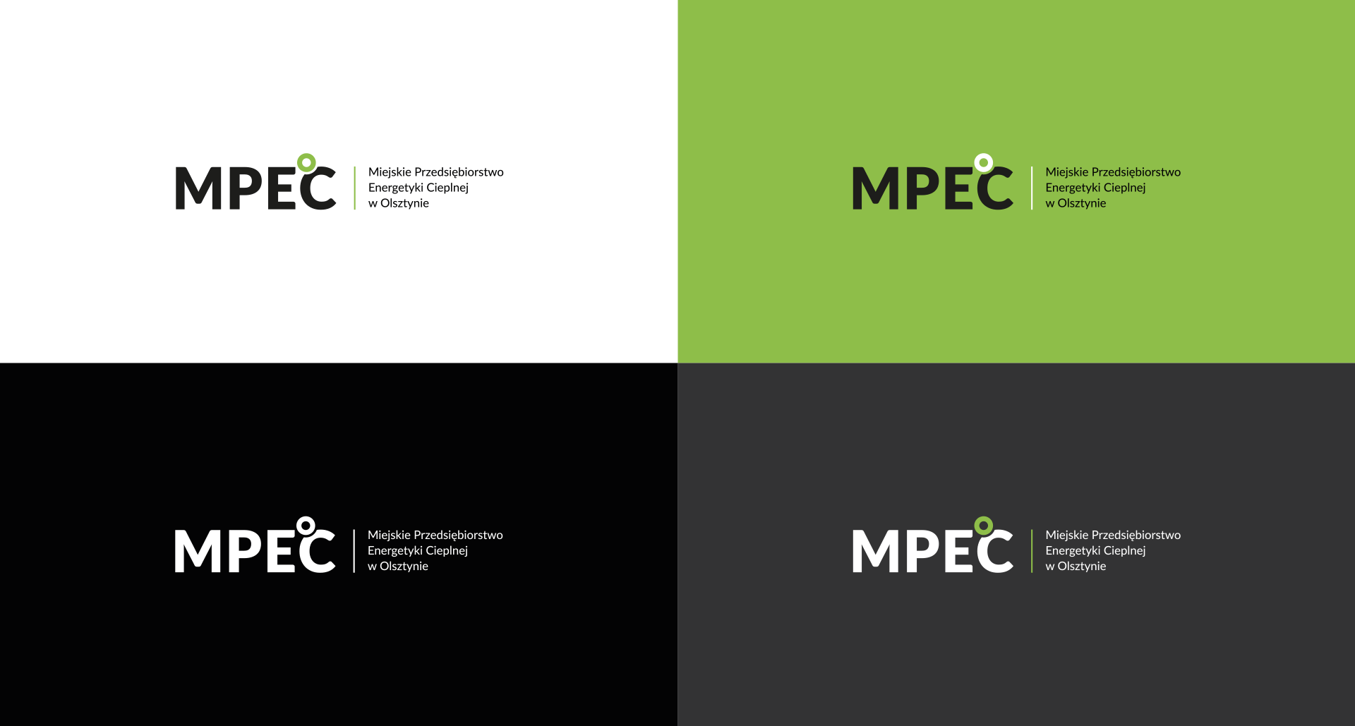
Our task was also to improve the scalability of the sign, which is why we have created 6 different versions adapted to display on various promotional materials. Additionally, for each of the proposed layouts, we have prepared various color versions.
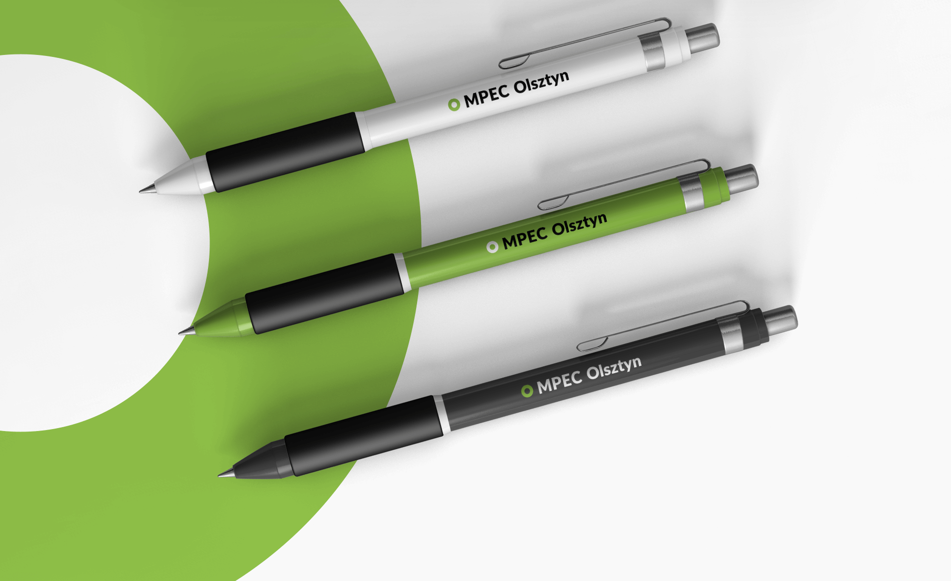
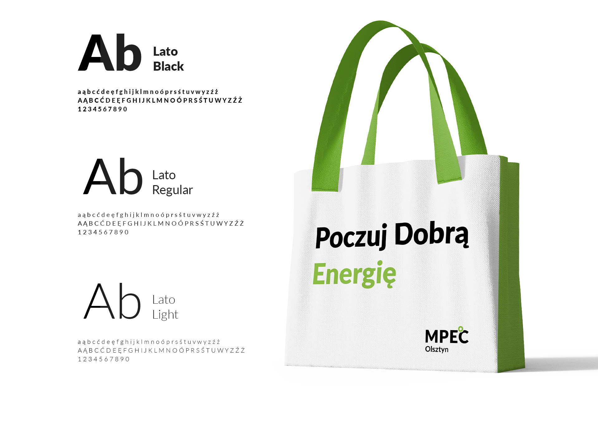

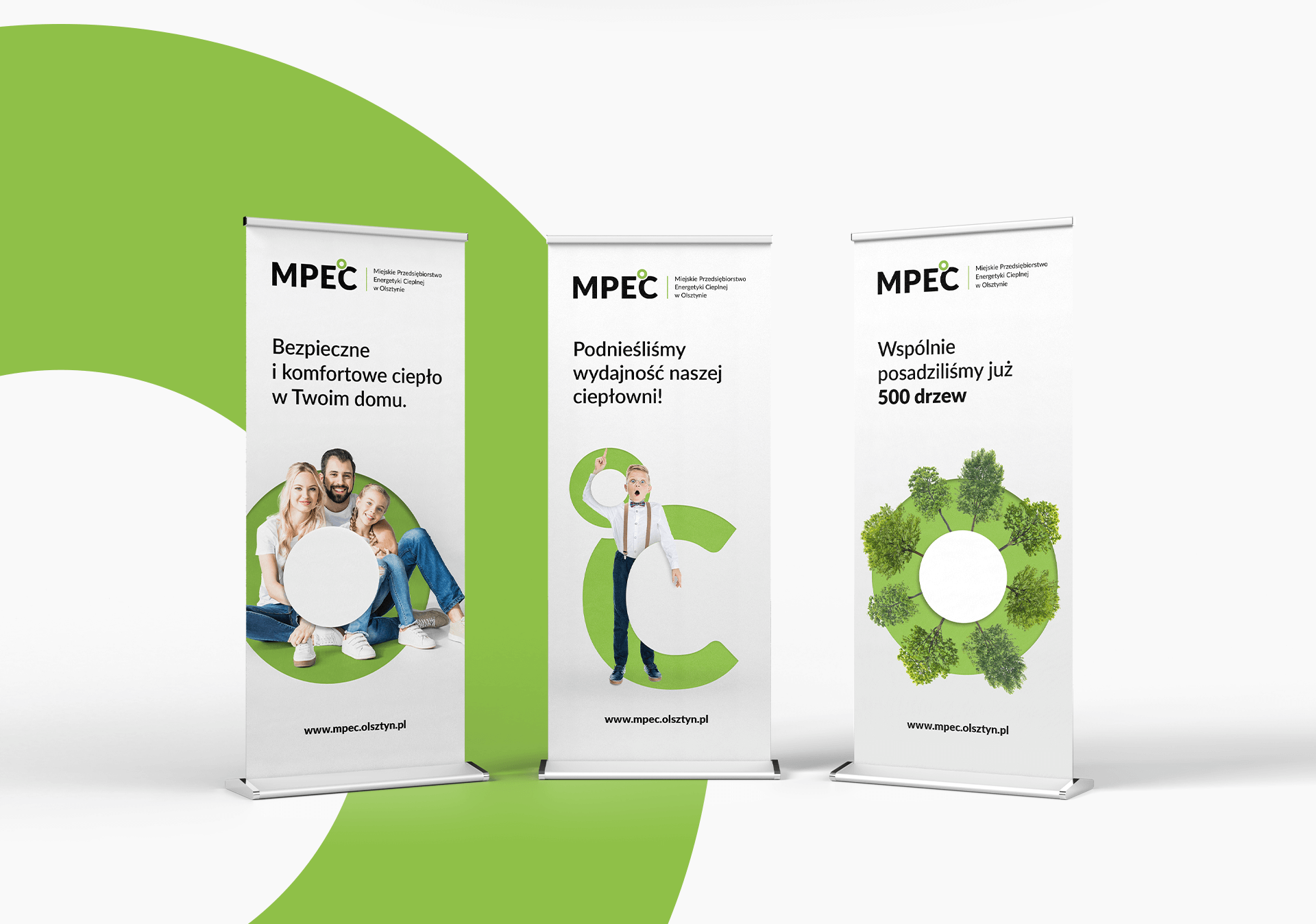
The “Degrees” symbol, resembling a bold circle, is a key element of visual identification and should be used as a basis for graphic creations. Over time, this element will be clearly associated with MPEC Olsztyn.
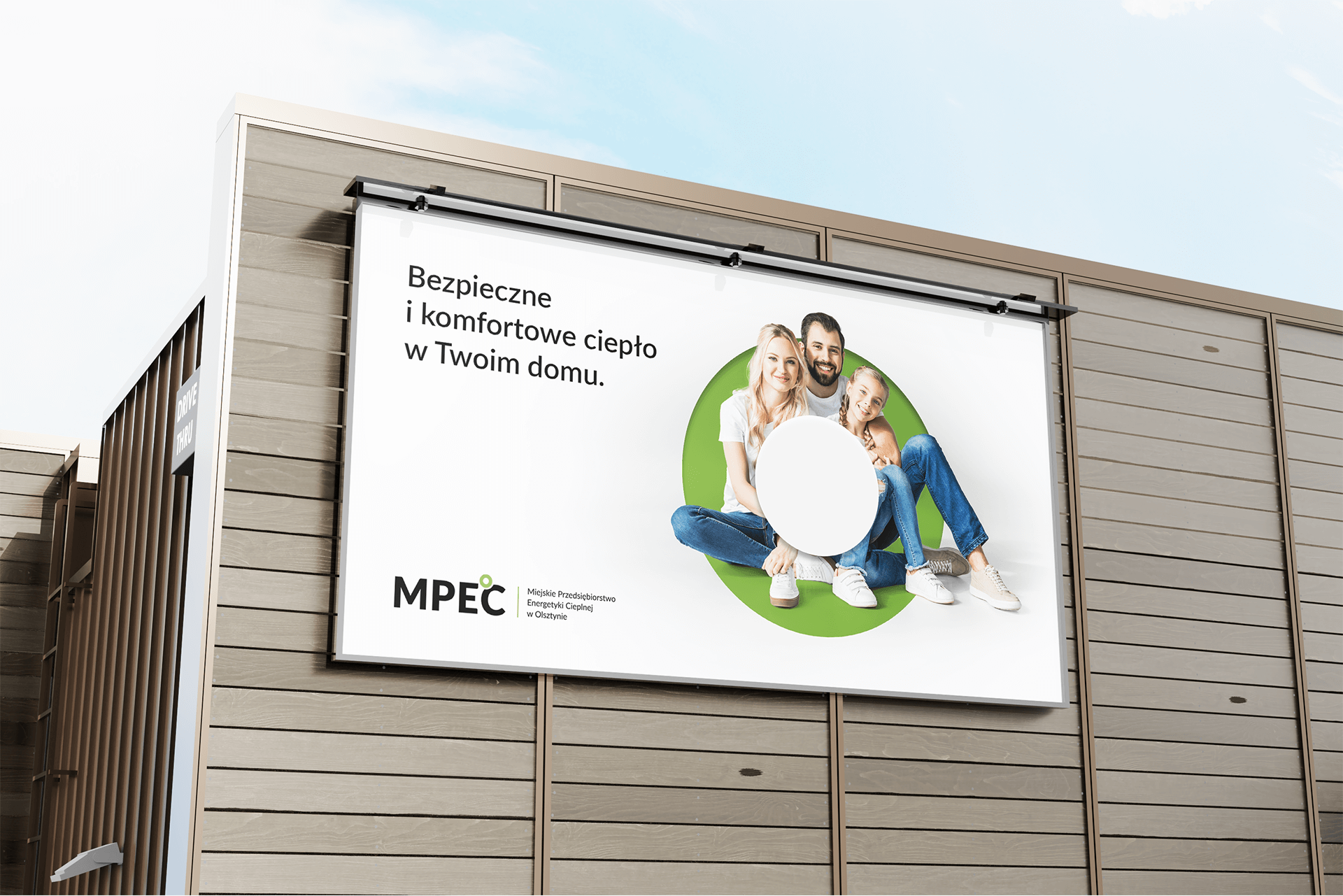
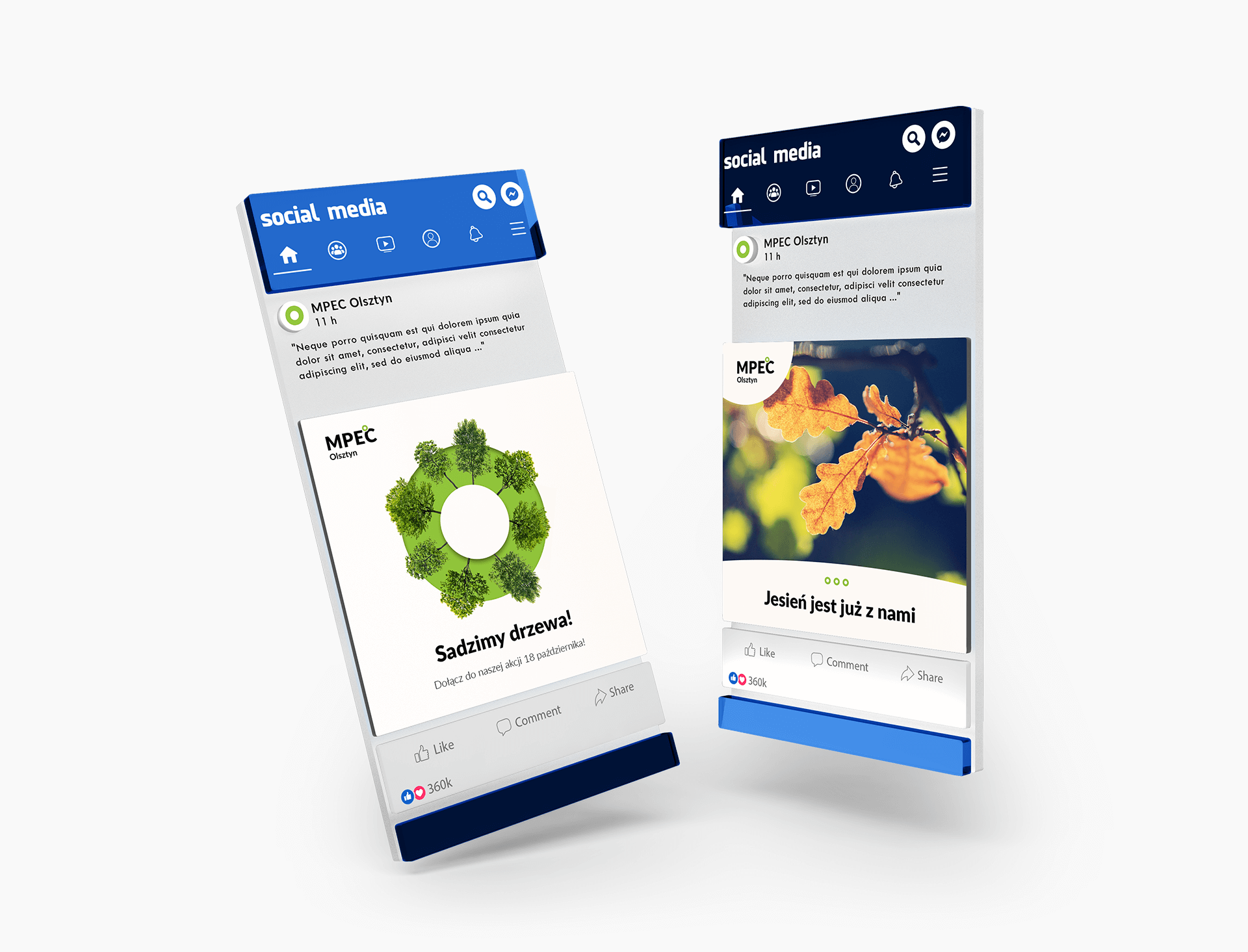
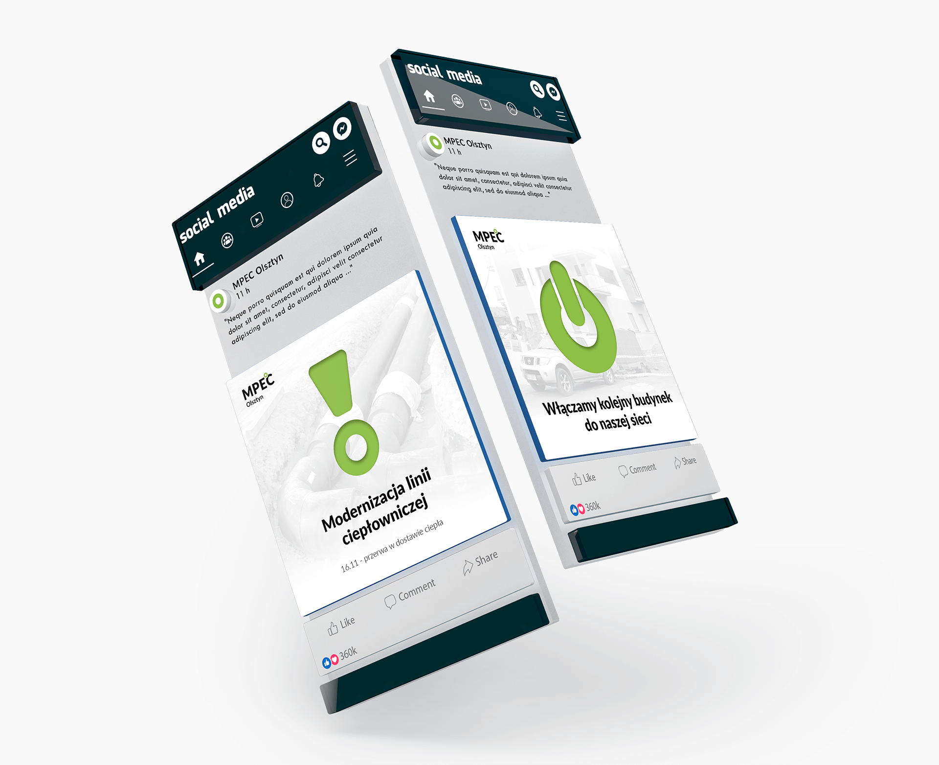
Photos should “interact” with the circle or its element. Such a procedure creates eye-catching graphics and is a characteristic element of the new visual identification.
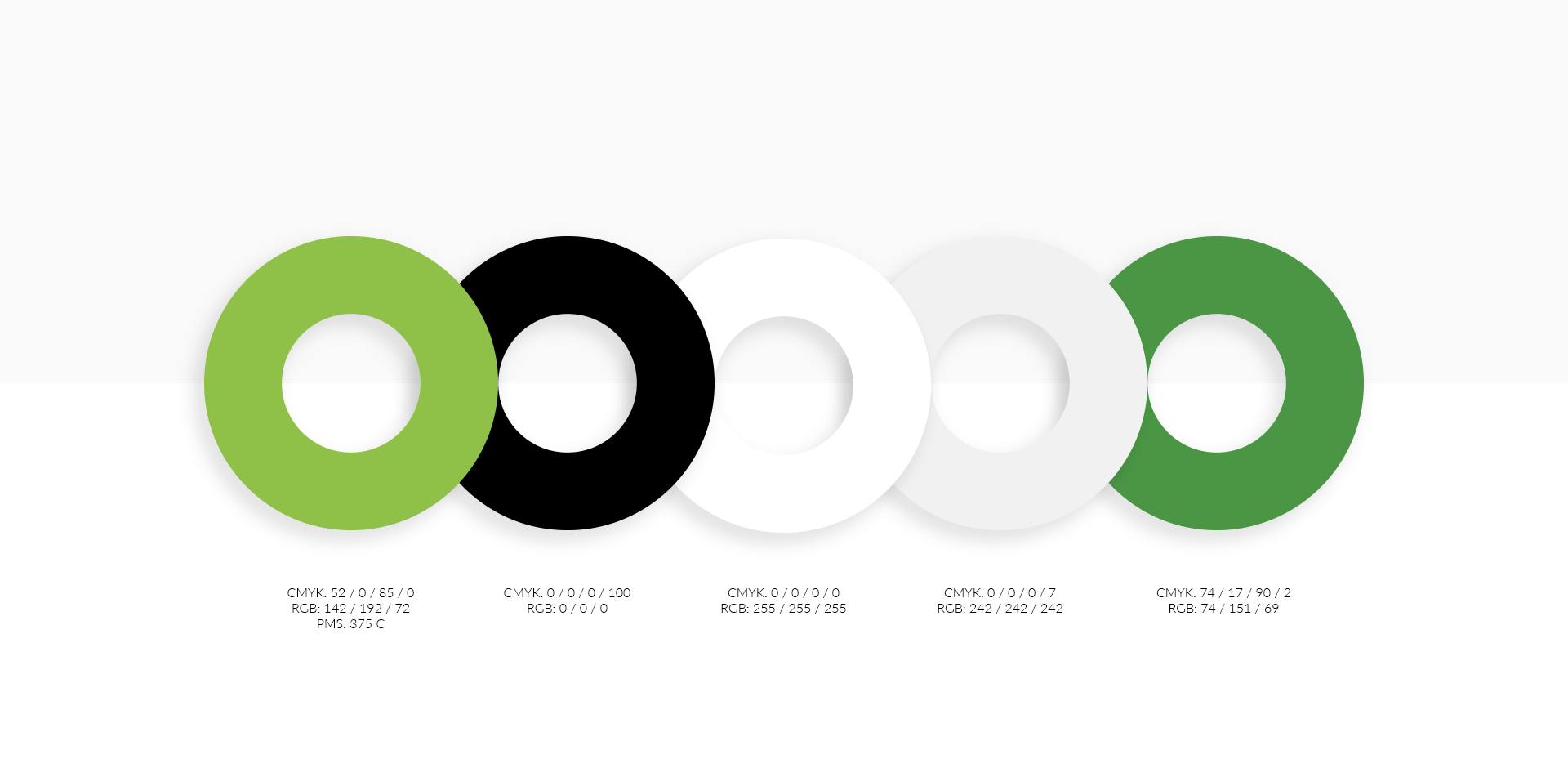
The green color refers to ecology and care for sustainable development. It symbolizes changes and new directions of MPEC development, focusing on modern technologies limiting the emission of harmful substances to the environment.


