Nuansa
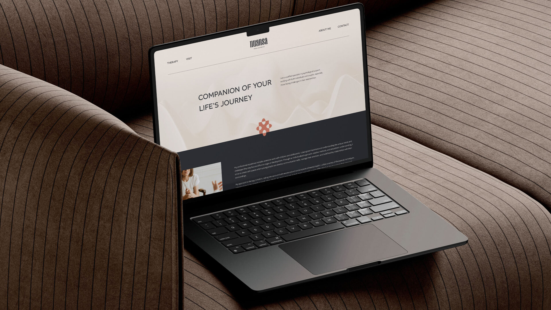
Nuansa – Companion of your life’s journey
Nuansa was created by psychologist and sexologist Iwona Sacharczuk, offering a holistic approach to individual therapy and couples counseling. Based on a partnership-driven relationship and a deep understanding of emotions, Nuansa supports patients in finding harmony in their personal lives and relationships, helping to eliminate the stigma associated with seeking psychological support.
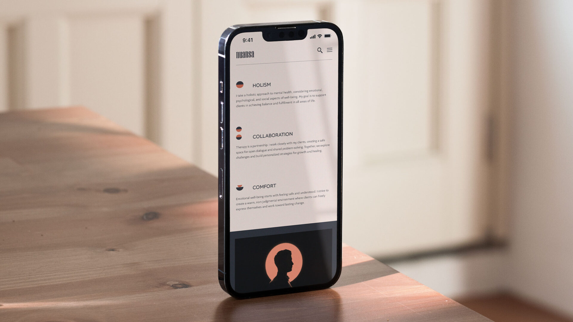
As a brand, Nuansa helps patients understand how the past influences the present and future, supporting them in finding harmony. Therapy is based on a partnership-driven relationship that fosters trust and a sense of safety. Iwona Sacharczuk creates a judgment-free space, eliminating stigma and fear associated with seeking help.
Our client approached us with the need to create a new brand that would reflect the nature of therapeutic work in a modern and professional way. The goal was to build a cohesive identity that inspires trust and helps break down barriers to seeking support. As part of the strategic process, we developed the name Nuansa, capturing the subtlety of emotions and the brand’s individual approach to patients.
Nuansa is a brand created for Iwona Sacharczuk – a qualified psychologist and sexologist whose mission is to provide holistic support to patients in their personal lives and relationships. She specializes in both individual therapy and couples counseling, with the goal of helping patients overcome emotional and intimacy-related challenges. Nuansa was born out of the need to create a space where comfort, understanding, and professionalism go hand in hand with a modern therapeutic approach.
The name “Nuansa” emerged from a strategic naming process aimed at capturing the subtlety of human emotions and the multidimensional nature of therapeutic work. The word perfectly reflects the brand’s philosophy — recognizing and understanding the small yet significant elements of the human psyche and relationships. It is a name that combines delicacy, professionalism, and sensitivity while emphasizing an individual approach to each patient.
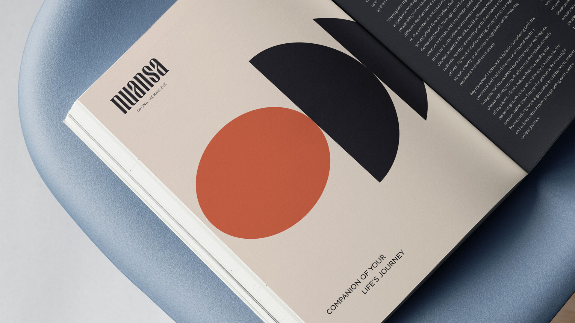
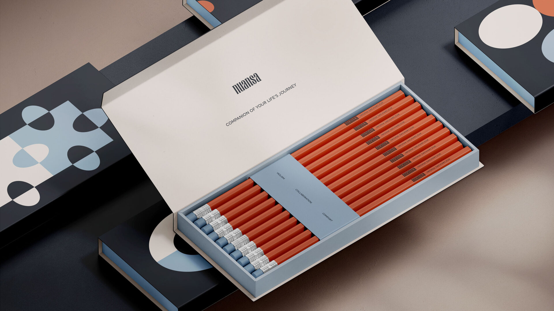
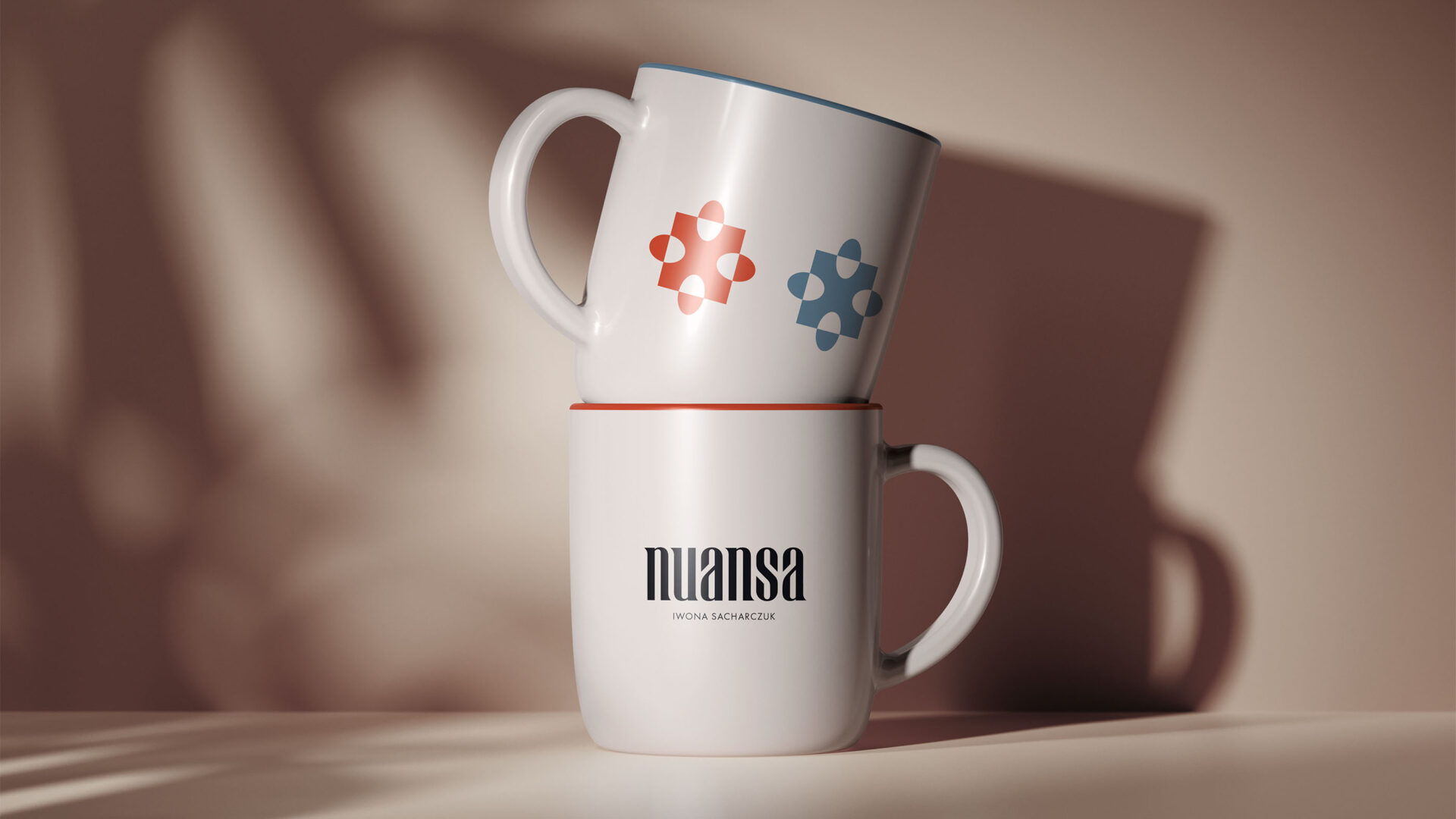
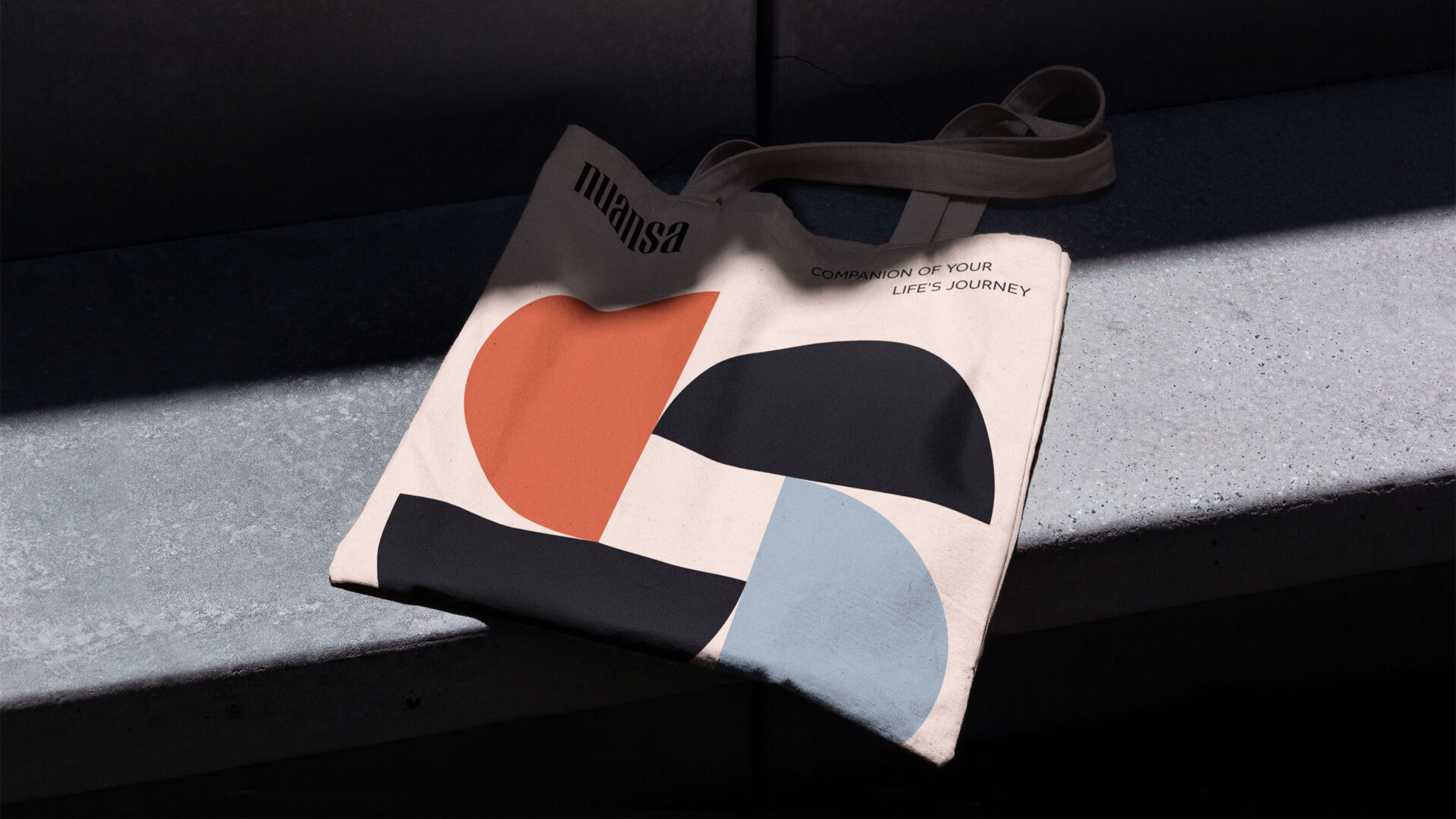
The wordmark was created using custom typography that blends elegance and subtlety. It is a logo with a distinct yet gentle character, radiating a sense of calm and professionalism.
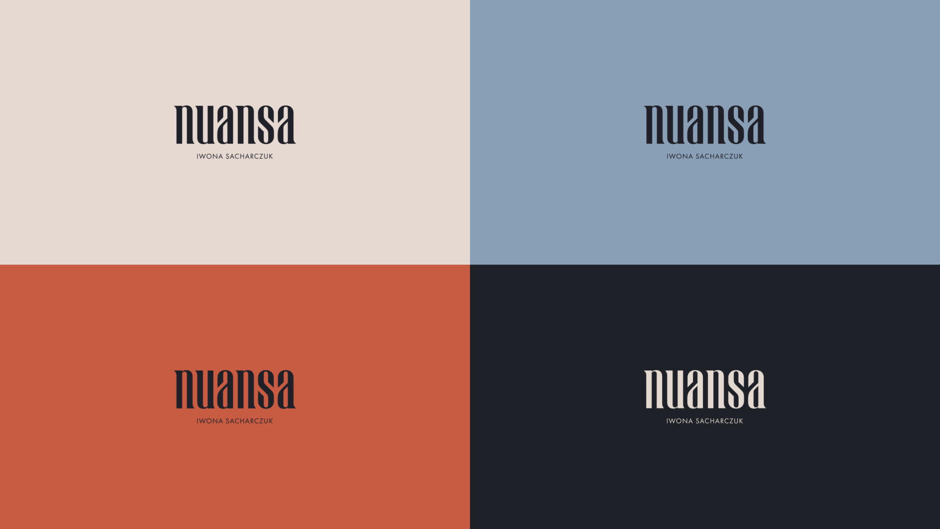
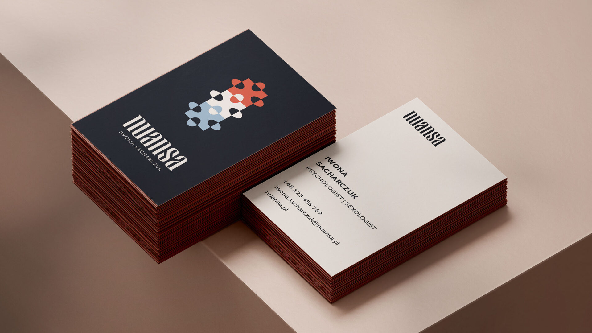
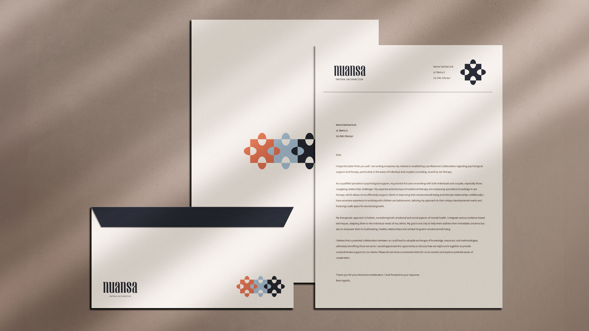
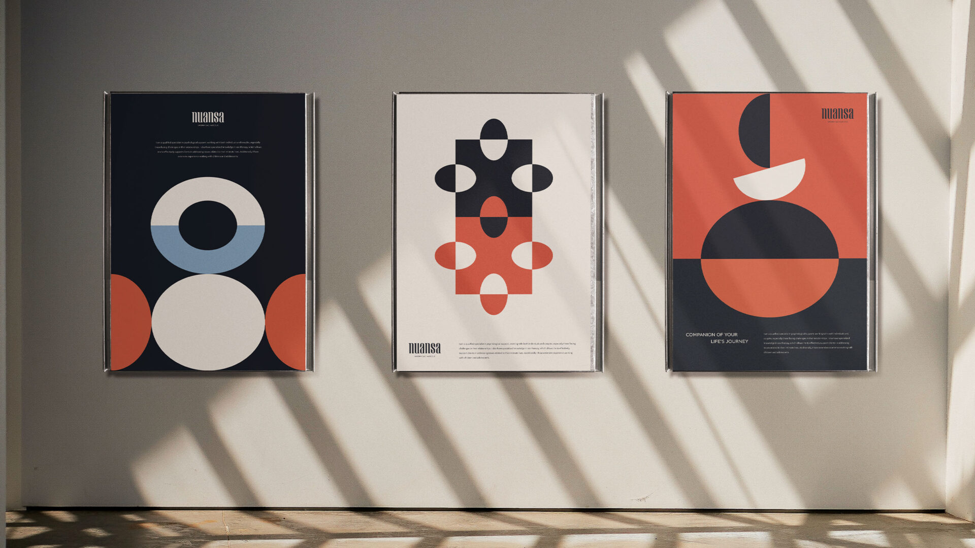
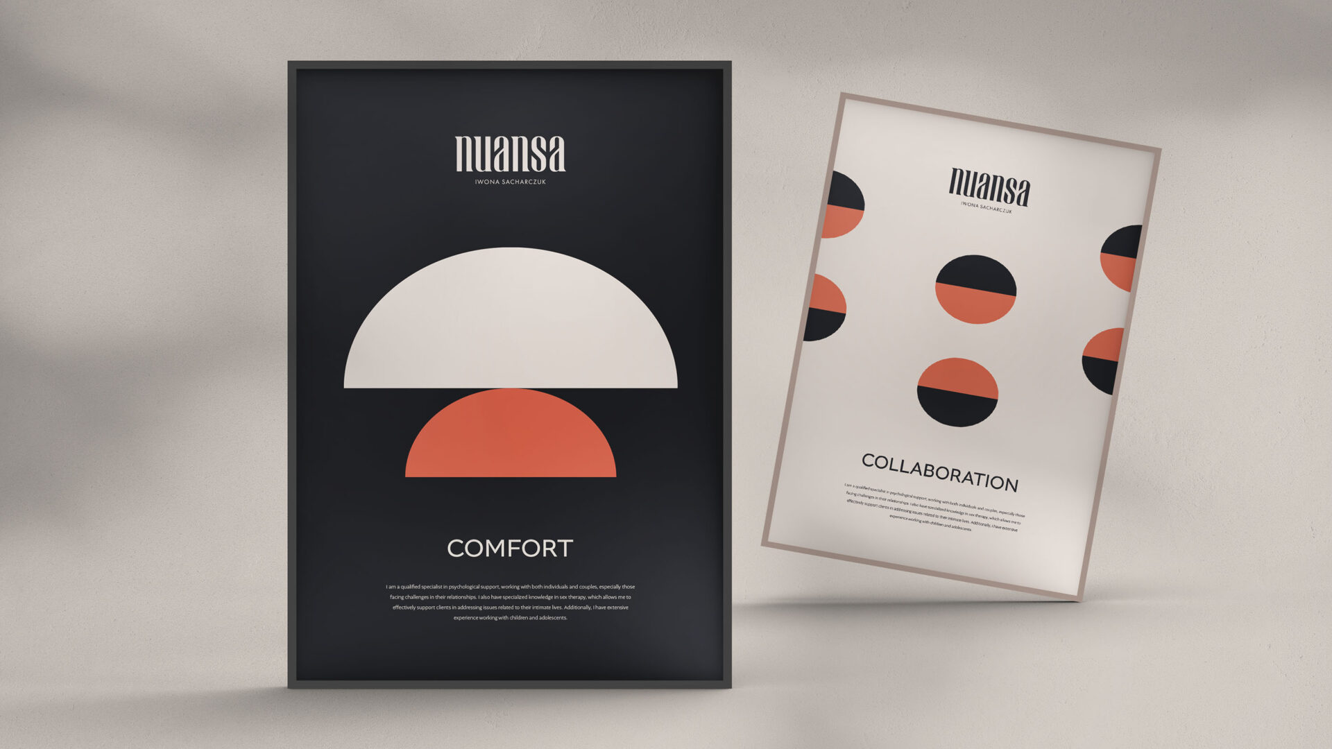
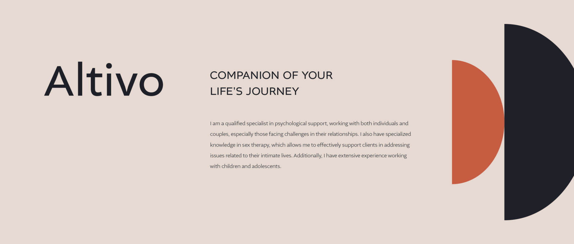
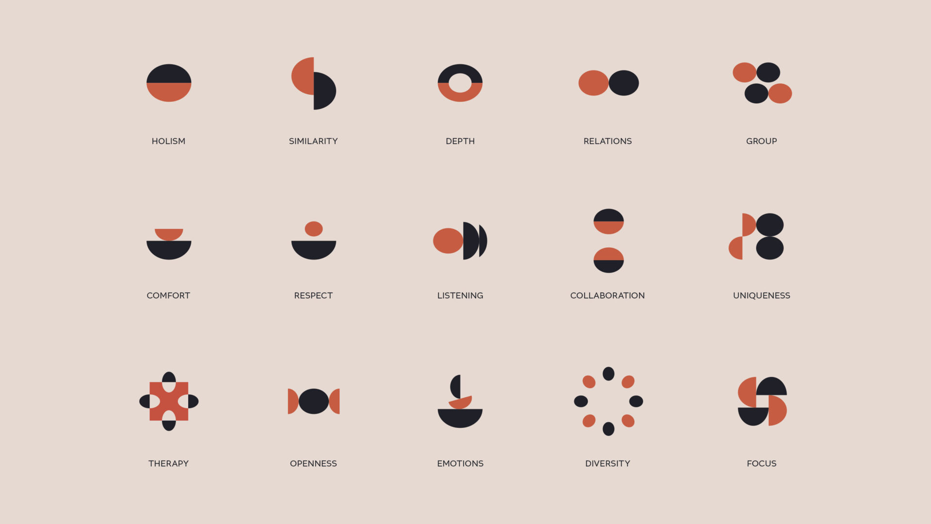
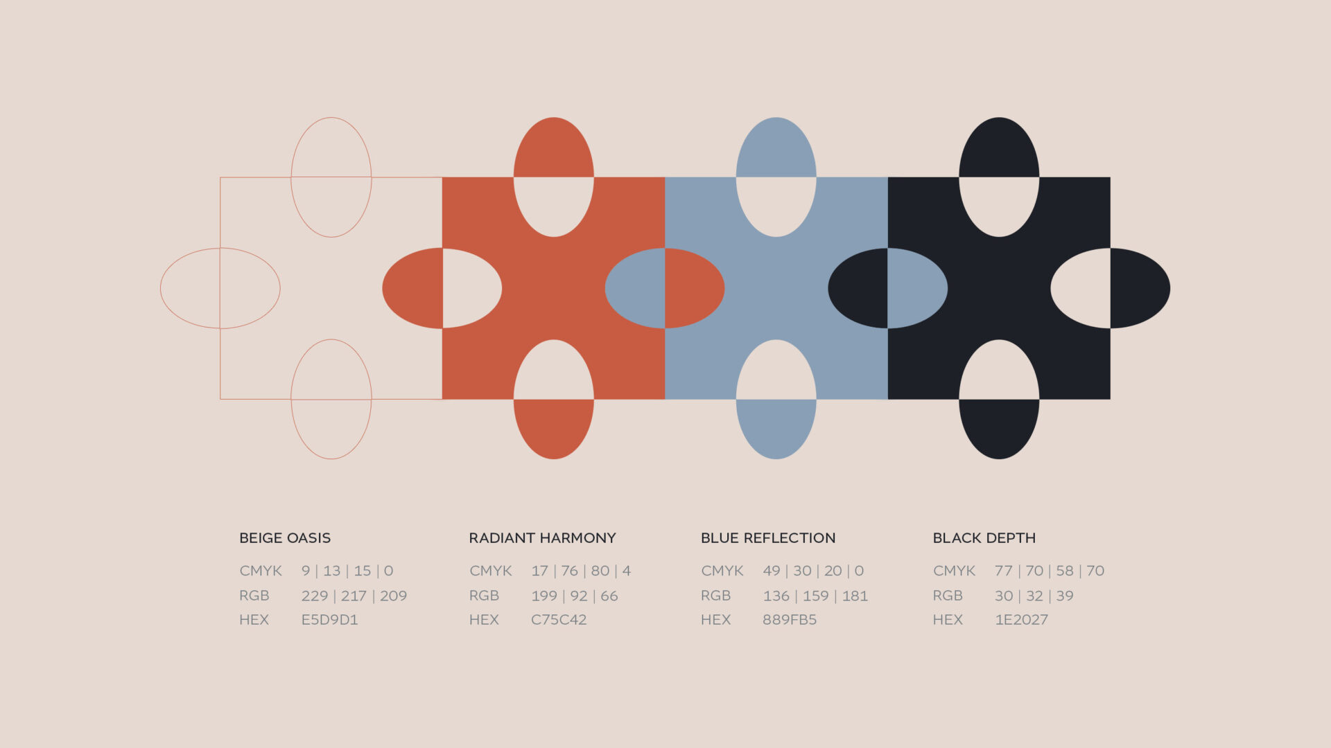
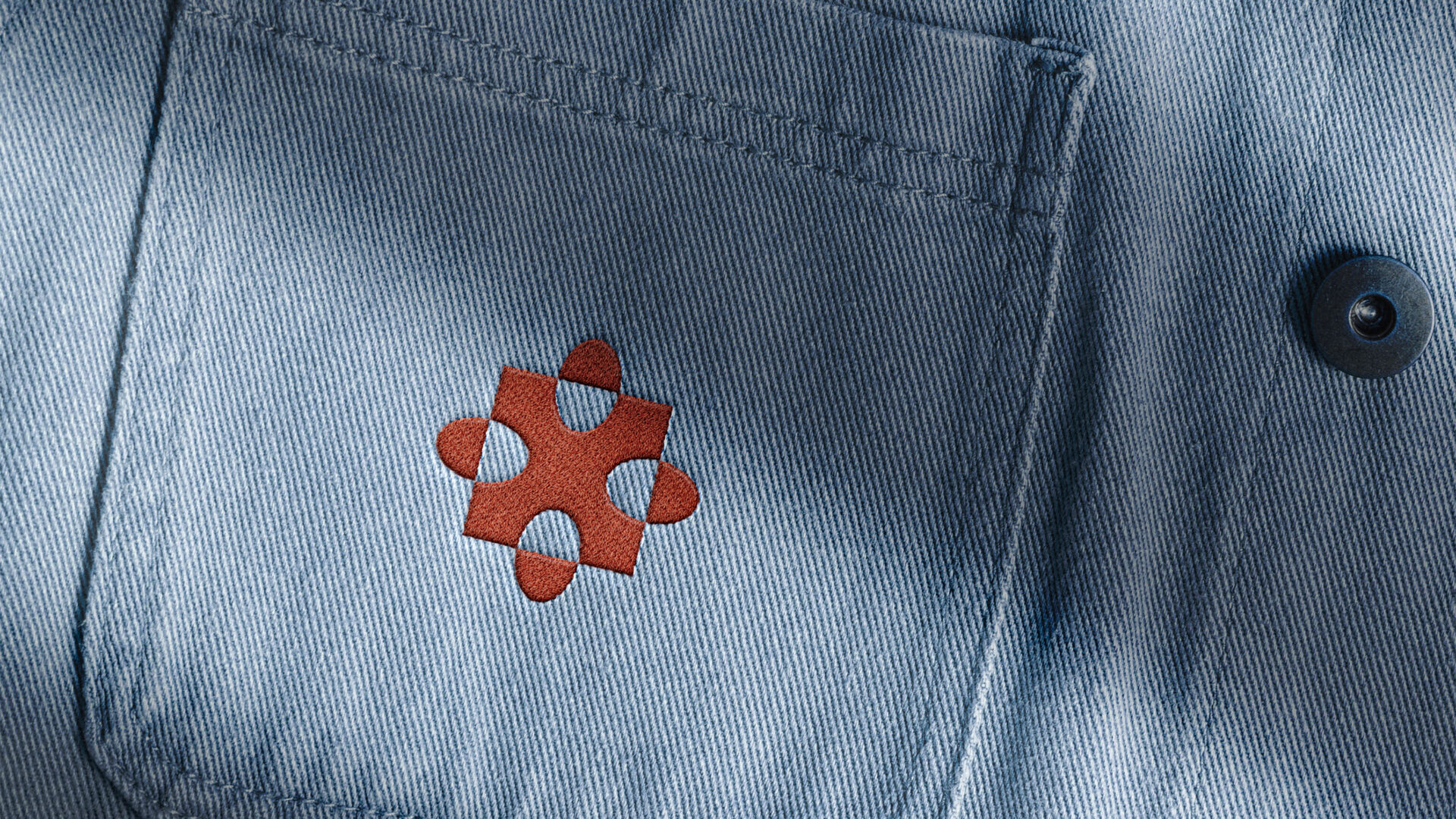
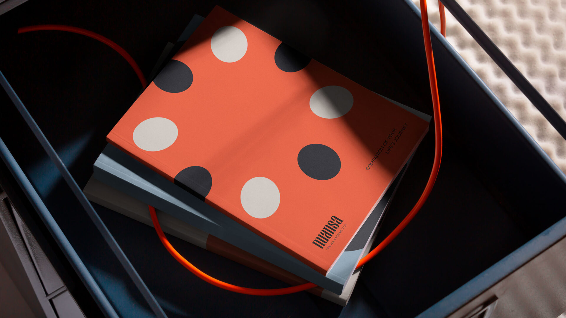
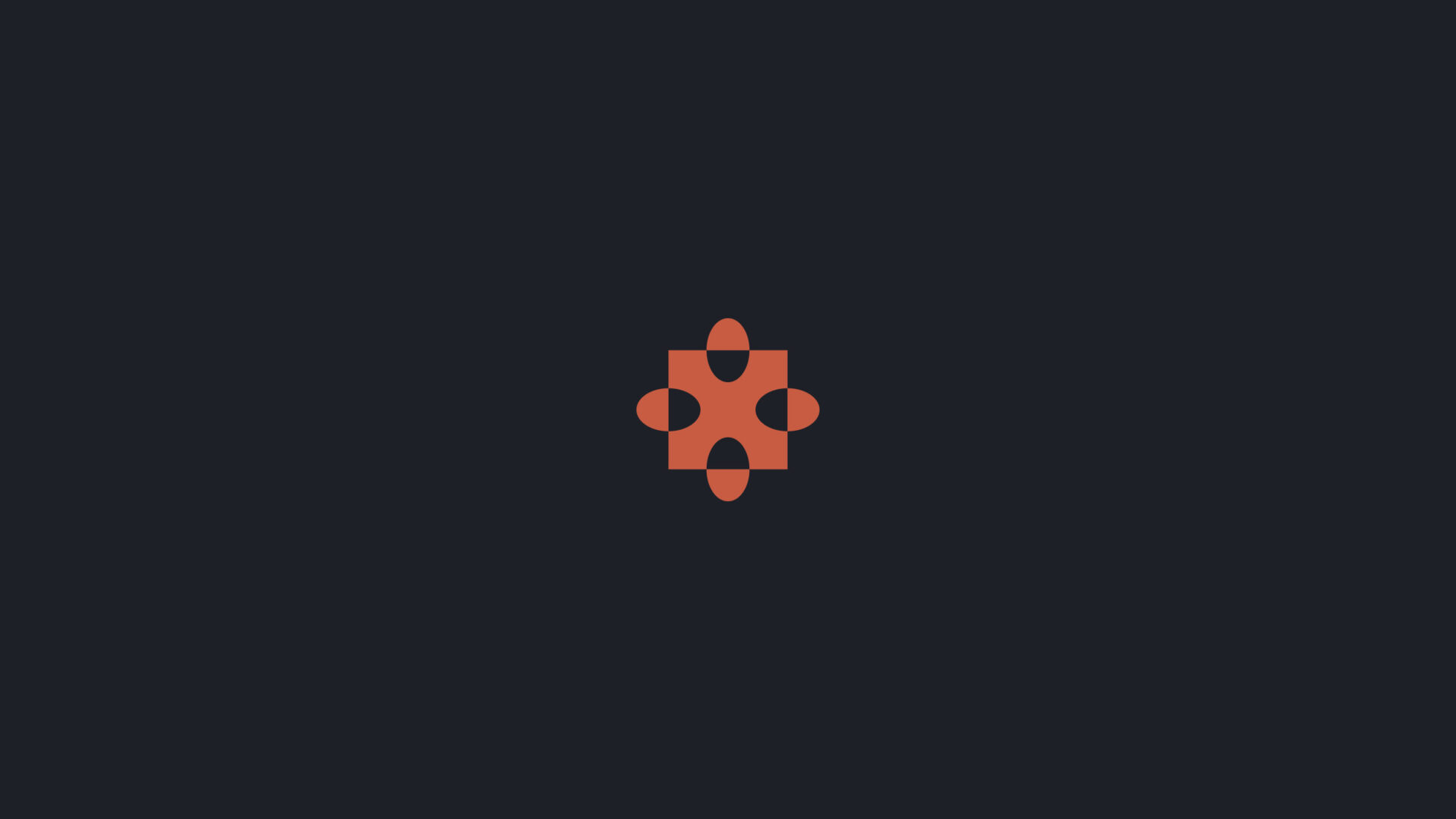
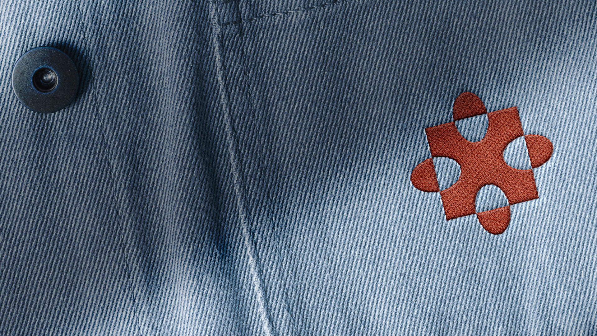
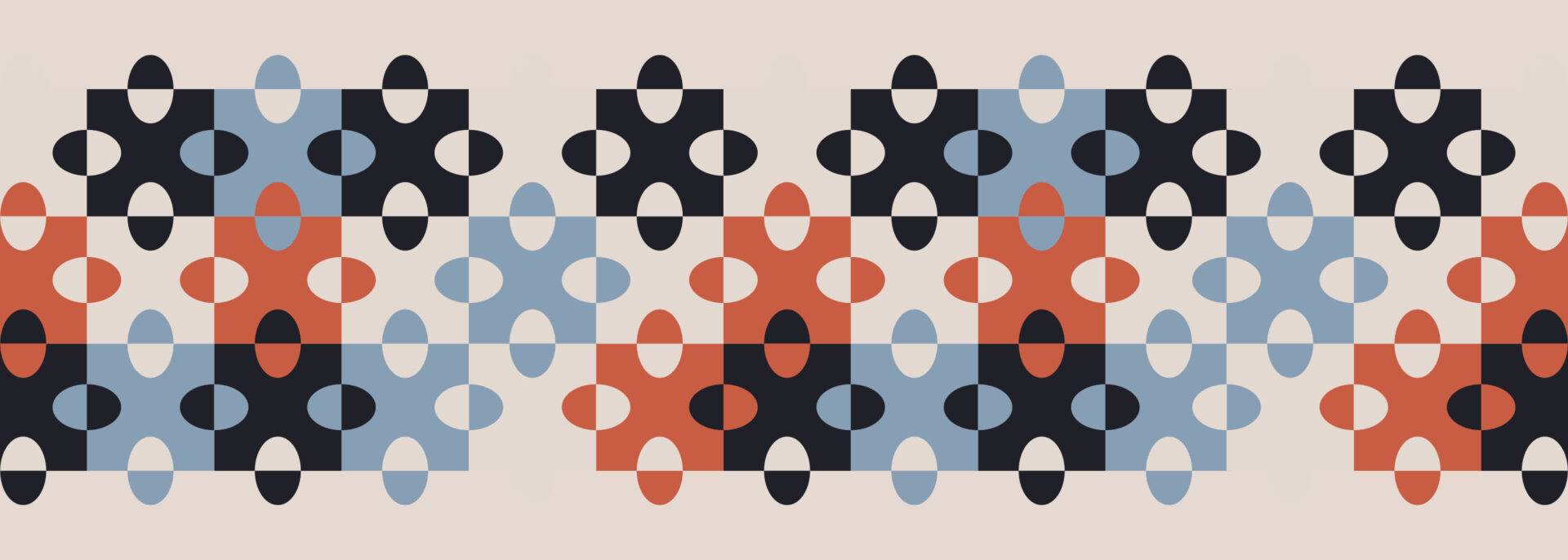
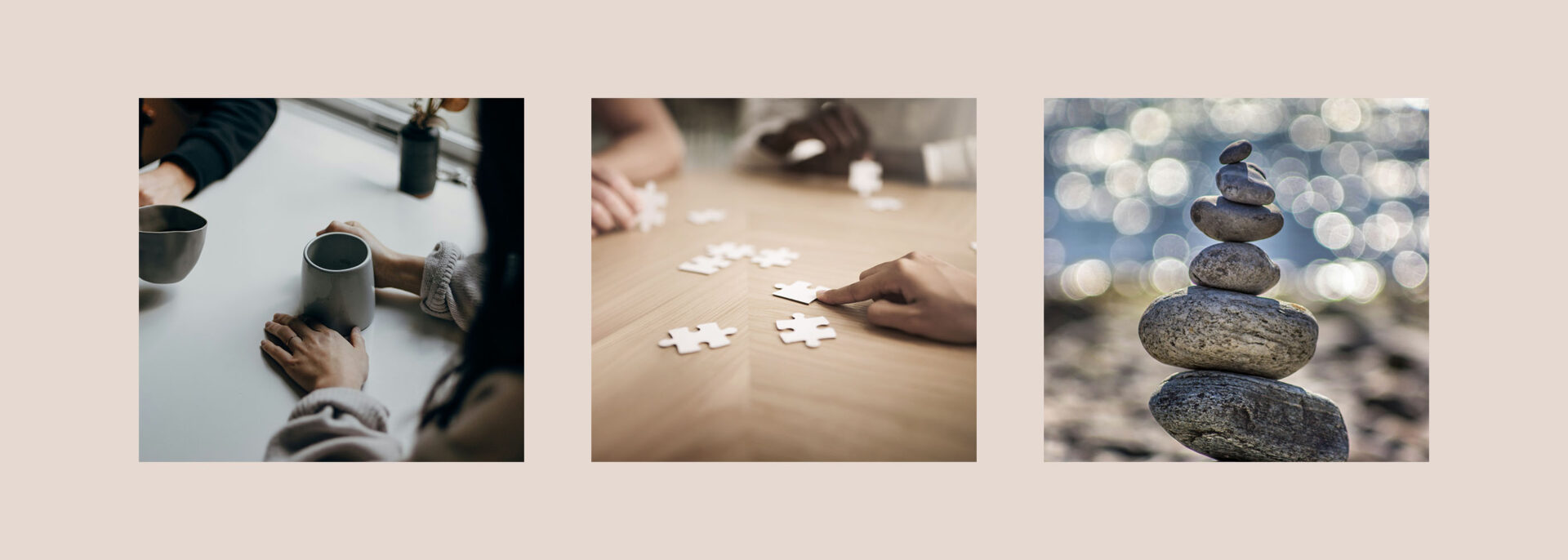
Minimalism and clarity form the foundation of the visual identity. Clean shapes and the harmonious composition of graphic materials direct attention to the brand’s core message. The designed elements reflect professionalism and a modern approach to therapy, avoiding unnecessary embellishments. The concept is based on a set of unique icons and illustrations inspired by puzzle shapes and Bauhaus aesthetics, symbolizing the search for connections, building relationships, and finding missing pieces in patients’ lives. The simplicity of the forms enhances the clarity of the message, while the geometric shapes bring order and cohesion to the project.