Helieko
Helieko – gain a sunny perspective
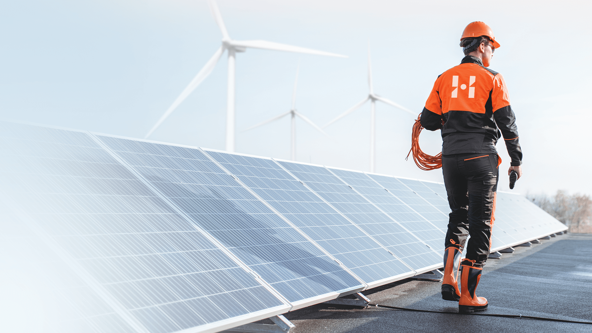
Helieko is a company specializing in modern photovoltaic solutions, operating since 2015 (initially as "Perfekt CO"). The brand offers a wide range of products, including photovoltaic modules, heat pumps, and energy storage systems, supporting ecological and sustainable energy acquisition.
Helieko provides comprehensive services, from consulting and installation to post-sales support, helping clients reduce electricity bills and increase energy independence. The company collaborates with reputable suppliers to deliver reliable and durable solutions, contributing to environmental protection.
Our client approached us with a clear goal: to refresh their outdated brand image, which no longer reflected their current objectives and values. The company aimed to create a modern identity that better represented its broad range of activities and commitment to sustainable development. As part of this process, our task was to develop a new name — Helieko.
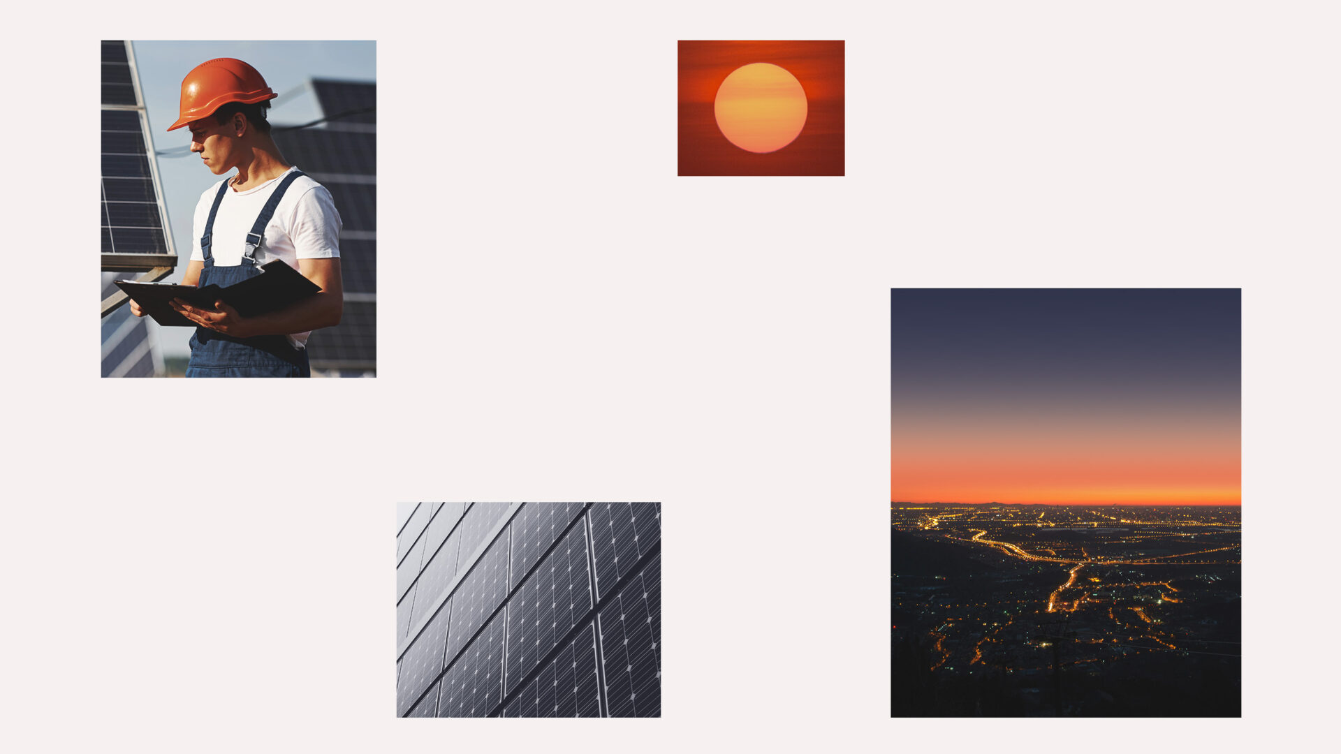
In rebranding Helieko, we conducted an in-depth analysis of the company’s profile, which has long emphasized professionalism, top quality, and ecological energy solutions. The new visual identity was designed to fully reflect these values while introducing a fresh and contemporary perspective.
We drew inspiration from the natural environment in which installers work-taking cues from the colors of
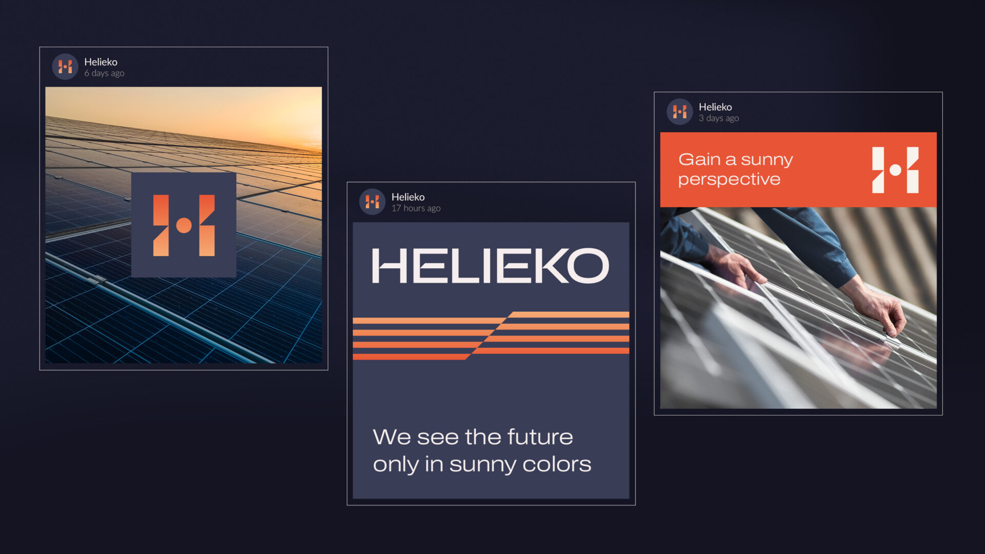
the sun and sky, as well as the geometric shapes of photovoltaic panels and sun rays. As a result, the new logo and brand identity symbolize the harmonious integration of technology and nature, highlighting Helieko’s commitment to sustainable development and a modern approach to renewable energy.
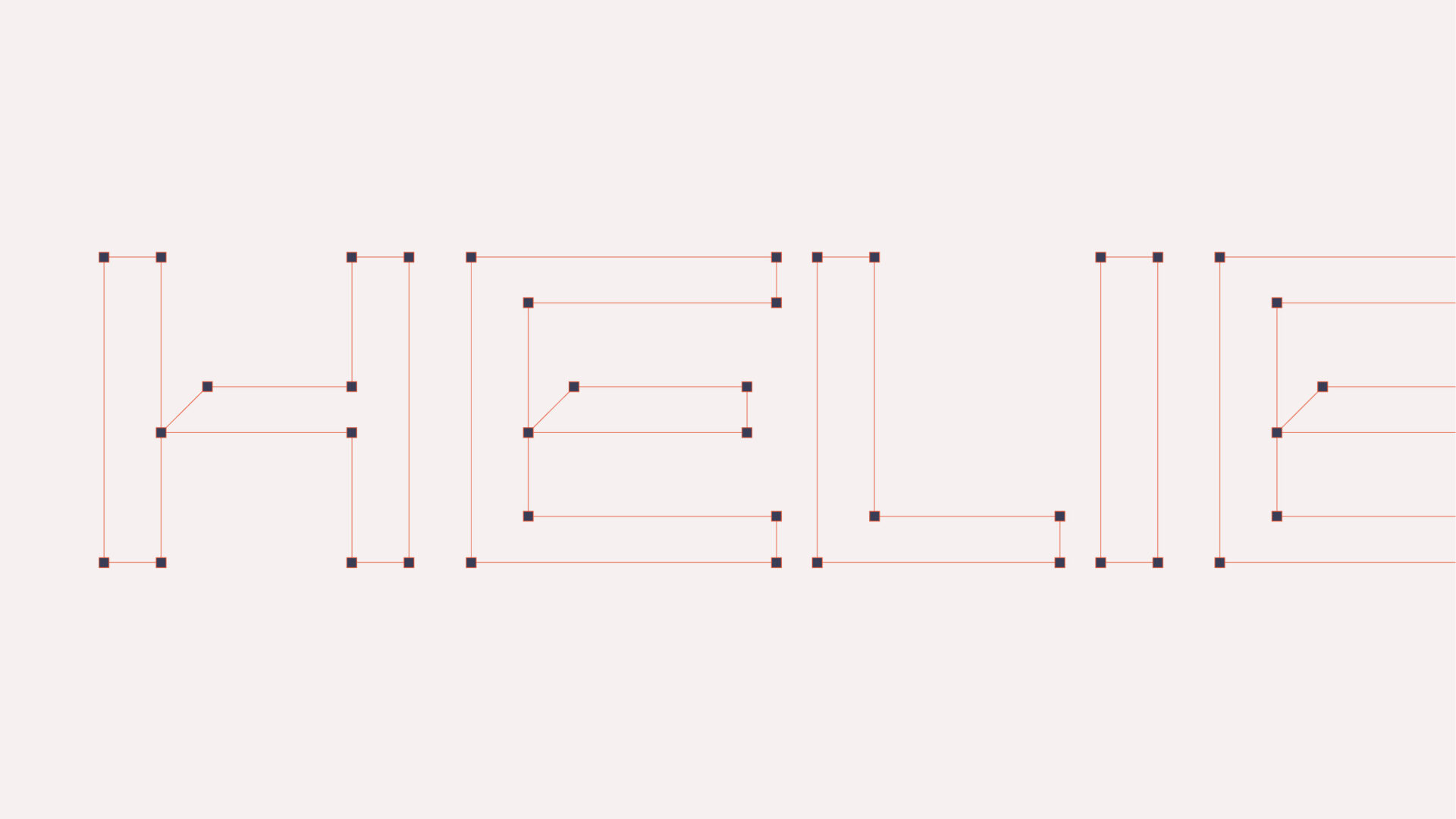
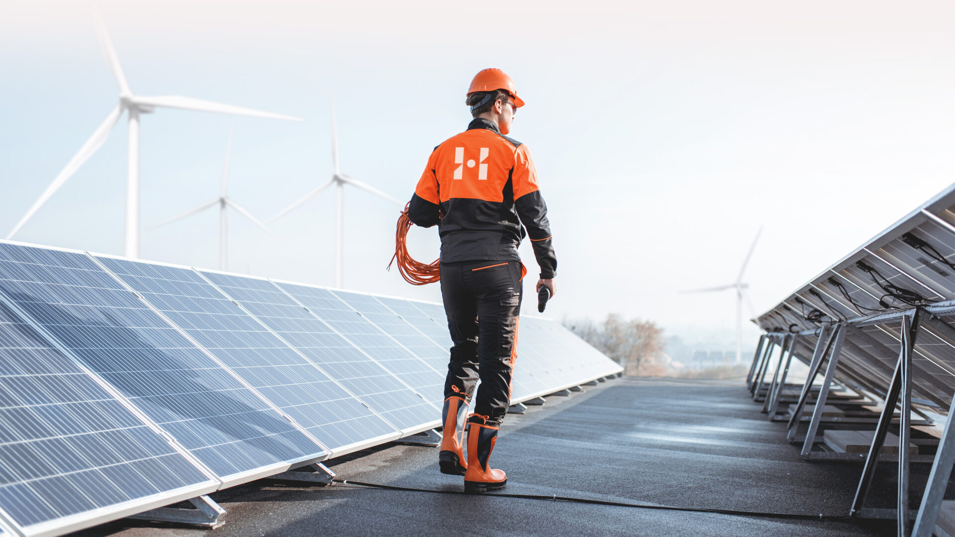
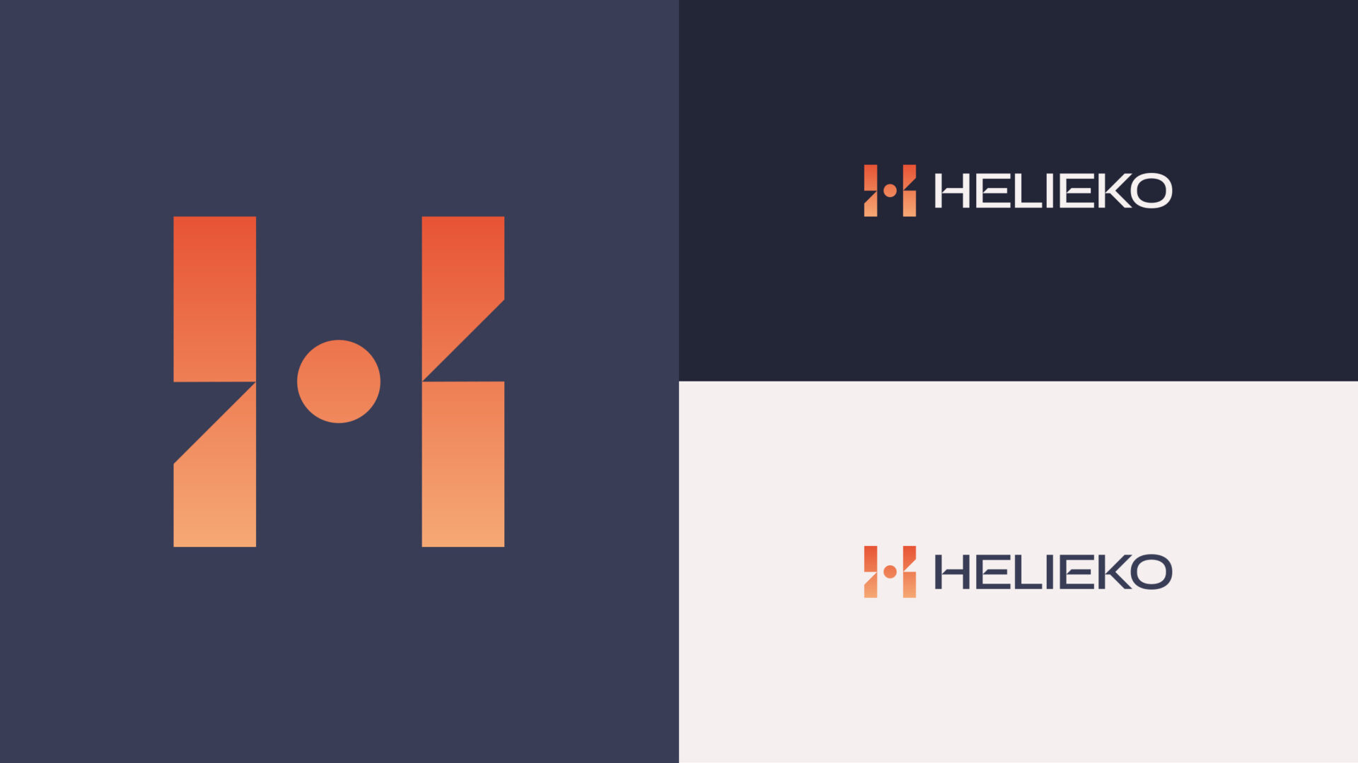
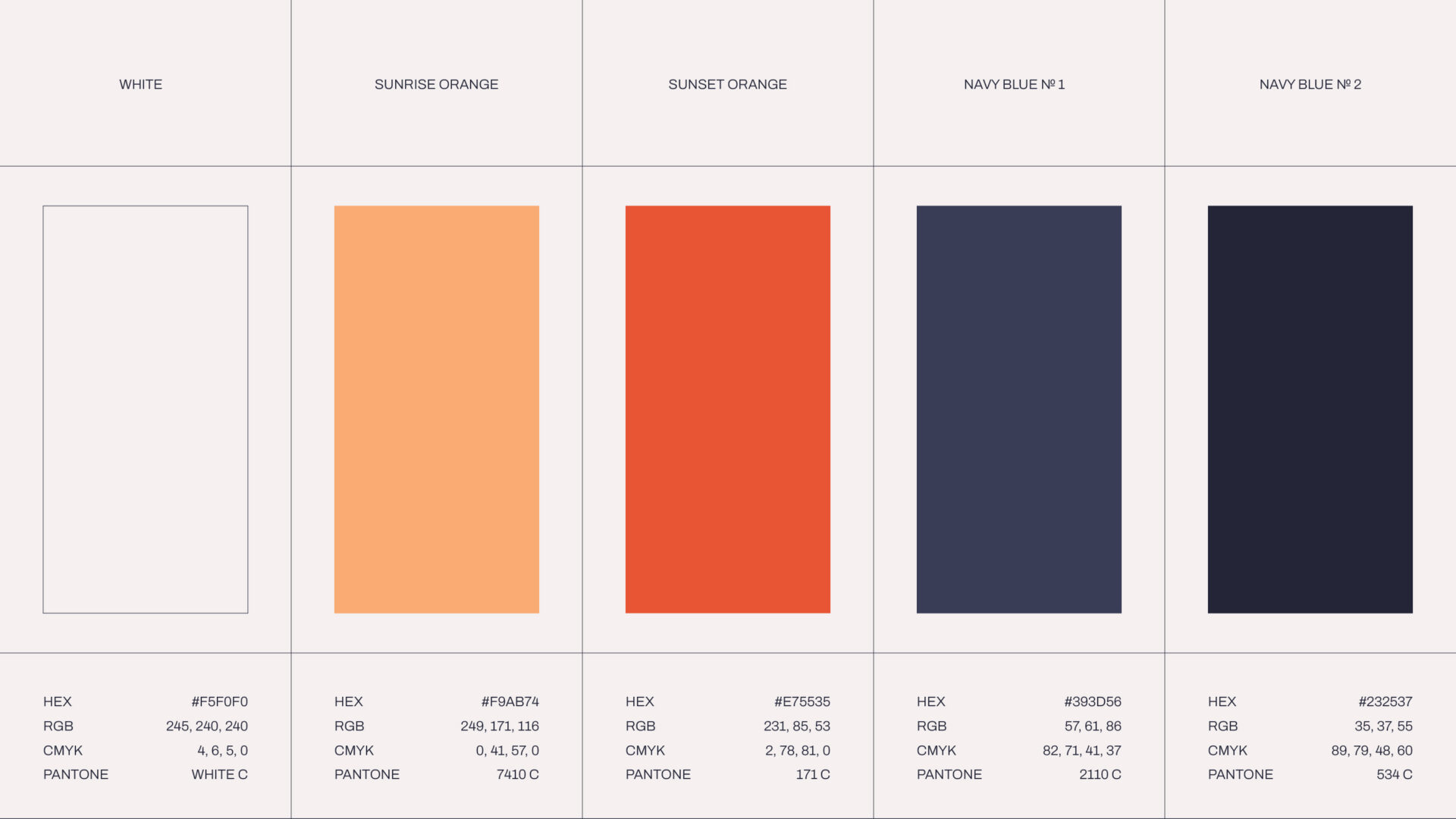
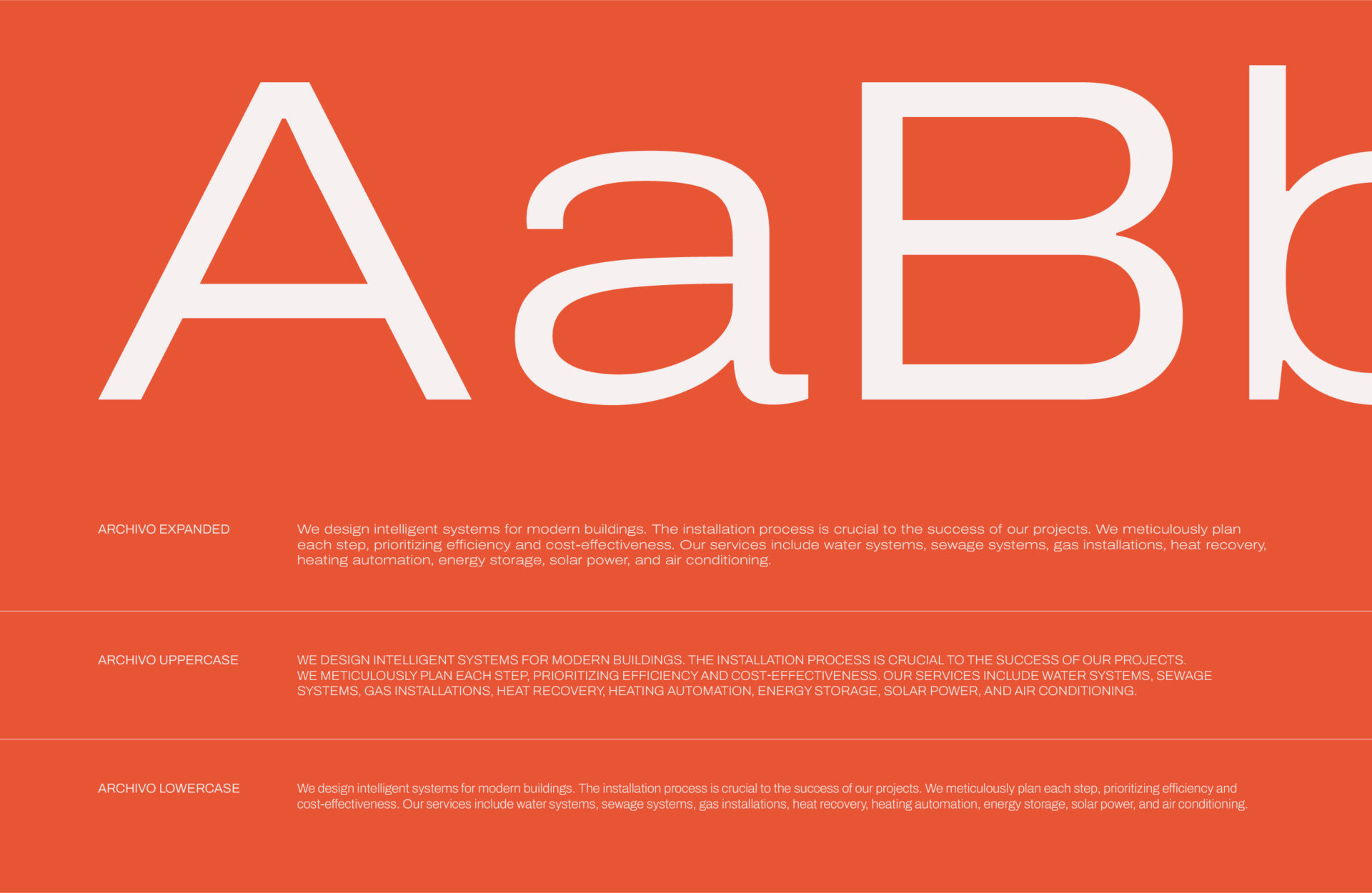
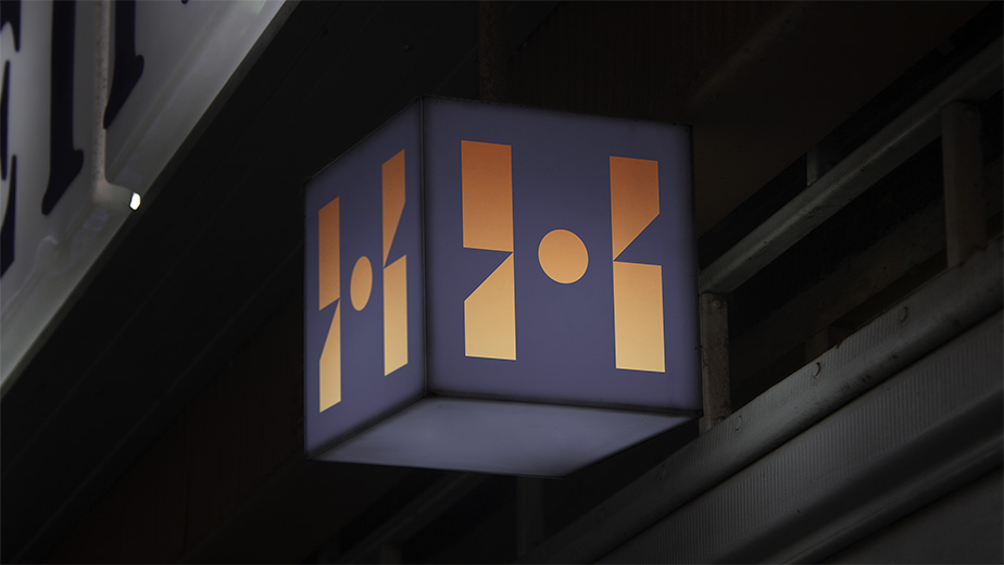
The outcome of our work is a modern logo where the letter “H” serves as a distinctive emblem, and the typography has been carefully crafted. The new logo represents the fusion of modern technology with natural resources, reflecting the company’s philosophy. The color scheme of the logo represents the source of renewable energy — a harmonious blend of deep blue with contrasting orange, evoking the light of the sun at dawn and dusk.
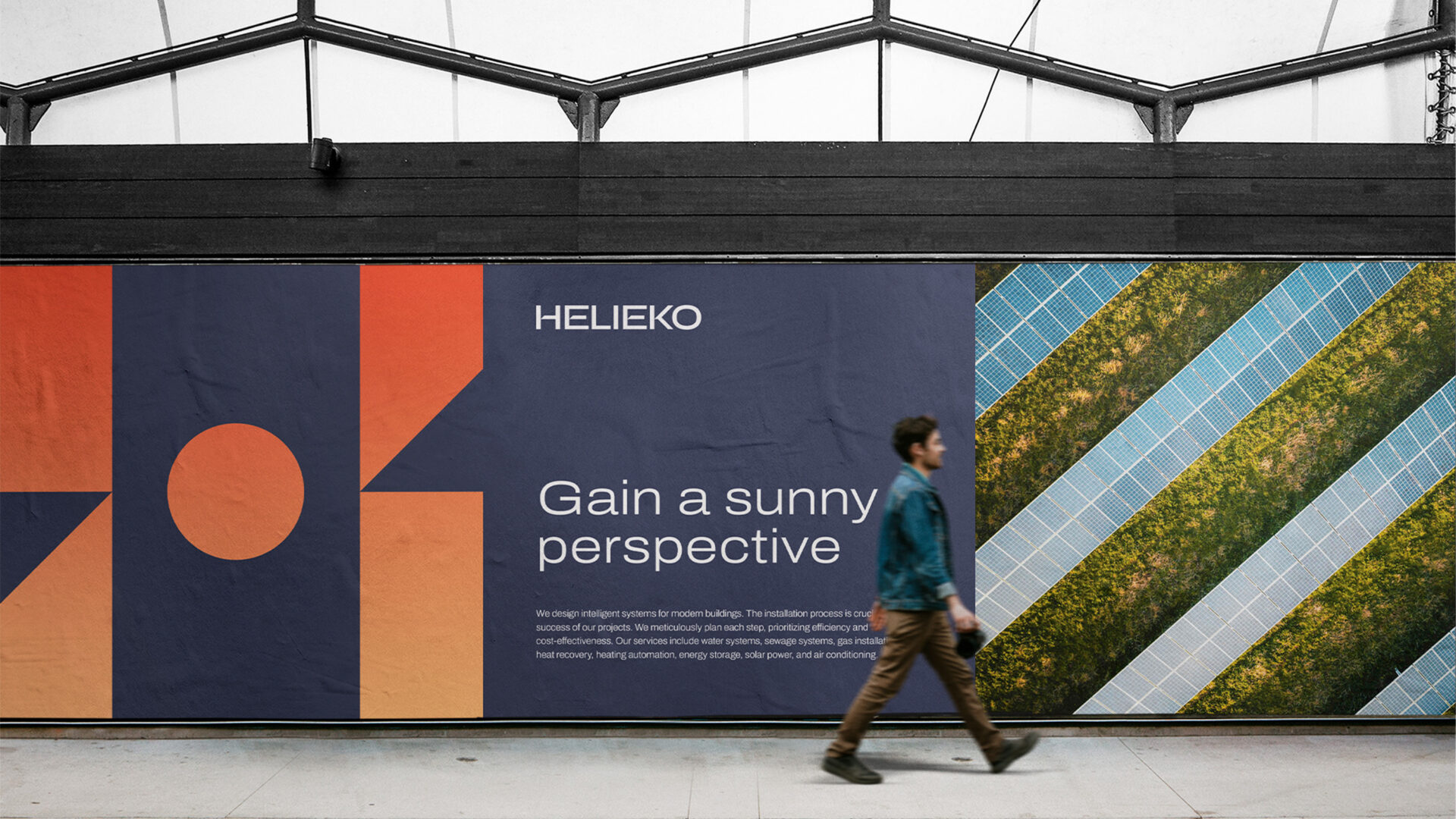
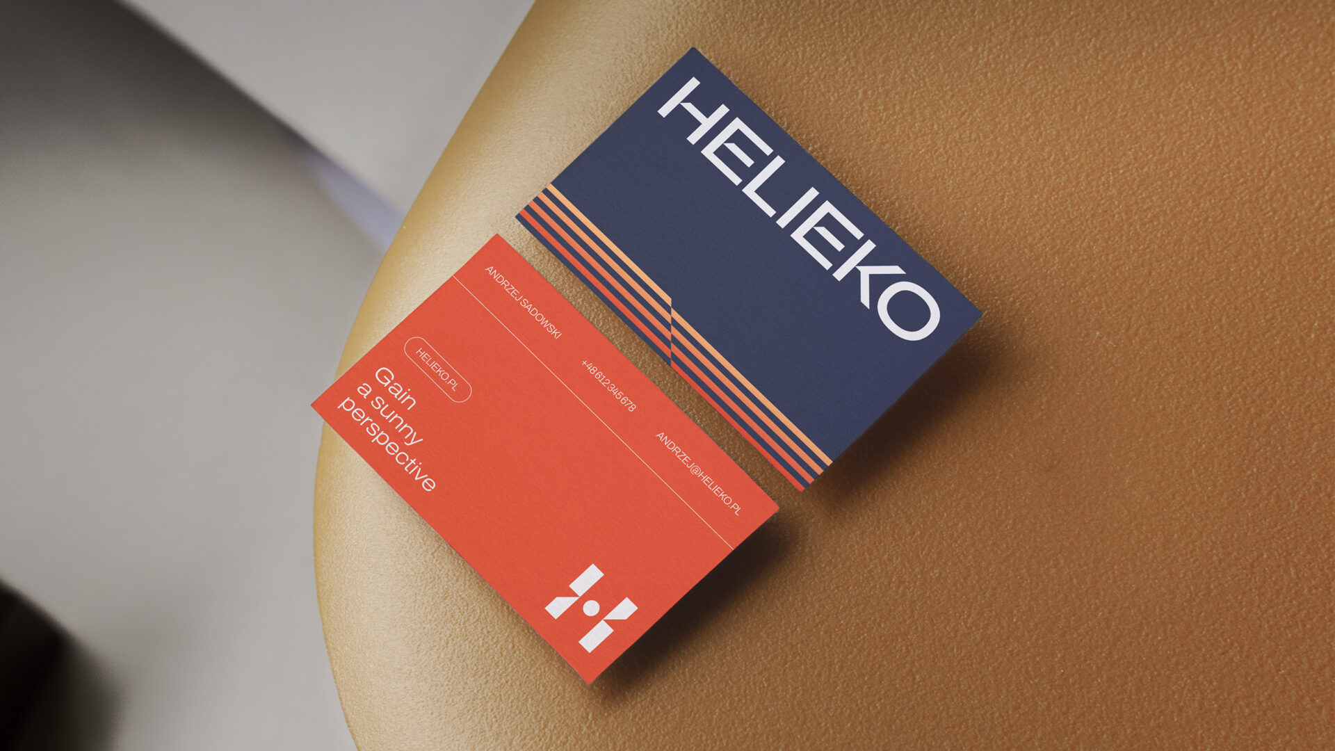
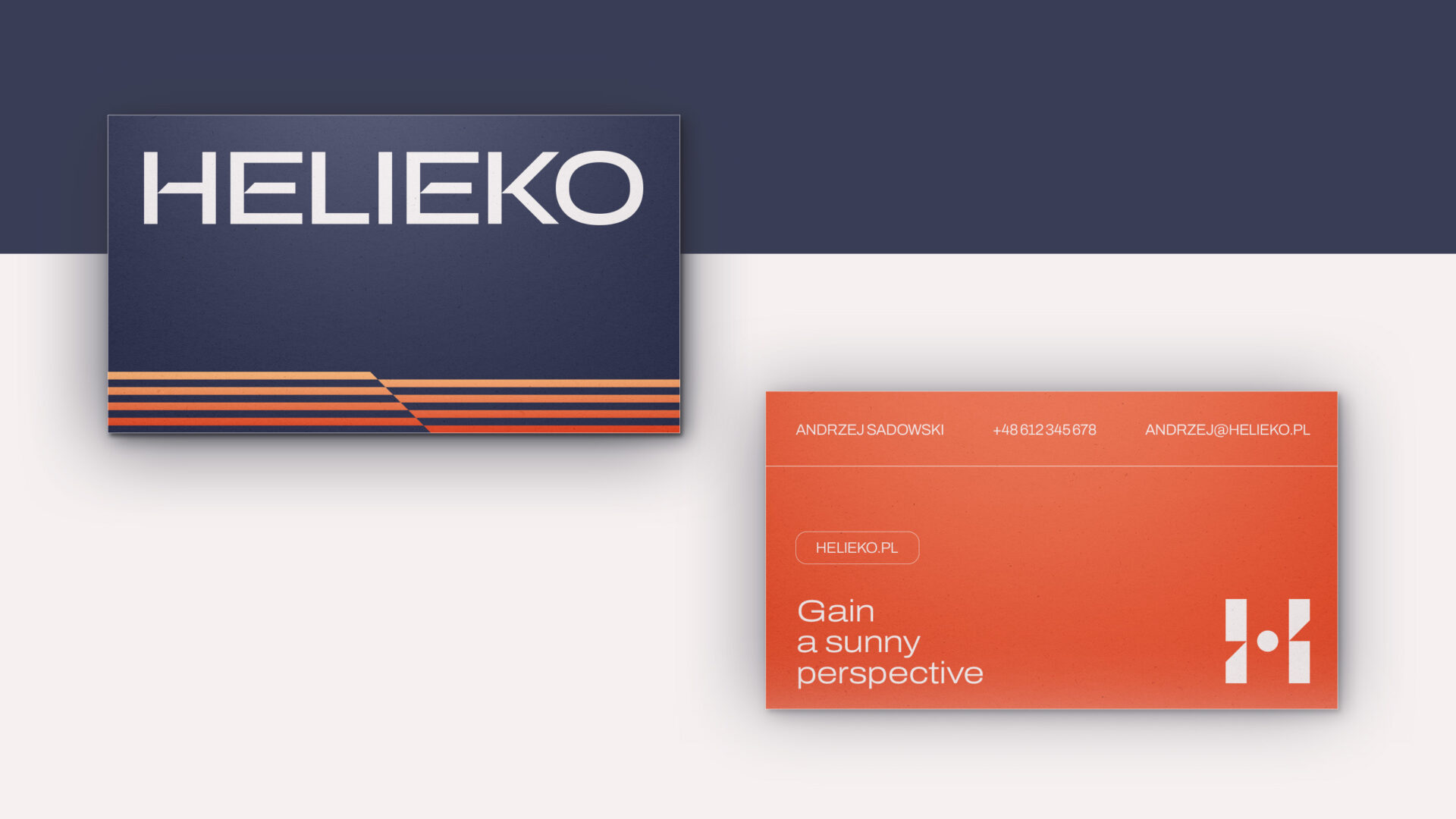

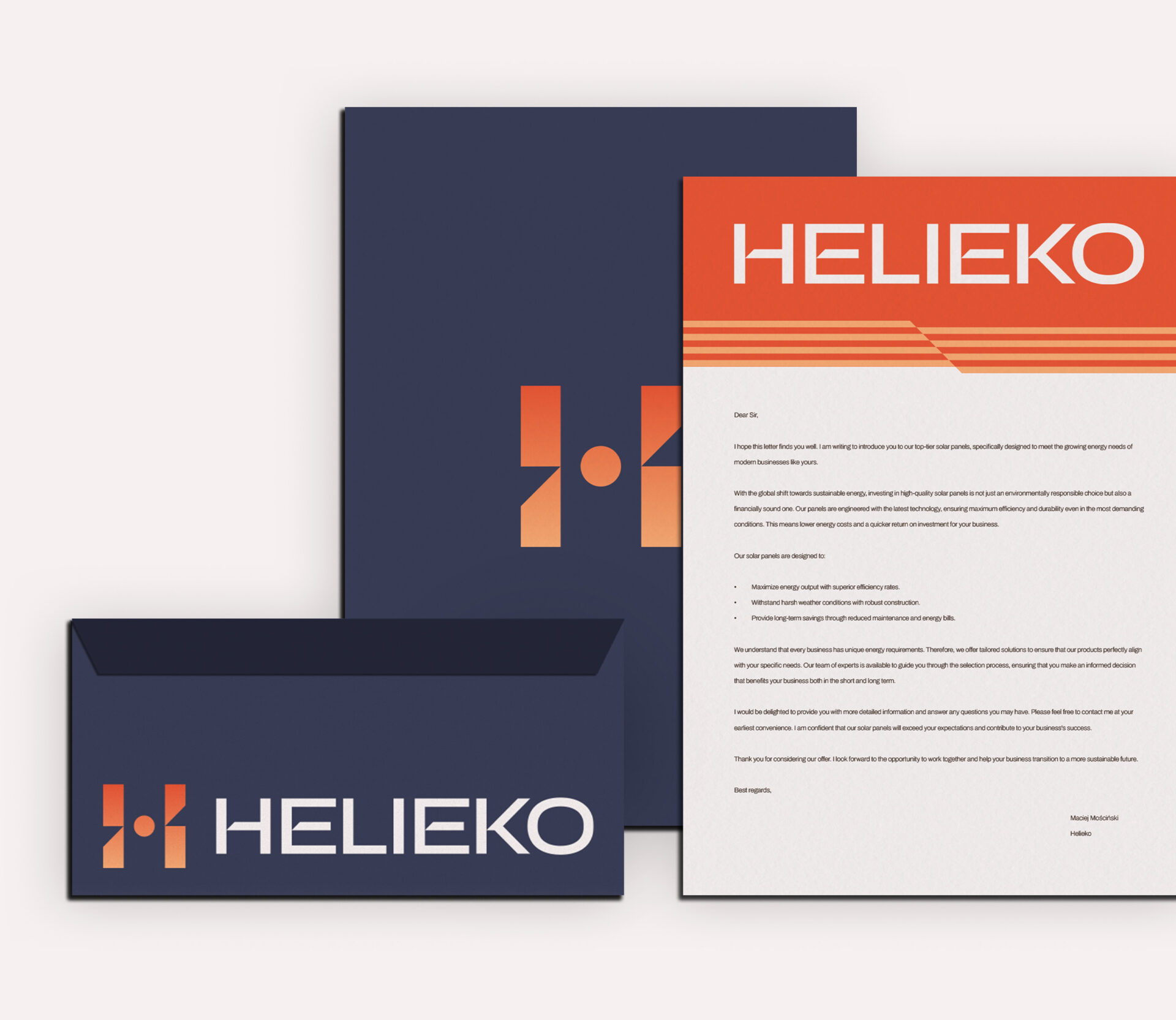
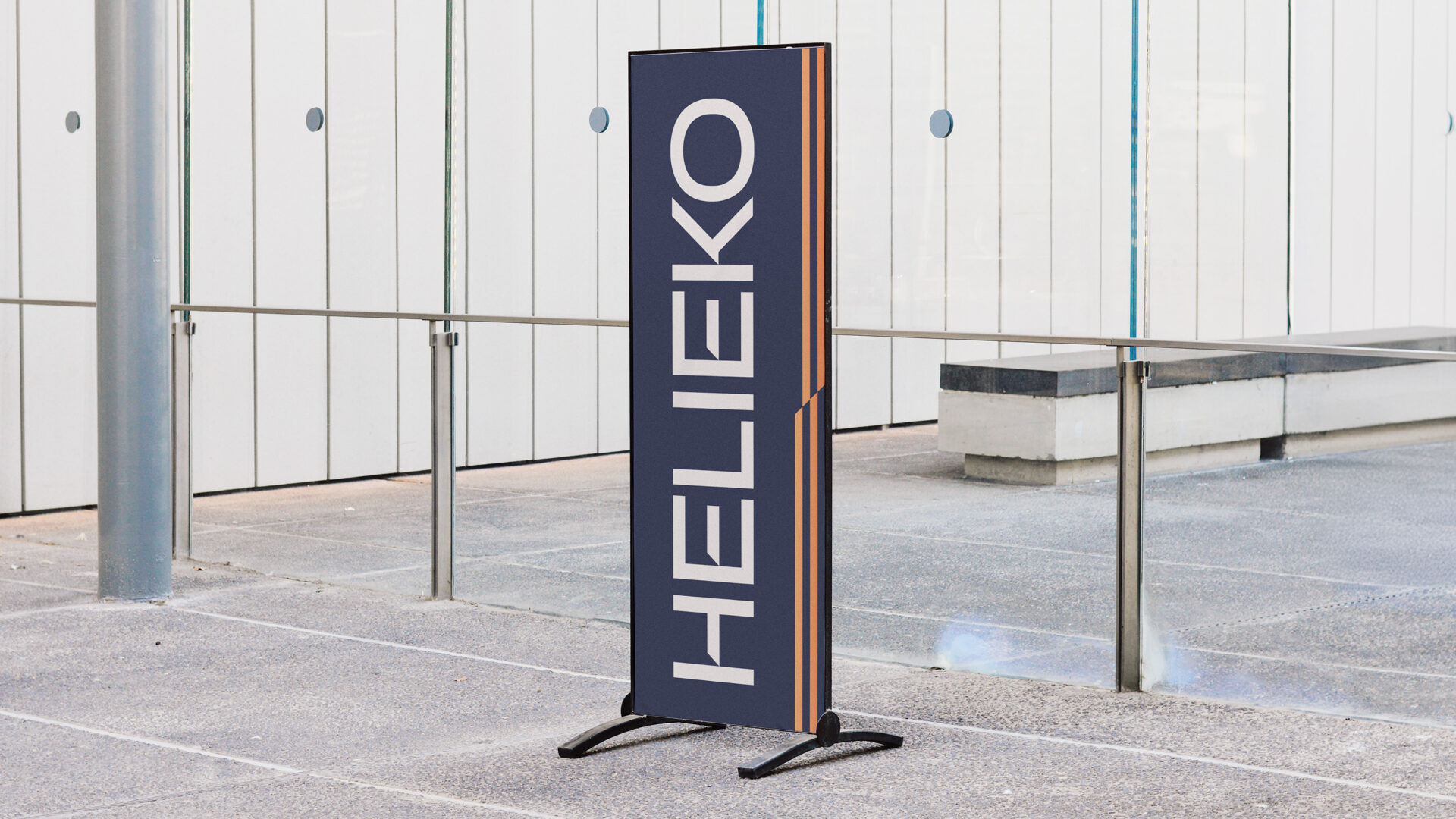
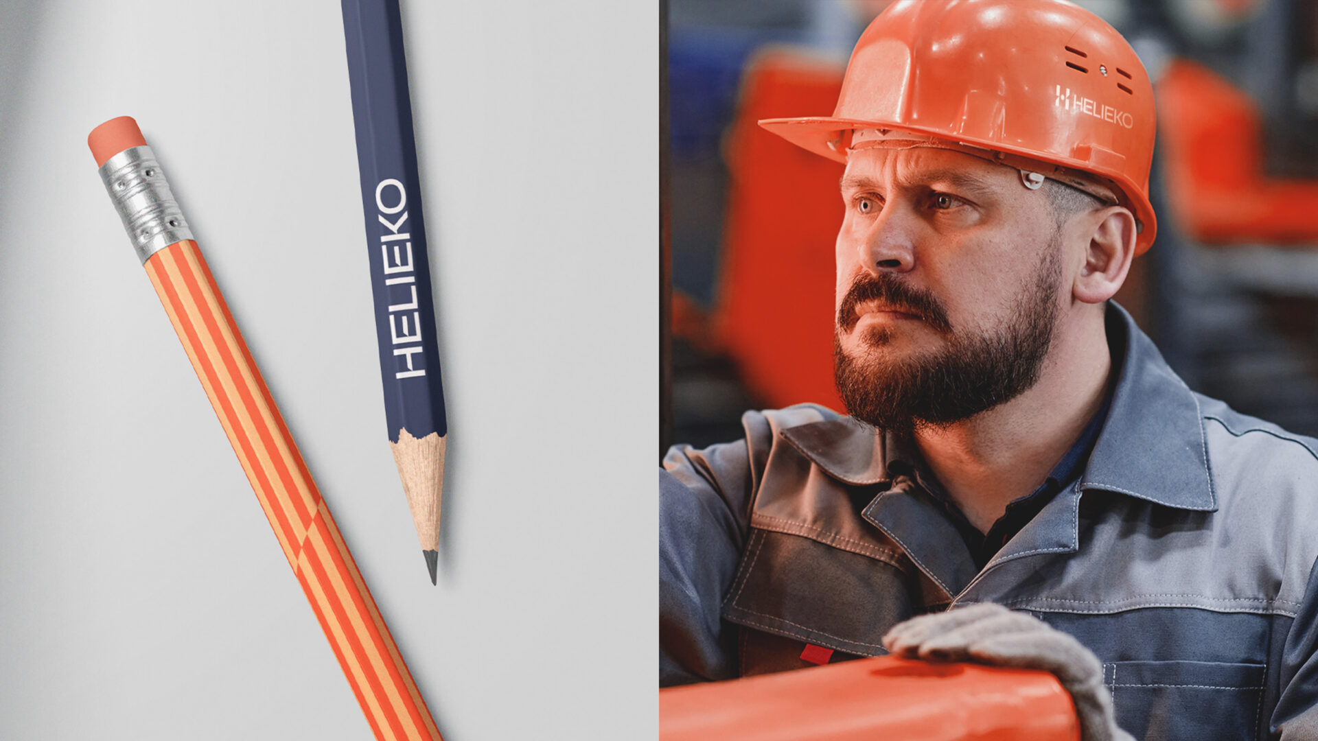
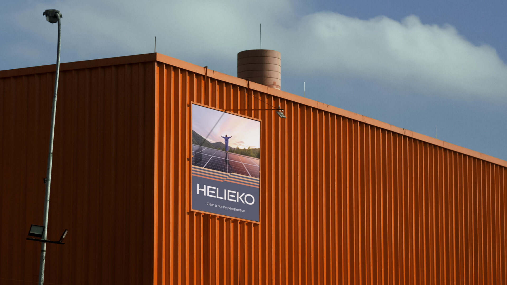
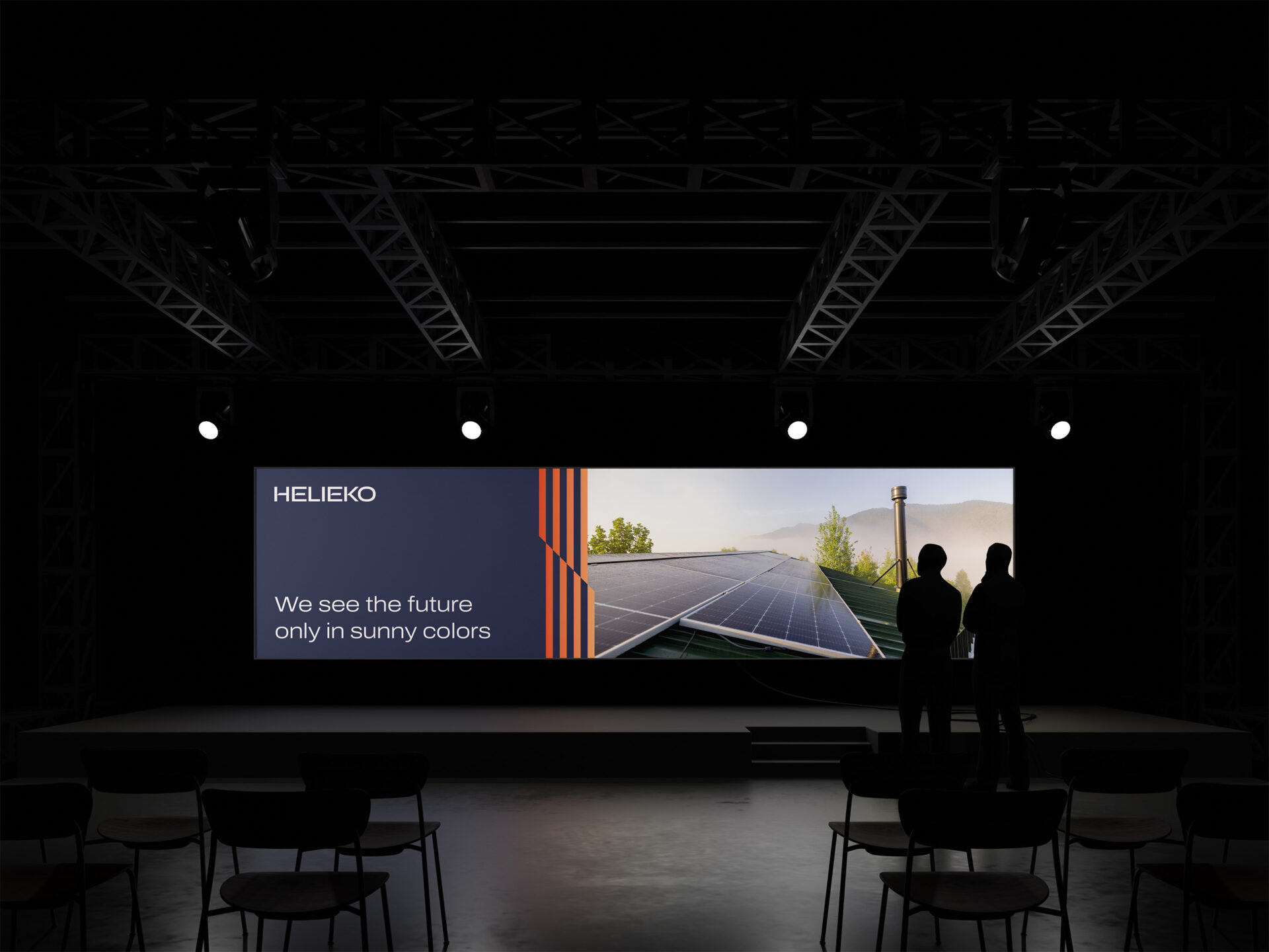
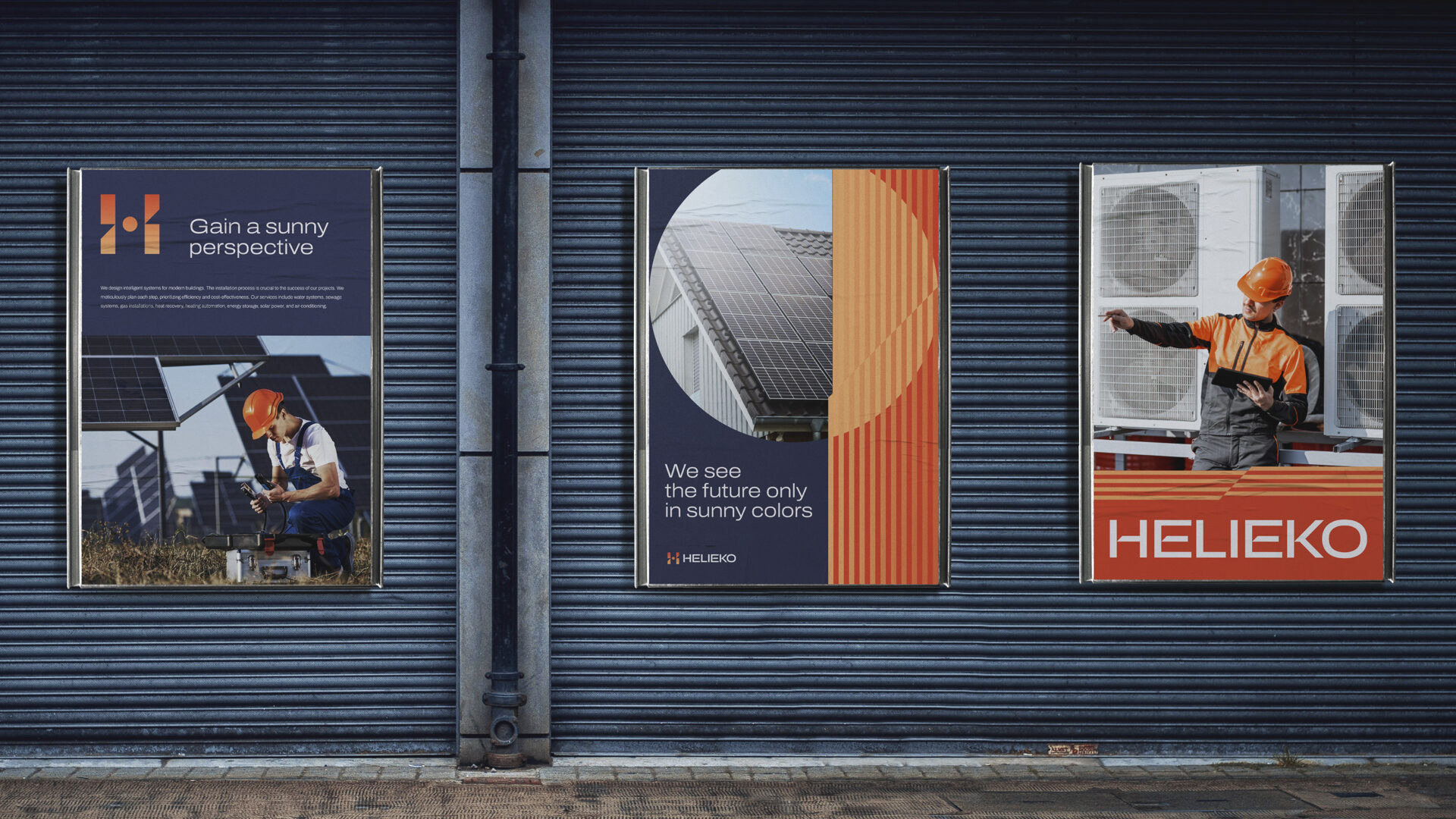
As part of the rebranding, we created a new visual concept that serves as a solid foundation for all brand materials. Thanks to this universal concept, our visual communication is both consistent and harmonious, effectively conveying the company’s values and mission. New materials, from the logo and printed materials to the website, were designed with simplicity and character in mind, ensuring their effectiveness for both business and individual audiences.

