DWE Group
DWE Group – A Place for Your Dreams

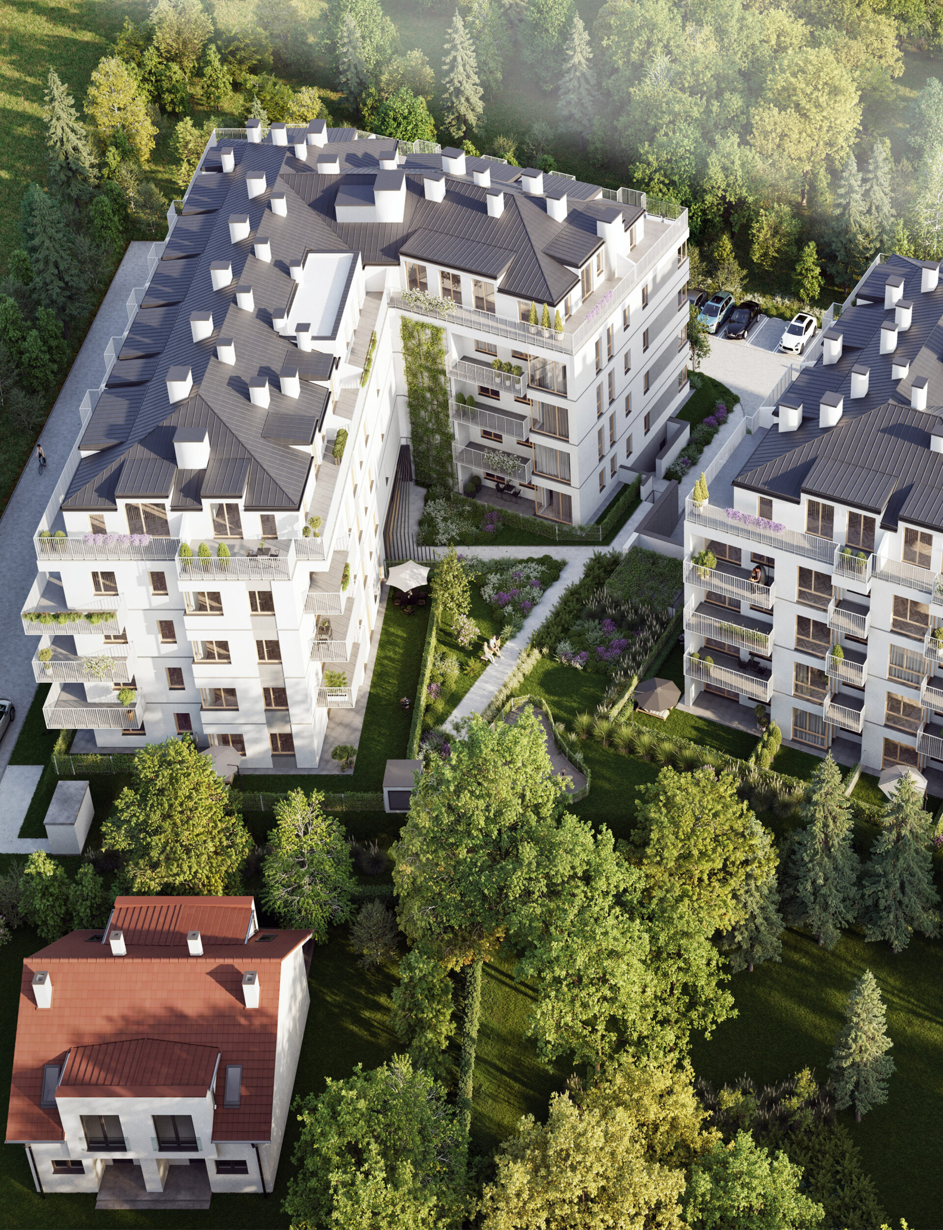
DWE GROUP is a Warsaw-based property developer delivering residential projects with growing reach and ambition. However, their brand image no longer reflected the scale and quality of their investments.
The lack of a consistent identity hindered communication and weakened brand distinctiveness in the competitive Warsaw market.
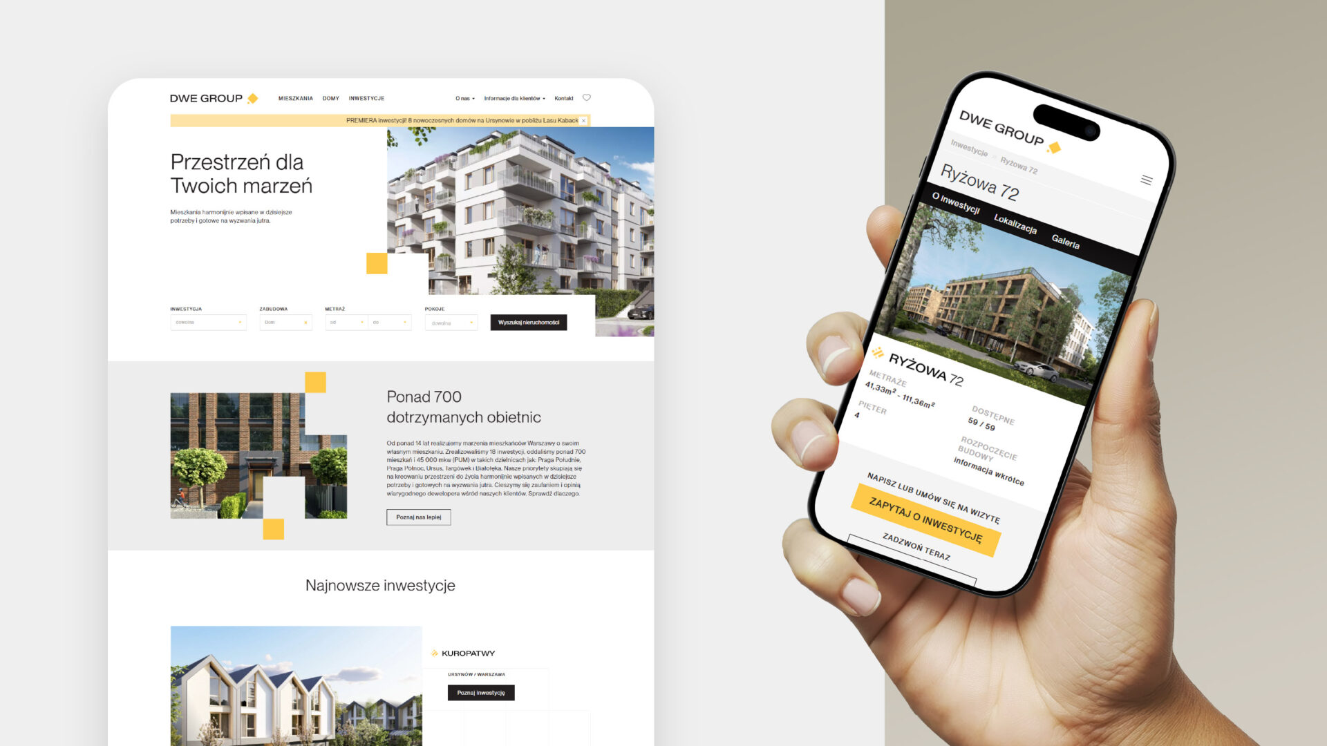
We were invited to lead a comprehensive rebranding process – both on the strategic and visual levels. The goal was to refresh the brand’s image, align it with current market standards, and build a strong foundation for consistent and future-proof communication. Our scope of work included:
– facilitating strategic workshops with the client
– developing the visual direction and identity system
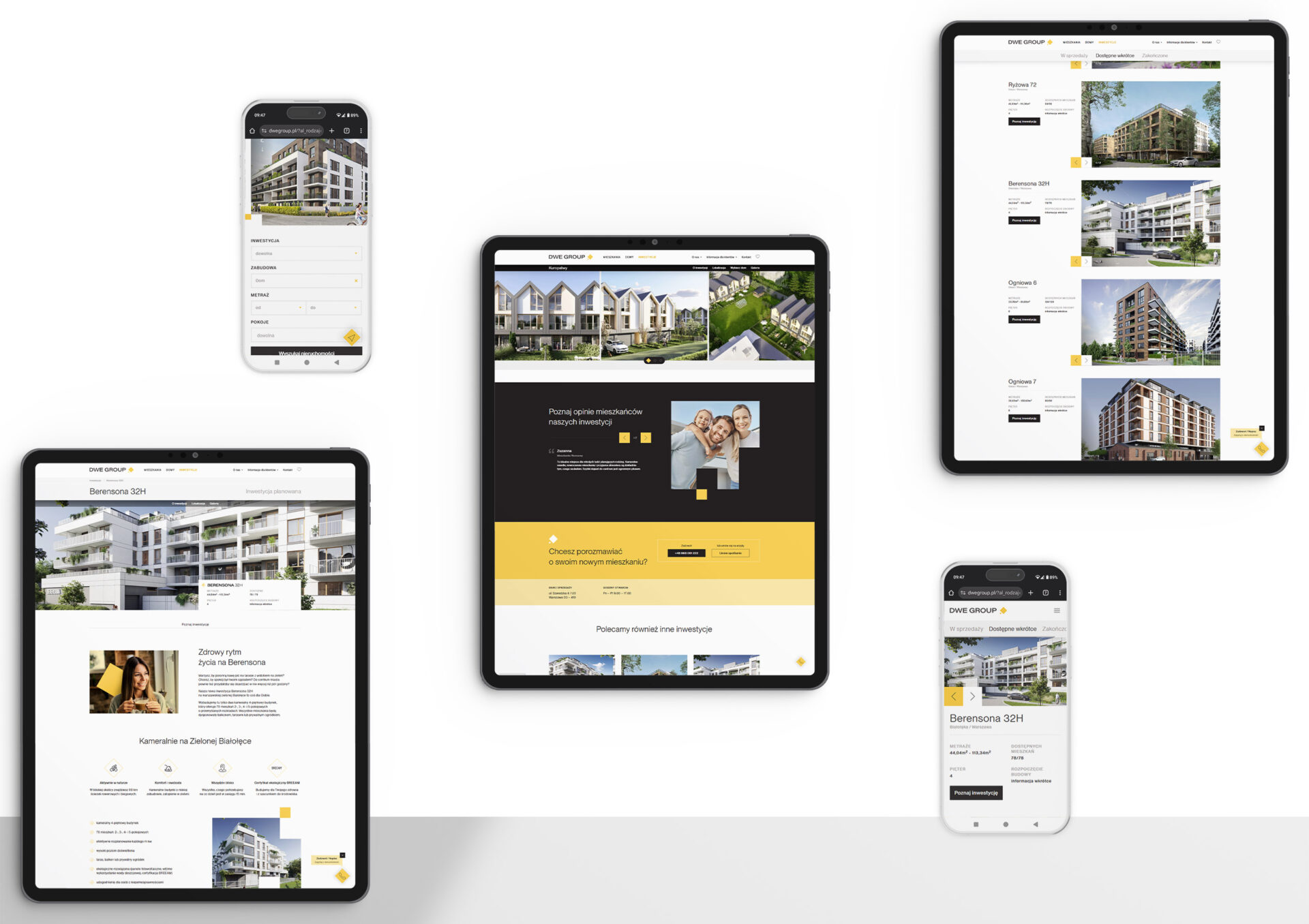
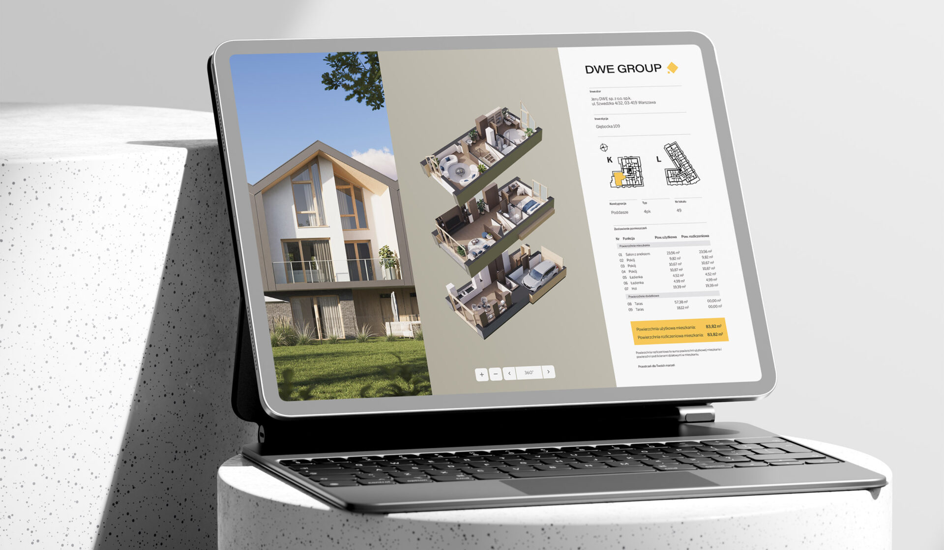
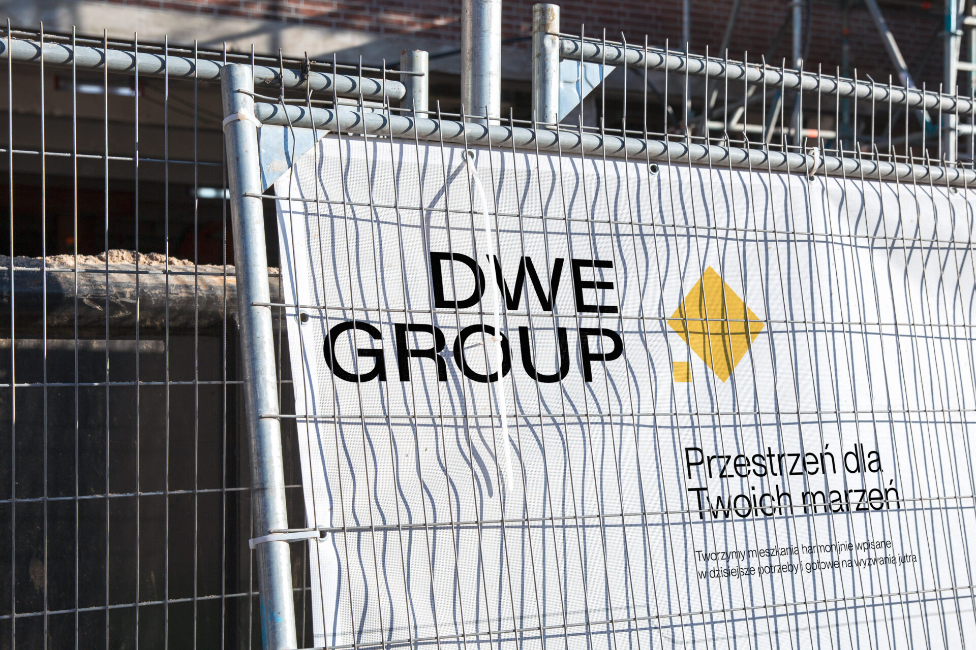
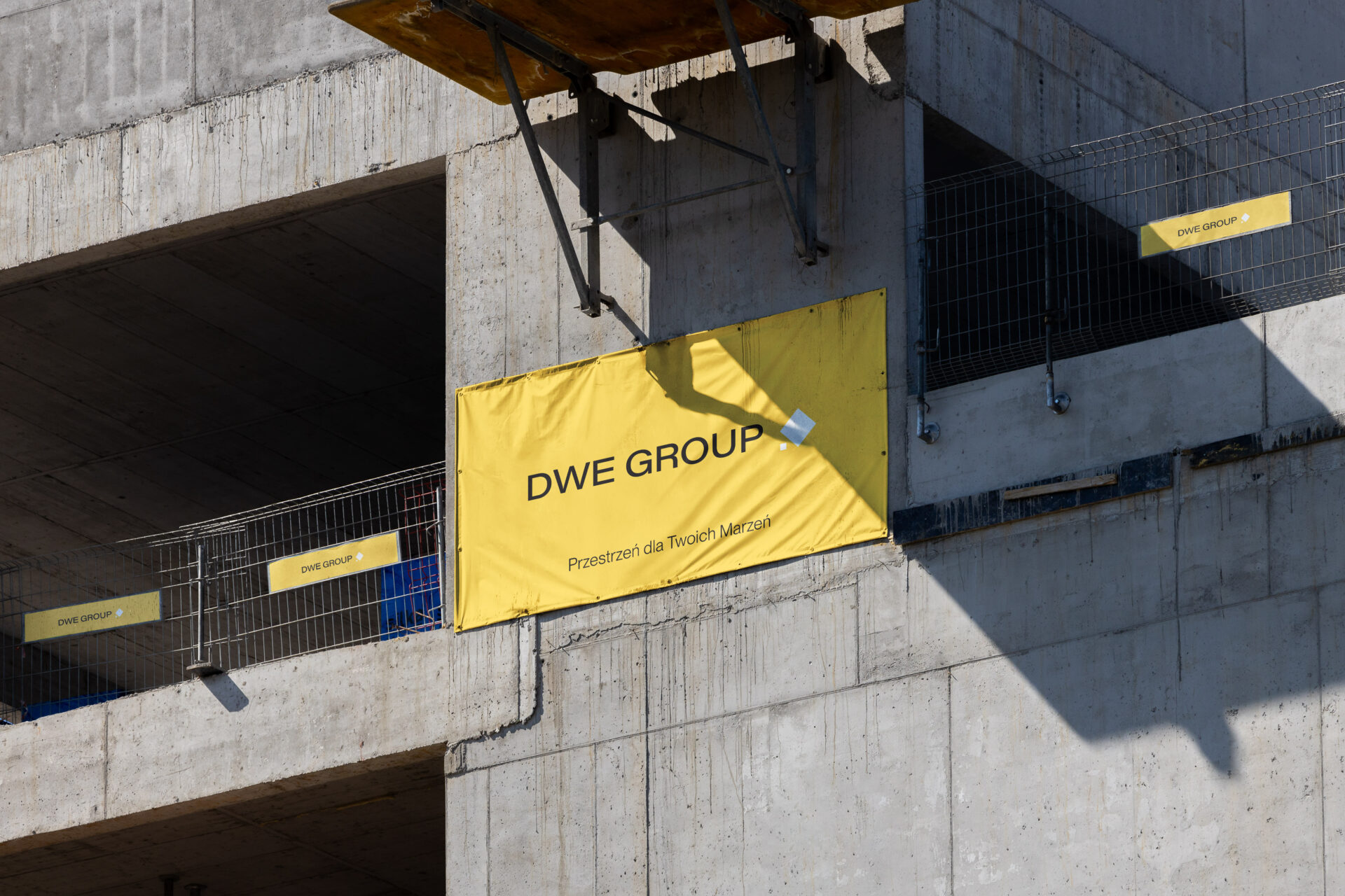
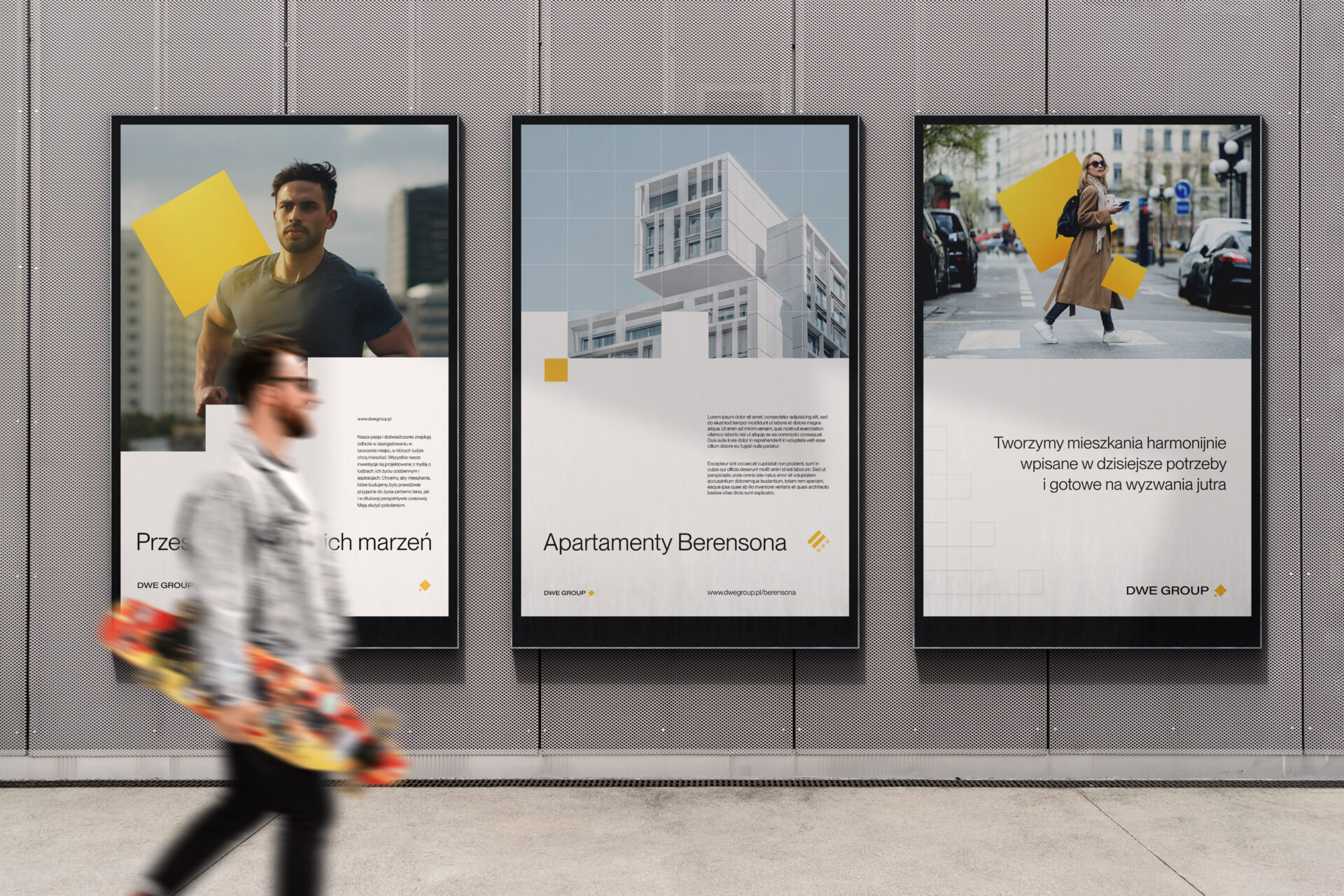
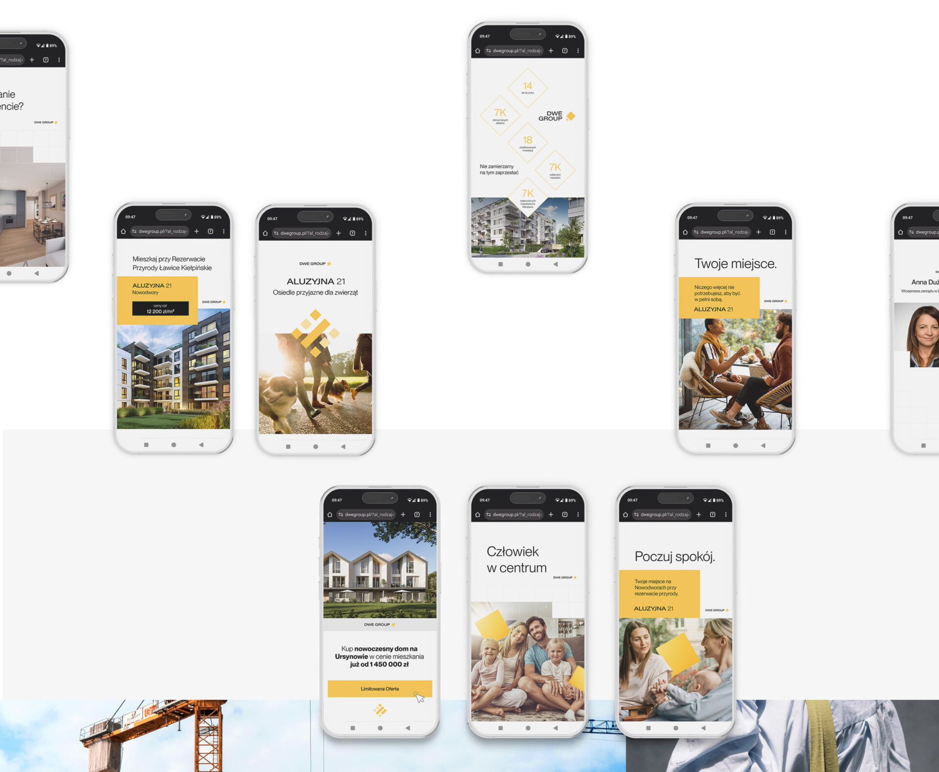
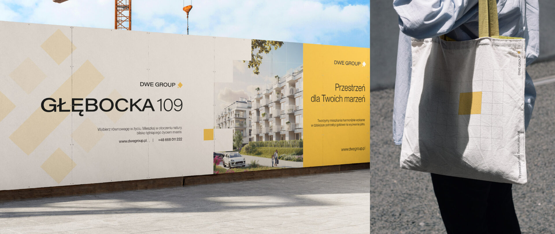
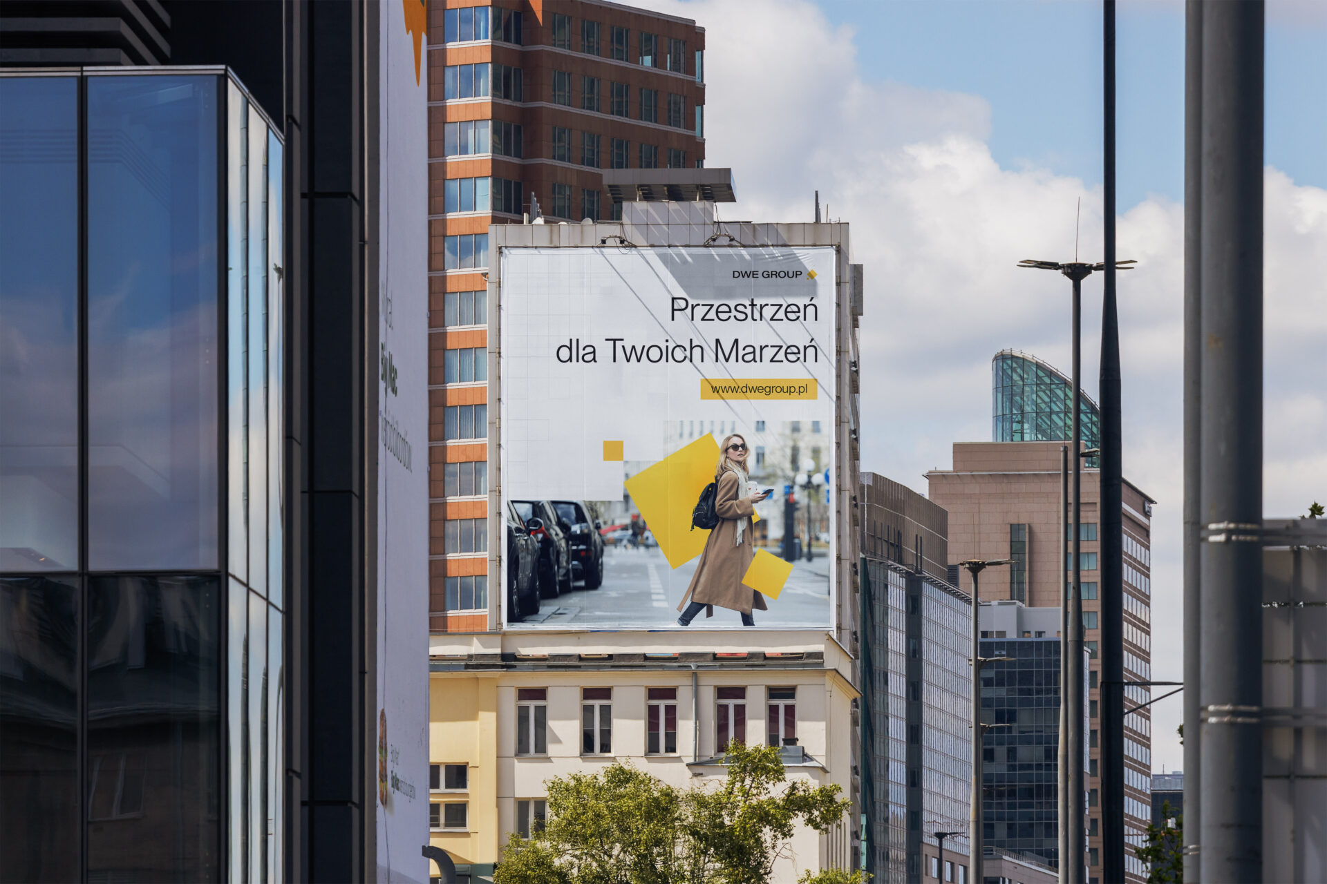
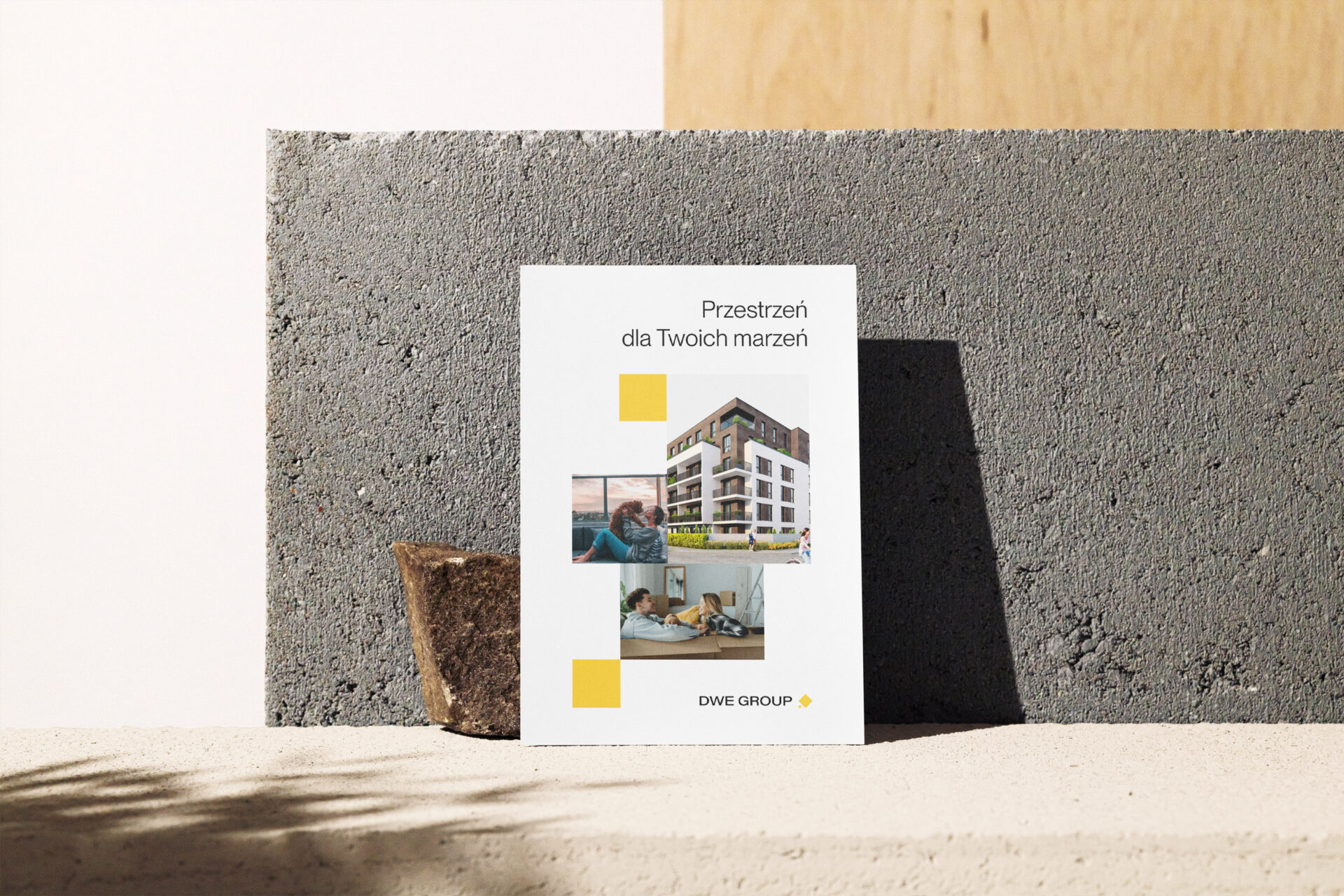
– implementing new design standards across online and offline channels
– providing ongoing communication support after the rollout
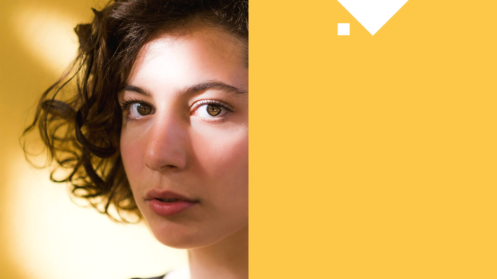
Everyone has a dream.
Sometimes it’s a first balcony with a view of the sunrise. Sometimes it’s a room for a child. Or simply the quiet after a long day.
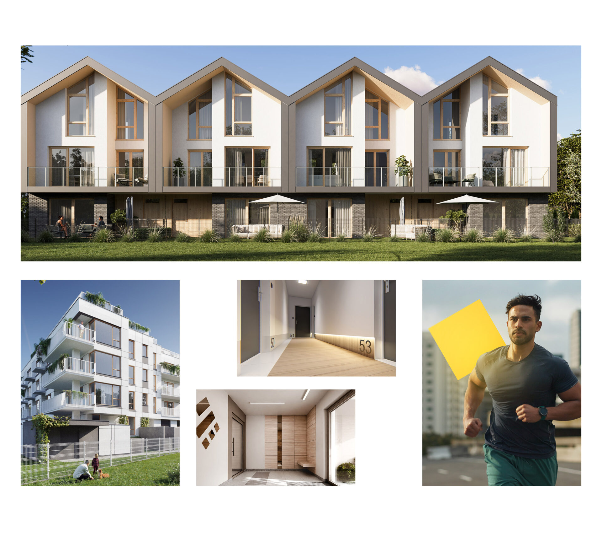
The new visual system for DWE GROUP tells that very story – about dreams that have a place to grow. The square, present in both the logo and the brand’s communication, became a visual metaphor for those dreams. It appears in photographs, layouts, and spatial elements – not as decoration, but as a symbol that these dreams are real. That the brand understands one essential truth: a home is not the end goal, but the beginning of something greater.

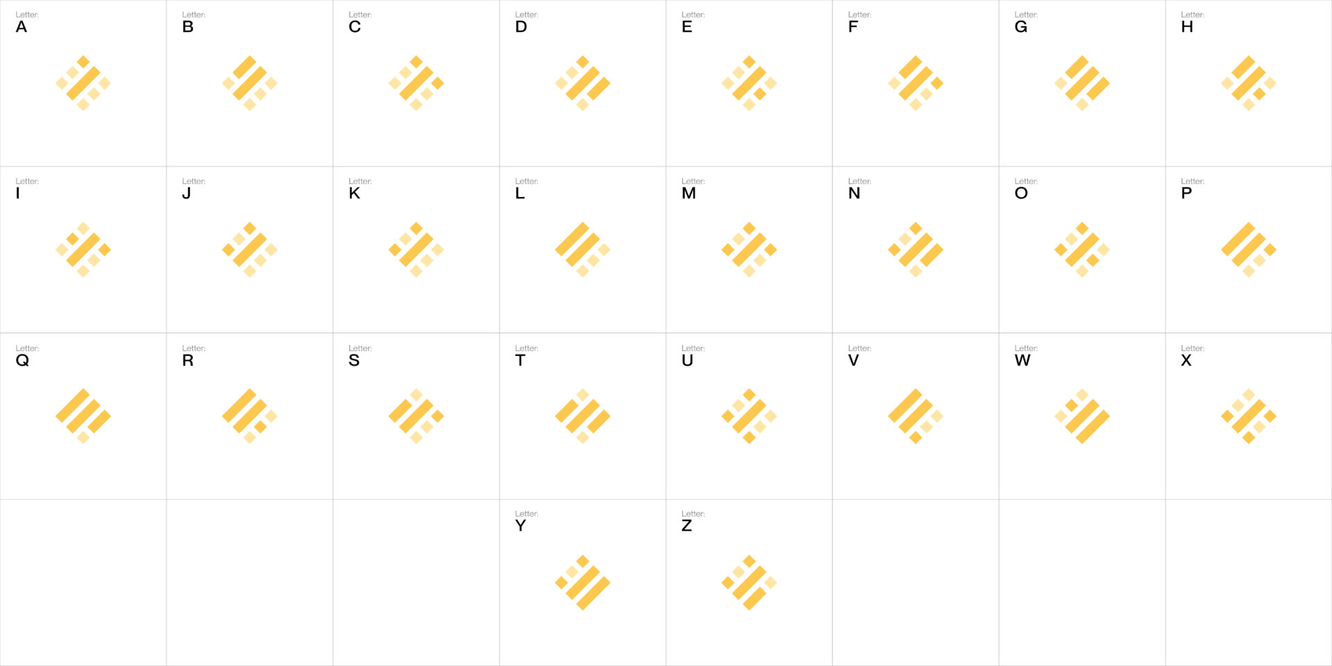
One system. An alphabet of dreams.
In a market where aesthetics are often reduced to square meters and logos tend to end with a street name, we decided to go further. We created a language of symbols that actually mean something.
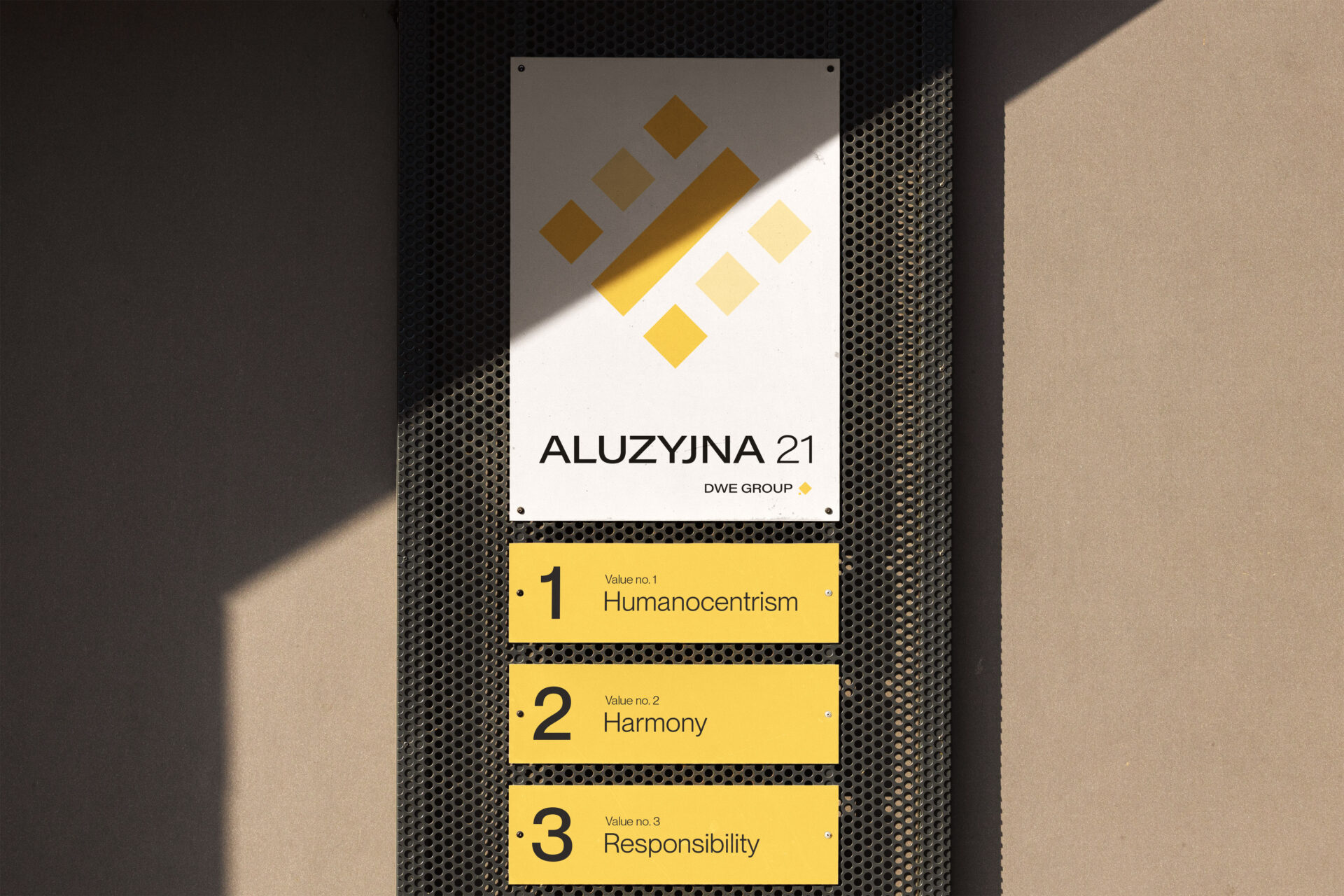
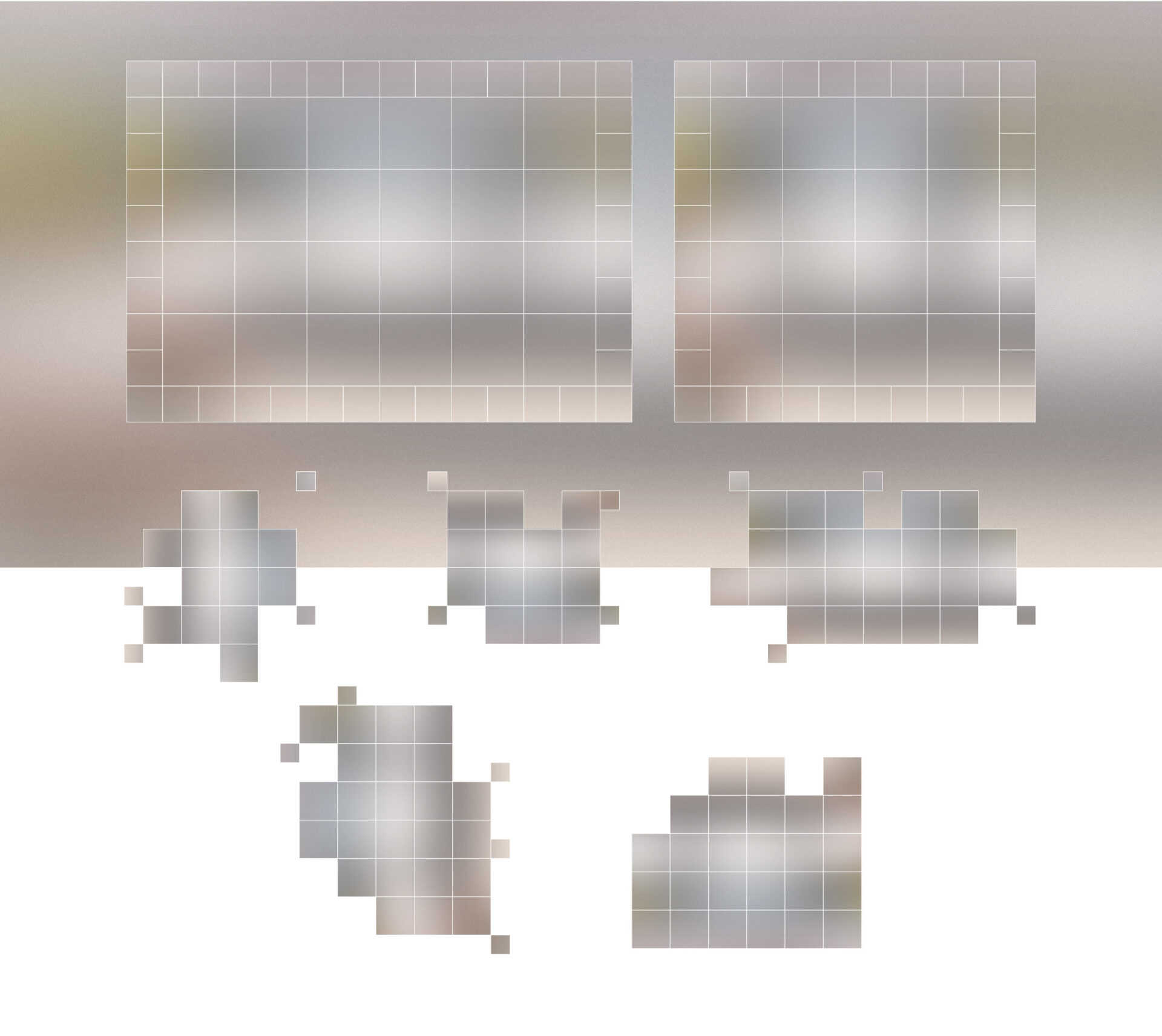
At its core is an alphabet inspired by the structure of Braille – a grid of seven modules, each representing a letter. And each letter – a single dream. We didn’t invent those dreams. They already exist. Safety. Peace. Closeness. Space.
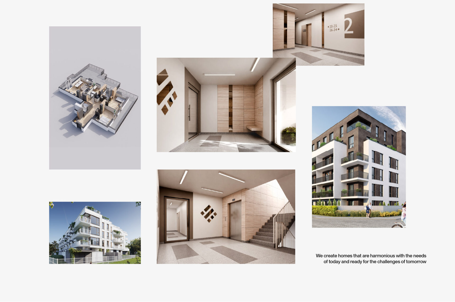
Each DWE GROUP development is given a sign that symbolizes one of these dreams.That’s how a meaningful architecture is built – a system of sub-brands that remain consistent with the main identity, while carrying their own distinct character.
We don’t encode names. We encode meaning.
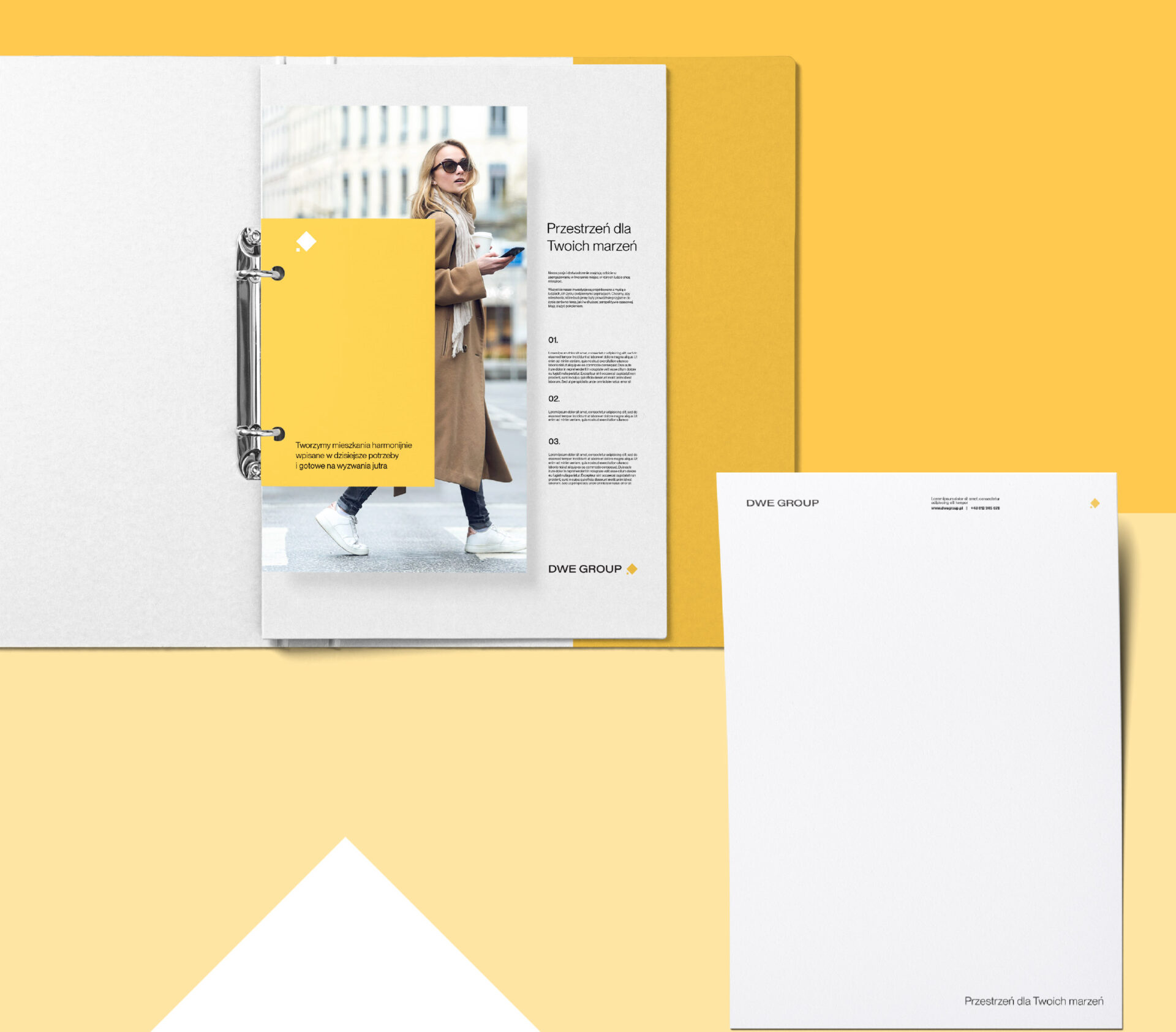
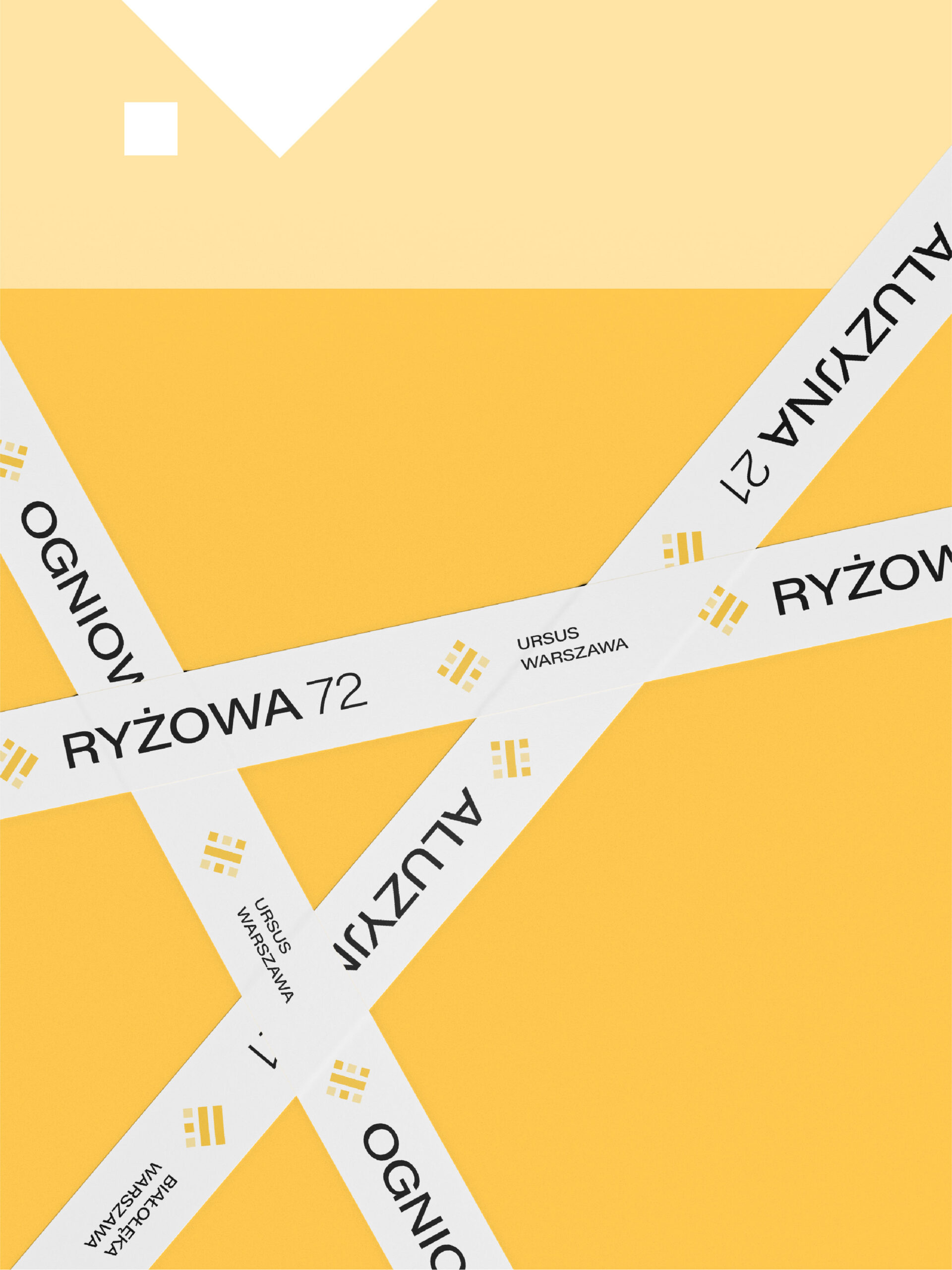
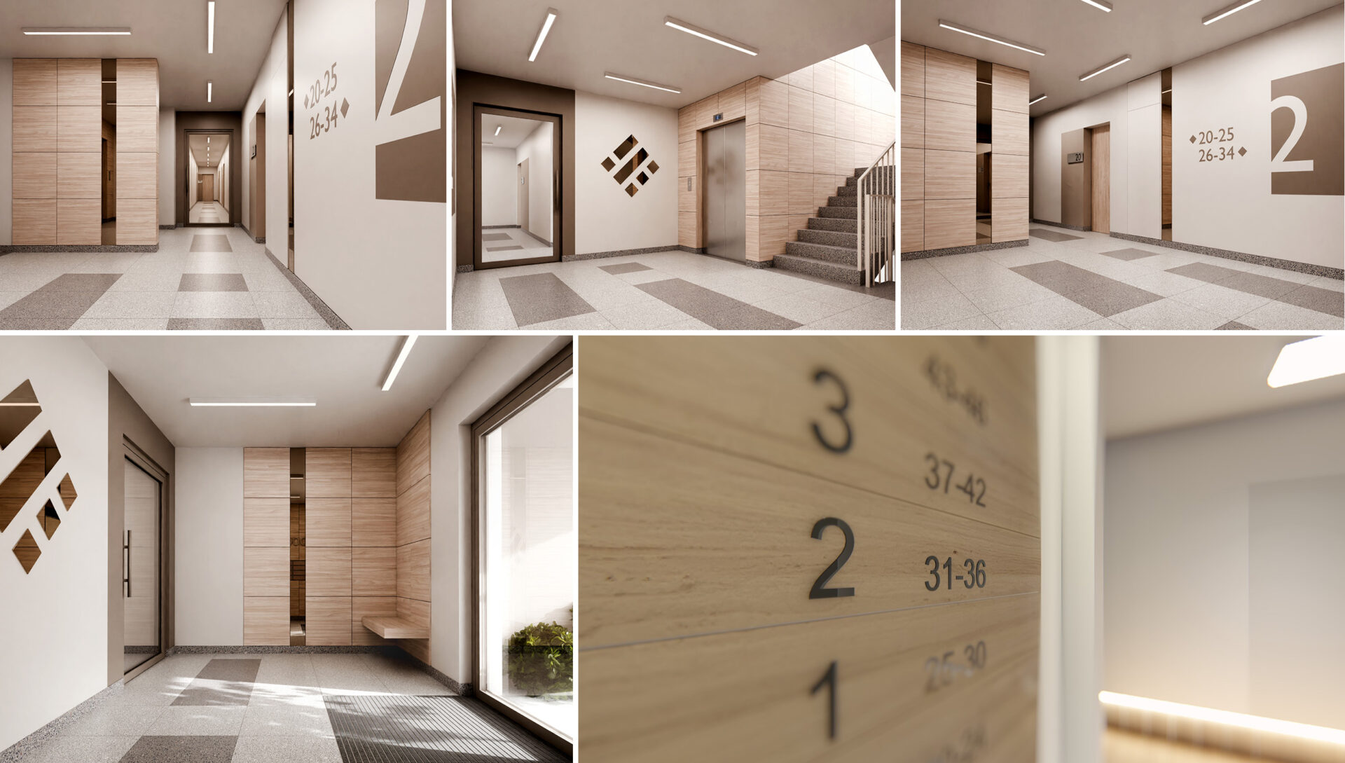
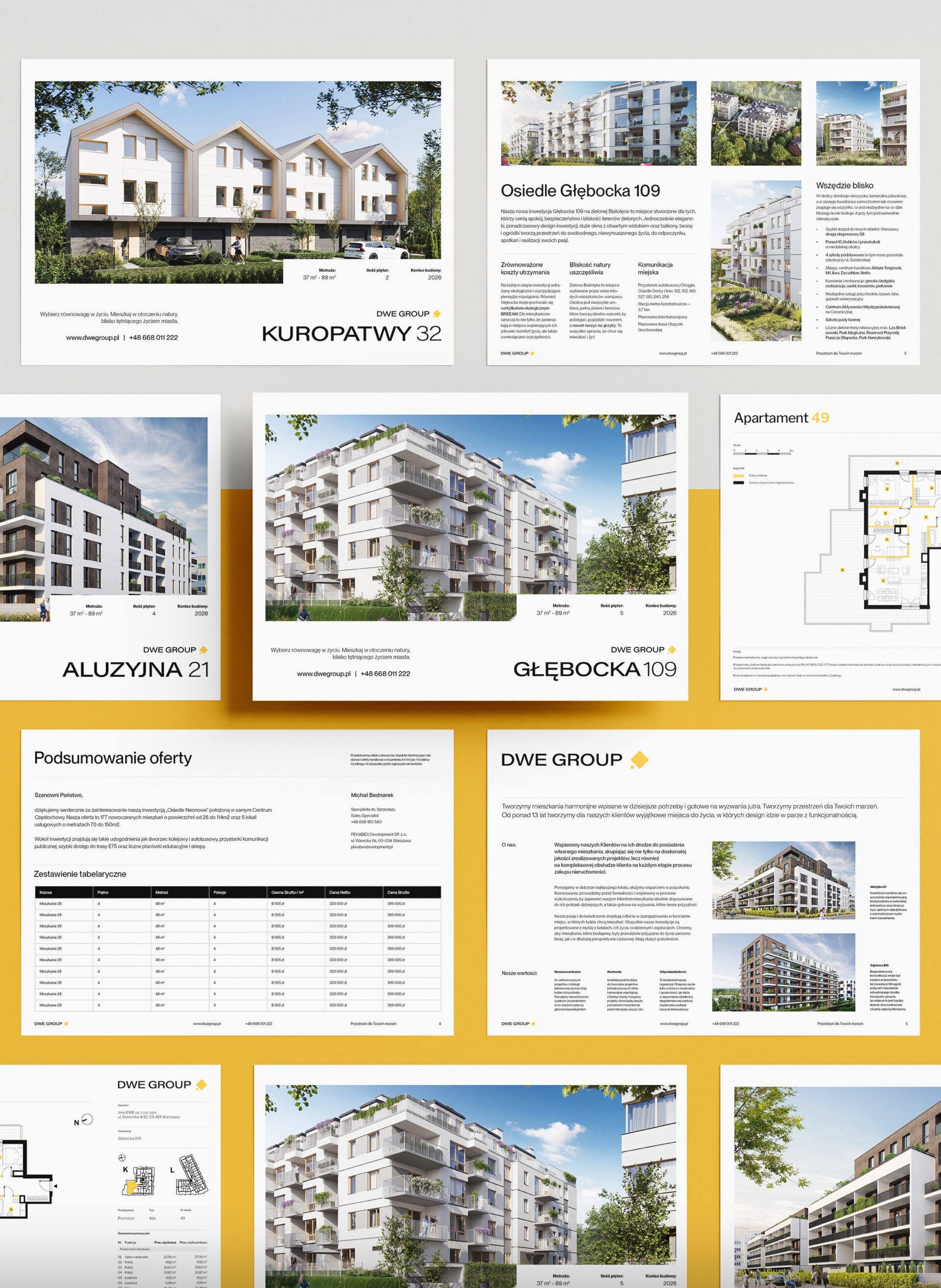
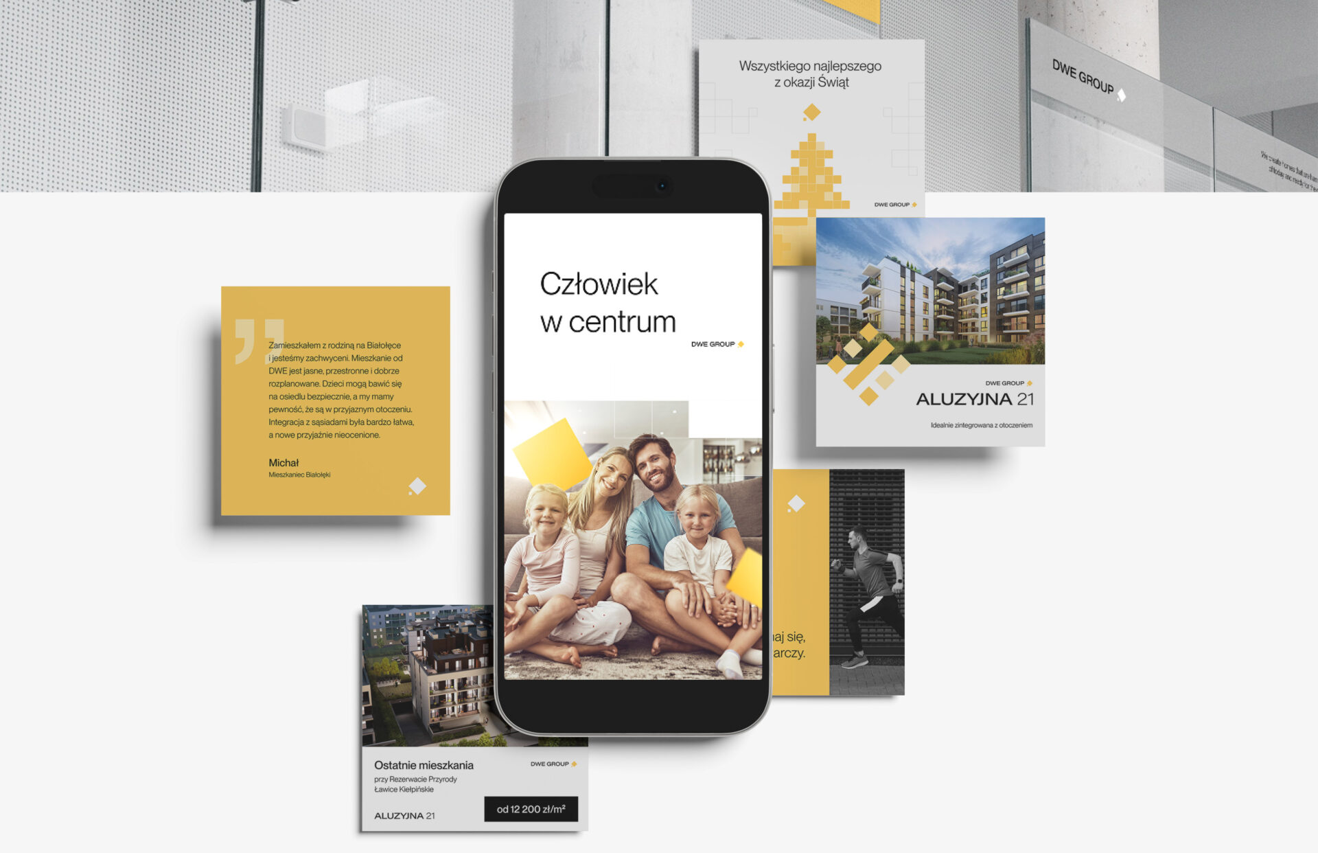
To expand the brand’s visual language, we designed modular grids inspired by the symbol. They enable the creation of diverse layouts while maintaining aesthetic consistency.
Thanks to the combination of small and large modules, the system remains flexible and versatile. It works seamlessly across digital and print, ensuring strong recognition without visual monotony.
The designed identity system allows the brand to speak a human language.
And to grow without losing its essence.
It’s a structure that brings order without imposing limits. It supports growth, strengthens recognition, and creates space to talk about what truly matters: dreams, relationships, and everyday life.
By turning intangible needs into a clear visual and verbal language, we helped DWE GROUP lay the foundations for long-term trust, memorability, and growth.
Because a brand is more than what people see. It’s what they feel before they decide.